Linear Progress Bar
pub package
CodeFactor
A powerful and customizable progress indicator library for Flutter. Supports linear progress bars, circular percent indicators, gauges, dots indicators, titled progress bars, gradient colors, and smooth animations.
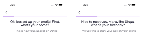
Linear Progress Bar
Dots Progress
Titled Progress
Features
Progress Bars
- ✅ Linear Progress Bar - Traditional horizontal progress indicator
- ✅ Titled Progress Bar - Progress bar with customizable labels
- ✅ Dots Progress Indicator - Step-based dots indicator
Percent Indicators
- ✅ Circular Percent Indicator - Beautiful circular progress with percentage display
- ✅ Linear Percent Indicator - Linear progress with leading/trailing/center widgets
- ✅ Multi-segment Linear Indicator - Show multiple progress segments
Gauges
- ✅ Gauge Indicator - Modern speedometer-style gauge with needle and ranges
- ✅ Linear Gauge - Horizontal/vertical gauge with ruler, pointer, and ranges
- ✅ Radial Gauge - Advanced circular gauge with needle and shape pointers
Common Features
- ✅ Gradient Support - Apply beautiful gradients to all indicators
- ✅ Smooth Animations - Animated progress transitions with customizable curves
- ✅ Toggle Animation - Enable/disable animations on any indicator
- ✅ Custom Animation Duration - Control animation timing
- ✅ Interactivity - Drag/tap to change values on gauges
- ✅ Multiple Label Types - Text, percentage, step count, or custom widgets
- ✅ Flexible Child Positioning - Left/right/center for linear, top/bottom/center for circular
- ✅ Customizable Appearance - Colors, sizes, shapes, borders, and more
- ✅ Accessibility Support - Semantic labels and values
Installation
Add this to your pubspec.yaml:
dependencies:
  linear_progress_bar: ^3.0.0
Then run:
flutter pub get
Quick Start
Import the package:
import 'package:linear_progress_bar/linear_progress_bar.dart';
Basic Linear Progress Bar
LinearProgressBar(
  maxSteps: 6,
  progressType: ProgressType.linear,
  currentStep: 3,
  progressColor: Colors.blue,
  backgroundColor: Colors.grey,
  borderRadius: BorderRadius.circular(10),
  minHeight: 12,
)
Circular Percent Indicator
CircularPercentIndicator(
  percent: 0.75,
  radius: 60,
  lineWidth: 10,
  progressColor: Colors.blue,
  backgroundColor: Colors.grey.shade300,
  circularStrokeCap: CircularStrokeCap.round,
  center: Text(
    '75%',
    style: TextStyle(
      fontSize: 20,
      fontWeight: FontWeight.bold,
    ),
  ),
)
Gauge Indicator
GaugeIndicator(
  value: 0.65,
  size: 200,
  strokeWidth: 20,
  valueColor: Colors.blue,
  backgroundColor: Colors.grey.shade300,
  showValue: true,
  gaugeStyle: GaugeStyle.modern,
)
Dots Progress Indicator
LinearProgressBar(
  maxSteps: 5,
  progressType: ProgressType.dots,
  currentStep: 2,
  progressColor: Colors.blue,
  backgroundColor: Colors.grey,
  dotsActiveSize: 12,
  dotsInactiveSize: 8,
)
Titled Progress Bar with Percentage
TitledProgressBar(
  maxSteps: 100,
  currentStep: 75,
  progressColor: Colors.green,
  backgroundColor: Colors.grey.shade300,
  labelType: LabelType.percentage,
  labelColor: Colors.white,
  labelFontWeight: FontWeight.bold,
  minHeight: 24,
  borderRadius: BorderRadius.circular(12),
)
Usage Examples
Circular Percent Indicator
Basic Circle with Percentage
CircularPercentIndicator(
  percent: 0.75,
  radius: 60,
  lineWidth: 10,
  progressColor: Colors.blue,
  backgroundColor: Colors.grey.shade300,
  circularStrokeCap: CircularStrokeCap.round,
  center: Text('75%'),
)
With Gradient Colors
CircularPercentIndicator(
  percent: 0.75,
  radius: 70,
  lineWidth: 12,
  backgroundColor: Colors.grey.shade200,
  linearGradient: LinearGradient(
    colors: [Colors.purple, Colors.pink, Colors.orange],
  ),
  circularStrokeCap: CircularStrokeCap.round,
  center: Column(
    mainAxisSize: MainAxisSize.min,
    children: [
      Text('75%', style: TextStyle(fontSize: 24, fontWeight: FontWeight.bold)),
      Text('Complete', style: TextStyle(fontSize: 12, color: Colors.grey)),
    ],
  ),
)
With Header and Footer
CircularPercentIndicator(
  percent: 0.75,
  radius: 60,
  lineWidth: 8,
  progressColor: Colors.green,
  backgroundColor: Colors.grey.shade300,
  header: Text('Downloading...', style: TextStyle(fontWeight: FontWeight.bold)),
  center: Icon(Icons.download, size: 32, color: Colors.green),
  footer: Text('75%', style: TextStyle(fontSize: 16, fontWeight: FontWeight.bold)),
)
Animated Circular Progress
CircularPercentIndicator(
  percent: 0.75,
  radius: 60,
  lineWidth: 10,
  progressColor: Colors.purple,
  backgroundColor: Colors.grey.shade300,
  animation: true,
  animationDuration: Duration(milliseconds: 800),
  animationCurve: Curves.easeInOut,
)
Gauge Indicator
Simple Gauge
GaugeIndicator(
  value: 0.65,
  size: 200,
  strokeWidth: 15,
  valueColor: Colors.blue,
  backgroundColor: Colors.grey.shade300,
  showValue: true,
)
Speedometer Style with Needle
GaugeIndicator(
  value: 0.65,
  size: 200,
  strokeWidth: 20,
  valueColor: Colors.green,
  backgroundColor: Colors.grey.shade200,
  showNeedle: true,
  needleColor: Colors.red,
  gaugeStyle: GaugeStyle.ticked,
  tickCount: 10,
  showMinMax: true,
  minLabel: '0',
  maxLabel: '100',
)
Half Gauge (180°)
GaugeIndicator(
  value: 0.65,
  size: 200,
  strokeWidth: 20,
  valueColor: Colors.teal,
  backgroundColor: Colors.grey.shade300,
  startAngle: 180,
  sweepAngle: 180,
  showValue: true,
)
Gradient Gauge
GaugeIndicator(
  value: 0.65,
  size: 200,
  strokeWidth: 18,
  backgroundColor: Colors.grey.shade200,
  gradient: SweepGradient(
    startAngle: 2.35,
    endAngle: 7.07,
    colors: [Colors.green, Colors.yellow, Colors.orange, Colors.red],
  ),
  gaugeStyle: GaugeStyle.modern,
  tickCount: 8,
  showValue: true,
)
Range Colors Gauge
GaugeIndicator(
  value: 0.65,
  size: 200,
  strokeWidth: 20,
  backgroundColor: Colors.grey.shade200,
  ranges: [
    GaugeRange(start: 0.0, end: 0.33, color: Colors.green),
    GaugeRange(start: 0.33, end: 0.66, color: Colors.orange),
    GaugeRange(start: 0.66, end: 1.0, color: Colors.red),
  ],
  showNeedle: true,
  needleColor: Colors.black87,
  showMinMax: true,
  minLabel: 'Low',
  maxLabel: 'High',
  showValue: true,
  valueFormatter: (v) {
    if (v < 0.33) return 'Good';
    if (v < 0.66) return 'Normal';
    return 'Alert';
  },
)
With Title and Subtitle
GaugeIndicator(
  value: 0.65,
  size: 180,
  strokeWidth: 15,
  valueColor: Colors.deepPurple,
  backgroundColor: Colors.grey.shade300,
  showValue: true,
  valueFormatter: (v) => '${(v * 100).toInt()}°C',
  title: Text('Temperature', style: TextStyle(fontSize: 18, fontWeight: FontWeight.bold)),
  subtitle: Text('Current reading', style: TextStyle(fontSize: 12, color: Colors.grey)),
)
Linear Progress Bar
With Gradient
LinearProgressBar(
  maxSteps: 100,
  progressType: ProgressType.linear,
  currentStep: 65,
  progressGradient: LinearGradient(
    colors: [Colors.blue, Colors.purple, Colors.pink],
  ),
  backgroundColor: Colors.grey.shade300,
  borderRadius: BorderRadius.circular(10),
  minHeight: 16,
)
With Animation
LinearProgressBar(
  maxSteps: 100,
  progressType: ProgressType.linear,
  currentStep: currentStep,
  progressColor: Colors.blue,
  backgroundColor: Colors.grey.shade300,
  animateProgress: true,
  animationDuration: Duration(milliseconds: 500),
  animationCurve: Curves.easeInOut,
)
API Reference
CircularPercentIndicator
| Property |
Type |
Default |
Description |
percent |
double |
0.0 |
Progress value (0.0 to 1.0) |
radius |
double |
50.0 |
Radius of the circle |
lineWidth |
double |
5.0 |
Width of the progress line |
backgroundWidth |
double? |
lineWidth |
Width of background circle |
progressColor |
Color |
Colors.blue |
Progress indicator color |
backgroundColor |
Color |
grey |
Background color |
linearGradient |
Gradient? |
null |
Gradient for progress |
circularStrokeCap |
CircularStrokeCap |
round |
Line cap style |
startAngle |
CircularStartAngle |
top |
Starting position |
reverse |
bool |
false |
Reverse direction |
animation |
bool |
false |
Enable animation |
animationDuration |
Duration |
500ms |
Animation duration |
animationCurve |
Curve |
easeInOut |
Animation curve |
center |
Widget? |
null |
Widget in the center |
header |
Widget? |
null |
Widget above circle |
footer |
Widget? |
null |
Widget below circle |
fillColor |
bool |
false |
Fill background |
circleColor |
Color? |
null |
Fill color |
GaugeIndicator
| Property |
Type |
Default |
Description |
value |
double |
0.0 |
Current value (0.0 to 1.0) |
size |
double |
200.0 |
Size of the gauge |
strokeWidth |
double |
15.0 |
Width of the arc |
valueColor |
Color |
Colors.blue |
Value indicator color |
backgroundColor |
Color |
grey |
Background color |
gradient |
Gradient? |
null |
Gradient for value arc |
startAngle |
double |
135.0 |
Start angle in degrees |
sweepAngle |
double |
270.0 |
Sweep angle in degrees |
showValue |
bool |
true |
Show value label |
labelPosition |
GaugeLabelPosition |
center |
Label position |
valueFormatter |
Function? |
null |
Custom value formatter |
valueTextStyle |
TextStyle? |
null |
Value text style |
center |
Widget? |
null |
Custom center widget |
animation |
bool |
false |
Enable animation |
animationDuration |
Duration |
500ms |
Animation duration |
gaugeStyle |
GaugeStyle |
simple |
Gauge style |
tickCount |
int |
10 |
Number of tick marks |
tickLength |
double |
8.0 |
Length of tick marks |
ranges |
List<GaugeRange>? |
null |
Color ranges |
showNeedle |
bool |
false |
Show needle pointer |
needleColor |
Color |
Colors.red |
Needle color |
showMinMax |
bool |
false |
Show min/max labels |
title |
Widget? |
null |
Title widget |
subtitle |
Widget? |
null |
Subtitle widget |
LinearProgressBar
| Property |
Type |
Default |
Description |
maxSteps |
int |
1 |
Maximum number of steps |
currentStep |
int |
0 |
Current step (0 to maxSteps) |
progressType |
ProgressType |
linear |
Type of progress bar |
progressColor |
Color |
Colors.red |
Progress indicator color |
backgroundColor |
Color |
Colors.white |
Background color |
minHeight |
double |
10 |
Minimum height of the bar |
borderRadius |
BorderRadiusGeometry |
zero |
Border radius |
progressGradient |
Gradient? |
null |
Gradient for progress |
animateProgress |
bool |
false |
Enable animations |
animationDuration |
Duration |
300ms |
Animation duration |
animationCurve |
Curve |
easeInOut |
Animation curve |
dotsAxis |
Axis |
horizontal |
Dots orientation |
dotsActiveSize |
double |
8 |
Active dot size |
dotsInactiveSize |
double |
8 |
Inactive dot size |
dotsSpacing |
EdgeInsets |
zero |
Spacing around dots |
onDotTap |
OnTap? |
null |
Dot tap callback |
LinearGauge
| Property |
Type |
Default |
Description |
value |
double |
0.0 |
Current value (0.0 to 1.0) |
orientation |
LinearGaugeOrientation |
horizontal |
Gauge orientation |
thickness |
double |
20.0 |
Track thickness |
valueColor |
Color |
Colors.blue |
Value bar color |
backgroundColor |
Color |
grey |
Background color |
valueGradient |
Gradient? |
null |
Gradient for value bar |
rulerStyle |
RulerStyle |
none |
Ruler/tick style |
rulerPosition |
RulerPosition |
start |
Ruler position |
pointer |
PointerConfig? |
null |
Pointer configuration |
ranges |
List<LinearGaugeRange>? |
null |
Color ranges |
animation |
bool |
false |
Enable animation |
interactive |
bool |
false |
Enable drag interaction |
onValueChanged |
Function? |
null |
Value change callback |
RadialGauge
| Property |
Type |
Default |
Description |
value |
double |
0.0 |
Current value (0.0 to 1.0) |
size |
double |
200.0 |
Gauge size |
position |
RadialGaugePosition |
bottom |
Start position |
sweepAngle |
double |
270.0 |
Sweep angle in degrees |
trackWidth |
double |
20.0 |
Track width |
valueColor |
Color |
Colors.blue |
Value bar color |
needle |
NeedleConfig? |
null |
Needle configuration |
shapePointer |
ShapePointerConfig? |
null |
Shape pointer config |
ranges |
List<RadialGaugeRange>? |
null |
Color ranges |
showTicks |
bool |
false |
Show tick marks |
showTickLabels |
bool |
false |
Show tick labels |
interactive |
bool |
false |
Enable drag interaction |
LinearPercentIndicator
| Property |
Type |
Default |
Description |
percent |
double |
0.0 |
Progress value (0.0 to 1.0) |
width |
double? |
null |
Width (uses available space if null) |
lineHeight |
double |
10.0 |
Height of the progress bar |
progressColor |
Color |
Colors.blue |
Progress color |
linearGradient |
Gradient? |
null |
Gradient for progress |
leading |
Widget? |
null |
Widget on the left |
trailing |
Widget? |
null |
Widget on the right |
center |
Widget? |
null |
Widget in the center |
childPosition |
LinearChildPosition |
center |
Child positioning |
animation |
bool |
false |
Enable animation |
animationDuration |
int |
500 |
Animation duration (ms) |
showPercentage |
bool |
false |
Show percentage text |
segments |
List<LinearSegment>? |
null |
Multi-segment config |
isRTL |
bool |
false |
Right-to-left support |
Enums
GaugeStyle
GaugeStyle.simple - Simple arc gaugeGaugeStyle.ticked - Gauge with tick marksGaugeStyle.segmented - Gauge with segmentsGaugeStyle.modern - Modern gradient gauge
GaugeLabelPosition
GaugeLabelPosition.center - Label at centerGaugeLabelPosition.bottom - Label below gaugeGaugeLabelPosition.none - No label
CircularStrokeCap
CircularStrokeCap.round - Rounded capCircularStrokeCap.square - Square capCircularStrokeCap.butt - No cap
CircularStartAngle
CircularStartAngle.top - Start from top (12 o'clock)CircularStartAngle.right - Start from right (3 o'clock)CircularStartAngle.bottom - Start from bottom (6 o'clock)CircularStartAngle.left - Start from left (9 o'clock)
LinearGaugeOrientation
LinearGaugeOrientation.horizontal - Horizontal gaugeLinearGaugeOrientation.vertical - Vertical gauge
RulerStyle
RulerStyle.none - No ruler marksRulerStyle.simple - Simple tick marksRulerStyle.labeled - Tick marks with labelsRulerStyle.graduated - Major and minor tick marksRulerStyle.bothSides - Tick marks on both sides
PointerStyle
PointerStyle.none - No pointerPointerStyle.triangle - Triangle pointerPointerStyle.diamond - Diamond pointerPointerStyle.arrow - Arrow pointerPointerStyle.circle - Circle pointerPointerStyle.rectangle - Rectangle pointerPointerStyle.invertedTriangle - Inverted triangle
RadialGaugePosition
RadialGaugePosition.top - Start from topRadialGaugePosition.right - Start from rightRadialGaugePosition.bottom - Start from bottomRadialGaugePosition.left - Start from leftRadialGaugePosition.custom - Custom start angle
NeedleStyle
NeedleStyle.none - No needleNeedleStyle.simple - Simple line needleNeedleStyle.tapered - Tapered needleNeedleStyle.triangle - Triangle needleNeedleStyle.diamond - Diamond needleNeedleStyle.flat - Modern flat needleNeedleStyle.compass - Compass-style needle
ShapePointerStyle
ShapePointerStyle.none - No shape pointerShapePointerStyle.circle - Circle shapeShapePointerStyle.triangle - Triangle shapeShapePointerStyle.diamond - Diamond shapeShapePointerStyle.rectangle - Rectangle shapeShapePointerStyle.invertedTriangle - Inverted triangleShapePointerStyle.arrow - Arrow shape
LinearChildPosition
LinearChildPosition.left - Child on leftLinearChildPosition.right - Child on rightLinearChildPosition.center - Child in center
CircularChildPosition
CircularChildPosition.center - Child in centerCircularChildPosition.top - Child at topCircularChildPosition.bottom - Child at bottom
Helper Classes
GaugeRange
GaugeRange(
  start: 0.0,
  end: 0.33,
  color: Colors.green,
  label: 'Low',
)
GaugeSegment
GaugeSegment(
  start: 0.0,
  end: 0.33,
  color: Colors.red,
)
GaugeDecorator
Preset configurations for gauge styles:
// Speedometer style
final decorator = GaugeDecorator.speedometer();

// Minimal flat style
final decorator = GaugeDecorator.minimal();

// Gradient style
final decorator = GaugeDecorator.gradient();

// Health/fitness style
final decorator = GaugeDecorator.health();

// Temperature style
final decorator = GaugeDecorator.temperature();
CircularDecorator
Preset configurations for circular indicators:
// Gradient style
final decorator = CircularDecorator.gradient();

// Minimal style
final decorator = CircularDecorator.minimal();

// Thick line style
final decorator = CircularDecorator.thick();

// Thin line style
final decorator = CircularDecorator.thin();
Linear Gauge
A powerful linear gauge with orientation, ruler style, pointer, value bar, ranges, animation, and interactivity.
LinearGauge(
  value: 0.65,
  orientation: LinearGaugeOrientation.horizontal,
  thickness: 20,
  valueColor: Colors.blue,
  backgroundColor: Colors.grey.shade300,
  rulerStyle: RulerStyle.graduated,
  pointer: PointerConfig(
    style: PointerStyle.triangle,
    color: Colors.red,
    size: 20,
  ),
  ranges: [
    LinearGaugeRange(start: 0.0, end: 0.3, color: Colors.green),
    LinearGaugeRange(start: 0.3, end: 0.7, color: Colors.yellow),
    LinearGaugeRange(start: 0.7, end: 1.0, color: Colors.red),
  ],
  animation: true,
  interactive: true,
  onValueChanged: (value) => print('Value: $value'),
)
Radial Gauge
An advanced radial gauge with position, needle pointer, shape pointer, value bar, and interactivity.
RadialGauge(
  value: 0.75,
  size: 250,
  position: RadialGaugePosition.bottom,
  trackWidth: 20,
  valueColor: Colors.blue,
  needle: NeedleConfig(
    style: NeedleStyle.tapered,
    color: Colors.red,
    lengthRatio: 0.75,
    showKnob: true,
  ),
  shapePointer: ShapePointerConfig(
    style: ShapePointerStyle.triangle,
    color: Colors.orange,
    position: ShapePointerPosition.outer,
  ),
  ranges: [
    RadialGaugeRange(start: 0.0, end: 0.33, color: Colors.green),
    RadialGaugeRange(start: 0.33, end: 0.66, color: Colors.orange),
    RadialGaugeRange(start: 0.66, end: 1.0, color: Colors.red),
  ],
  showTicks: true,
  showTickLabels: true,
  interactive: true,
  onValueChanged: (value) => print('Value: $value'),
)
Linear Percent Indicator
A linear progress indicator with leading/trailing/center widgets, multi-segment support, and gradients.
LinearPercentIndicator(
  percent: 0.75,
  lineHeight: 25,
  progressColor: Colors.blue,
  backgroundColor: Colors.grey.shade300,
  leading: Icon(Icons.download),
  trailing: Text('75%'),
  center: Text('Loading...'),
  animation: true,
  animationDuration: 1000,
  linearGradient: LinearGradient(
    colors: [Colors.blue, Colors.purple],
  ),
  borderRadius: BorderRadius.circular(12),
)
Multi-Segment Linear Indicator
MultiSegmentLinearIndicator(
  segments: [
    LinearSegment(start: 0.0, end: 0.3, color: Colors.green, label: 'Done'),
    LinearSegment(start: 0.3, end: 0.6, color: Colors.yellow, label: 'Progress'),
    LinearSegment(start: 0.6, end: 0.9, color: Colors.orange, label: 'Pending'),
  ],
  lineHeight: 30,
  animation: true,
  showLabels: true,
)
Circular Percent Indicator with Child Positioning
// Center positioned child
CircularPercentIndicator(
  percent: 0.75,
  radius: 60,
  child: Icon(Icons.check),
  childPosition: CircularChildPosition.center,
)

// Top positioned child
CircularPercentIndicator(
  percent: 0.75,
  radius: 60,
  child: Text('Title'),
  childPosition: CircularChildPosition.top,
)

// With automatic percentage display
CircularPercentIndicator(
  percent: 0.75,
  radius: 60,
  showPercentage: true,
  percentageDecimals: 1,
)
Migration Guides
Migration from v1.x
If you're upgrading from version 1.x:
Breaking Changes
- ProgressType Enum: Replace integer constants with enum values:
// Old (deprecated)
progressType: LinearProgressBar.progressTypeLinear

// New
progressType: ProgressType.linear
- TitledProgressBar: Now uses
const constructor and has additional features.
New Features in v2.0
animateProgress - Enable smooth progress animationsprogressGradient - Apply gradients to progress barsLabelType.percentage and LabelType.stepCount for TitledProgressBarLabelPosition for flexible label placementonDotTap callback for interactive dots- Improved null safety and assertions
Migration from v2.x
If you're upgrading from version 2.x:
New Features in v3.0
-
LinearGauge - Linear gauge with:
- Horizontal/vertical orientation
- Ruler styles (none, simple, labeled, graduated, bothSides)
- Pointer types (triangle, diamond, arrow, circle, rectangle)
- Value bar with gradient support
- Range coloring
- Animation and interactivity (drag to change value)
-
RadialGauge - Radial gauge with:
- Customizable start position (top, right, bottom, left, custom angle)
- Needle pointer styles (simple, tapered, triangle, diamond, flat, compass)
- Shape pointer types (circle, triangle, diamond, rectangle, arrow)
- Value bar with gradient support
- Range coloring
- Tick marks with labels
- Animation and interactivity
-
LinearPercentIndicator - Linear percent indicator with:
- Leading/trailing/center widgets
- Child positioning (left, right, center)
- Multi-segment support
- Gradient progress
- RTL support
- Animation controls
-
MultiSegmentLinearIndicator - Display multiple segments in a single bar
-
CircularPercentIndicator enhancements:
- Child positioning (top, bottom, center)
- Automatic percentage display
- Custom decimal places
-
GaugeIndicator - Modern speedometer-style gauges with:
- Multiple styles (simple, ticked, segmented, modern)
- Needle pointer support
- Range colors
- Custom value formatting
-
GaugeDecorator - Preset gauge configurations
-
CircularDecorator - Preset circular indicator configurations
-
Improved animations and customization options
Example Project
Check out the example folder for a complete demo app showcasing all features.
cd example
flutter run
Download APK
You can download and test the example app directly on your Android device:
📱 Download APK
Contributing
Contributions are welcome! Please feel free to submit a Pull Request.
License
This project is licensed under the MIT License - see the LICENSE file for details.
Author
Created by @maravilhosinga


 v3.0.0