
 v5.3.4
group_button
Flutter benutzerdefiniertes Widget zum Erstellen einer Schaltflächengruppe. Enthält Radiobuttons und Checkboxen.
621Likes 219.00030-Tage-Downloads160Pub-Punkte
AndroidiOSWebmacOSWindowsLinux
:sweat_drops: Flutter-Eigenschaftswidget zur Erstellung einer Buttongruppe. Enthält Radiobuttons und Checkboxen.

{"sdk":"flutter"}{"sdk":"flutter"}^2.0.0Englischer Projektschnappschuss. Aktuelle Inhalte auf GitHub.
Included Radio and CheckBox buttons models with custom groping types 🤤
Show some ❤️ and star the repo to support the project!
Pub License: MIT Repository views Pub
Pub likes Pub popularity Pub points
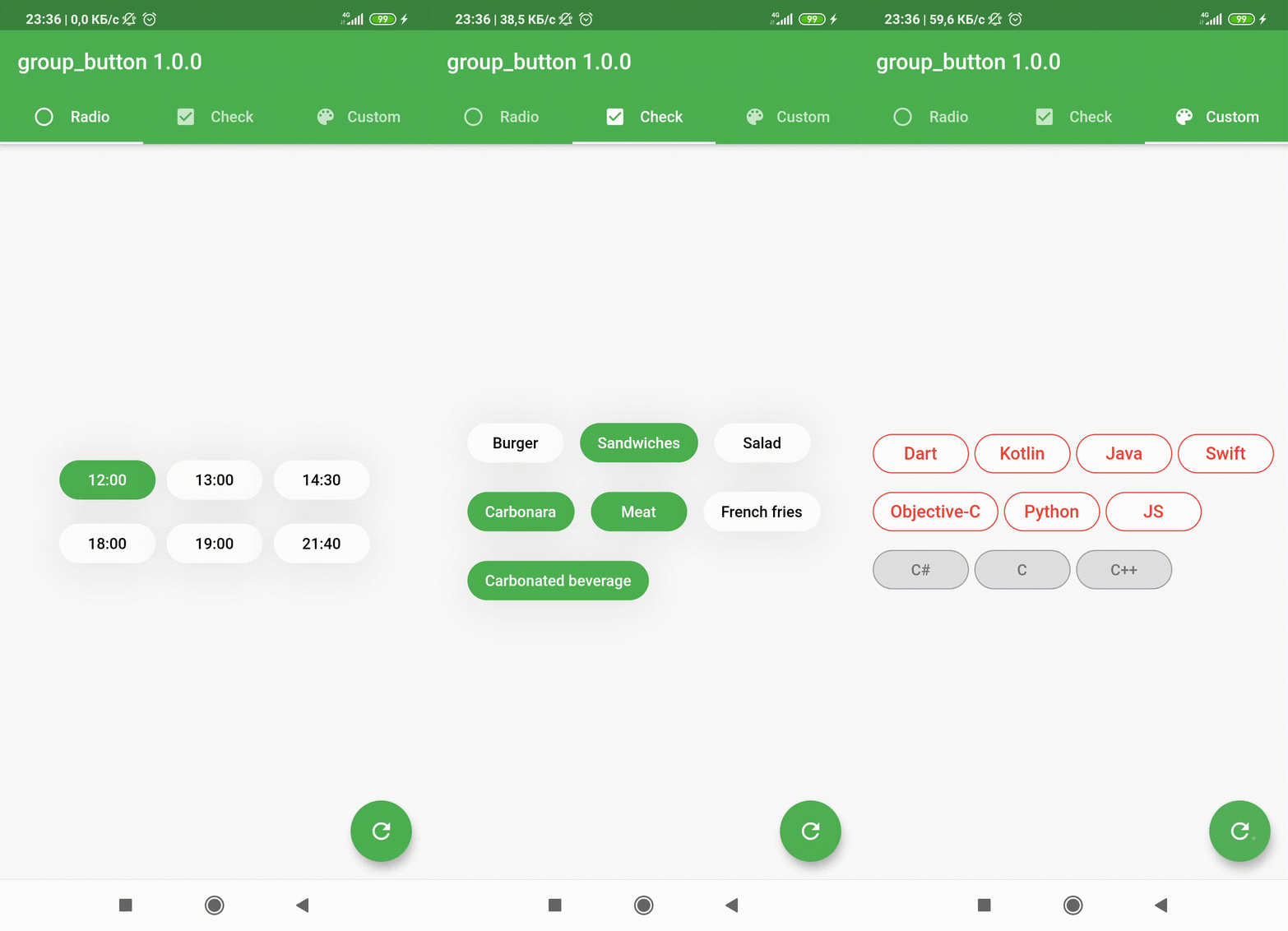
| https://github.com/Frezyx/group_button/blob/master/example/rep_files/new/e1.gif?raw=true | https://github.com/Frezyx/group_button/blob/master/example/rep_files/new/e2.gif?raw=true | https://github.com/Frezyx/group_button/blob/master/example/rep_files/new/e3.gif?raw=true |
|---|
| GroupButtonController | GroupButtonBuilder | GroupButtonOptions |
|---|
Follow these steps to use this package
dependencies:
  group_button: ^5.4.0
import 'package:group_button/group_button.dart';
Simple example of use GroupButton
Put this code in your project at an screen and learn how it works 😊
GroupButton(
    isRadio: false,
    onSelected: (index, isSelected) => print('$index button is selected'),
    buttons: ["12:00", "13:00", "14:30", "18:00", "19:00", "21:40"],
)
Starting from version 4.1.0
You can control your Group Button using the controller
final controller = GroupButtonController();

Column(
  children: [
    GroupButton.checkbox(
      controller: controller,
      buttons: ['12:00', '13:00', '14:00'],
      onSelected: (i, selected) => debugPrint('Button #$i $selected'),
    ),
    TextButton(
      onPressed: () => controller.selectIndex(1),
      child: const Text('Select 1 button'),
    )
  ],
),
In new 5.0.0 version you can set custom buttons value type
It can be int, DateTime, double or YourCustomClass
Button text will be result of .toString() model method in common button display case
GroupButton<DateTime>(
  buttons: [DateTime(2022, 4, 9), DateTime(2022, 4, 10)],
)
Also you can use generic button values with cutsom buttonBuilder
In order to turn values into any widget
GroupButton<DateTime>(
  buttons: [DateTime(2022, 4, 9), DateTime(2022, 4, 10)],
  buttonBuilder: (selected, date, context) {
    return Text('${date.year}-${date.month}-${date.day}');
  },
),
In this package, there are four different possibilities for customizing your buttons through builders
In order to customize your buttons inside GroupButton you can use GroupButtonOptions
GroupButtonOptions(
  selectedShadow: const [],
  selectedTextStyle: TextStyle(
    fontSize: 20,
    color: Colors.pink[900],
  ),
  selectedColor: Colors.pink[100],
  unselectedShadow: const [],
  unselectedColor: Colors.amber[100],
  unselectedTextStyle: TextStyle(
    fontSize: 20,
    color: Colors.amber[900],
  ),
  selectedBorderColor: Colors.pink[900],
  unselectedBorderColor: Colors.amber[900],
  borderRadius: BorderRadius.circular(100),
  spacing: 10,
  runSpacing: 10,
  groupingType: GroupingType.wrap,
  direction: Axis.horizontal,
  buttonHeight: 60,
  buttonWidth: 60,
  mainGroupAlignment: MainGroupAlignment.start,
  crossGroupAlignment: CrossGroupAlignment.start,
  groupRunAlignment: GroupRunAlignment.start,
  textAlign: TextAlign.center,
  textPadding: EdgeInsets.zero,
  alignment: Alignment.center,
  elevation: 0,
),
https://github.com/Frezyx/group_button/blob/master/example/rep_files/options_example.png?raw=true
You can check more examples of using this package here
Thanks to all contributors of this package
https://contrib.rocks/image?repo=Frezyx/group_buttonFor help getting started with 😍 Flutter, view online documentation, which offers tutorials, samples, guidance on mobile development, and a full API reference.