time_picker_spinner
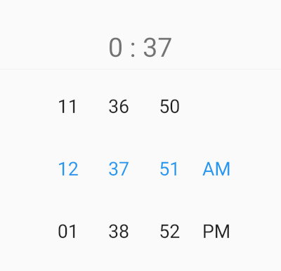
Time Picker with spinner instead of a default material time picker. This widget works with 12 or 24 hour format and custom interval mode, and this package allow localization ar and en.
Pub Version
Demo gif
image
Installation
- Add this to your package's
pubspec.yaml file:
dependencies:
  time_picker_spinner: any
- Get the package using your IDE's GUI or via command line with
$ pub get
- Import the
time_picker_spinner.dart file in your app
import 'package:time_picker_spinner/time_picker_spinner.dart';
Features
- This widget works with 12.
- This widget works with 24.
- allow localization ar and en.
Usage
EN
image
|
image
TimePickerSpinner(
              locale: const Locale('en', ''),
              time: dateTime,
              is24HourMode: false,
              isShowSeconds: true,
              itemHeight: 80,
              normalTextStyle: const TextStyle(
                fontSize: 24,
              ),
              highlightedTextStyle:
                  const TextStyle(fontSize: 24, color: Colors.blue),
              isForce2Digits: true,
              onTimeChange: (time) {
                setState(() {
                  dateTime = time;
                });
              },
            )
Ar
image
|
image
TimePickerSpinner(
              locale: const Locale('ar', ''),
              time: dateTime,
              is24HourMode: false,
              isShowSeconds: true,
              itemHeight: 80,
              normalTextStyle: const TextStyle(
                fontSize: 24,
              ),
              highlightedTextStyle:
                  const TextStyle(fontSize: 24, color: Colors.blue),
              isForce2Digits: true,
              onTimeChange: (time) {
                setState(() {
                  dateTime = time;
                });
              },
            )
Props
| props |
types |
defaultValues |
| time |
DateTime |
Current Time [ DateTime.now() ] |
| minutesInterval |
int |
1 |
| secondsInterval |
int |
1 |
| is24HourMode |
bool |
true |
| isShowSeconds |
bool |
false |
| isShowSeconds |
bool |
false |
| highlightedTextStyle |
TextStyle |
false |
| normalTextStyle |
TextStyle |
false |
| itemHeight |
double |
60.0 |
| itemWidth |
double |
45.0 |
| spacing |
double |
20.0 |
| alignment |
AlignmentGeometry |
Alignment.centerRight |
| isForce2Digits |
bool |
false |
| onTimeChange |
TimePickerCallback |
|
| locale |
bool |
en |


 v1.0.2