
 v0.0.1
draggable_carousel_slider
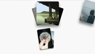
Ein ziehbarer Karussell-Slider-Widget, unterstützt Schleife und benutzerdefinierte Kind-Widgets.
25Likes 2430-Tage-Downloads140Pub-Punkte
AndroidiOSWebmacOSWindowsLinux
Ein dragbarer Carousel-Slider-Widget für Flutter, unterstützt Schleife und benutzerdefinierte Kind-Widgets.

{"sdk":"flutter"}^4.0.0^2.1.4{"sdk":"flutter"}Englischer Projektschnappschuss. Aktuelle Inhalte auf GitHub.
Draggable Carousel Slider
Draggable Carousel Slider is a Flutter package that provides a customizable carousel slider widget with draggable functionality. It allows users to easily create interactive carousel sliders where items can be dragged.
To start using the Draggable Carousel Slider package, you can simply add the package to your pubspec.yaml file and import it into your Flutter project.
dependencies:
  ...
  draggable_carousel_slider:
import 'package:draggable_carousel_slider/draggable_carousel_slider.dart';
import 'package:flutter/material.dart';
import 'package:shimmer/shimmer.dart';

void main() {
  runApp(const MyApp());
}

class MyApp extends StatefulWidget {
  const MyApp({super.key});
  @override
  State<MyApp> createState() => _MyAppPageState();
}

class _MyAppPageState extends State<MyApp> {
  @override
  void initState() {
    super.initState();
  }

  Widget _image(
    String path,
    double width,
    double height, [
    bool shimmer = false,
  ]) =>
      ClipRRect(
        borderRadius: BorderRadius.circular(16),
        child: Image.network(
          path,
          width: width,
          height: height,
          fit: BoxFit.cover,
          loadingBuilder: (
            BuildContext context,
            Widget child,
            ImageChunkEvent? loadingProgress,
          ) => AnimatedCrossFade(
              firstChild: child,
              secondChild: Shimmer.fromColors(
                baseColor: Colors.grey.shade400,
                highlightColor: Colors.grey.shade700,
                enabled: true,
                period: const Duration(seconds: 2),
                child: Container(
                  width: width,
                  height: height,
                  color: Colors.black,
                ),
              ),
              crossFadeState: shimmer ||
                      ((child as Semantics).child as RawImage).image == null
                  ? CrossFadeState.showSecond
                  : CrossFadeState.showFirst,
              duration: const Duration(milliseconds: 300),
            ),
        ),
      );

  @override
  Widget build(BuildContext context) {
    return MaterialApp(
      theme: ThemeData(
        colorScheme: ColorScheme.fromSeed(
          seedColor: Colors.deepPurple,
        ),
        useMaterial3: true,
      ),
      debugShowCheckedModeBanner: false,
      home: Scaffold(
        body: SafeArea(
          child: Padding(
            padding: const EdgeInsets.symmetric(vertical: 16.0),
            child: Center(
              child: DraggableSlider(
                loop: true,
                children: [
                  _image('https://picsum.photos/id/230/600/600', 300, 300),
                  _image(
                      'https://picsum.photos/id/431/600/600', 300, 300, true),
                  _image('https://picsum.photos/id/232/600/600', 300, 300),
                  _image('https://picsum.photos/id/433/600/600', 300, 300),
                  _image('https://picsum.photos/id/234/600/600', 300, 300),
                ],
              ),
            ),
          ),
        ),
      ),
    );
  }
}