Pakete, Repositories und App-Kategorien suchen

GitHub-RepositorySimonWang9610/flutter_slidable_panel

flutter_slidable_panel

Ein leistungsstarker Schiebepanel für Flutter.

Projektcover von flutter_slidable_panel
Sterne
3
Forks
1
Letzter Push (UTC)
20.08.2024
Projektstatus
Aktiv

Original-README

Englischer Projektschnappschuss. Aktuelle Inhalte auf GitHub.

A high-performant slidable Panel that can show actions in different positions, and also can expand the action item when the panel is opening

Features

this package uses some syntax sugar of Dart 3.0, please create issues if you want to use this package in Dart 2.x, I will remove those syntax sugars and migrate it to Dart 2.x

  1. When the panel is closed/dismissed, no actions would be painted and laid out.
  2. The animation of actions (e.g., expanding/collapsing a specific action) will be scoped and not result in the re-layout and re-painting of the entire SlidablePanel
  3. control the SlidablePanel and actions programmatically using SlideController, not limited to gestures.
All action widgets can be expanded when the SlidablePanel is opening.
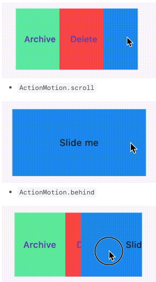
Different Motions
  • ActionMotion.drawer
  • ActionMotion.scroll
  • ActionMotion.behind
Disable gesture sliding

By setting gestureDisabled: true, you could avoid gesture sliding and continue sliding via SlideController programmatically

SlidablePanel(
  ...
  gestureDisabled: true,
  ...
)
Initial Opened Position

By specifying the initOpenedPosition of SlideController, you could open actions at the initOpenedPosition without using WidgetsBinding.instance.addPostFrameCallback.

you should ensure there are actions at the specified initOpenedPosition

  final SlideController _slideController = SlideController(
    usePreActionController: true,
    usePostActionController: true,
    initOpenedPosition: ActionPosition.pre,
  );

Getting started

import 'package:flutter/material.dart';
import 'package:flutter_slidable_panel/flutter_slidable_panel.dart';

class SizedSlidableExample extends StatefulWidget {
  const SizedSlidableExample({super.key});

  @override
  State<SizedSlidableExample> createState() => _SizedSlidableExampleState();
}

class _SizedSlidableExampleState extends State<SizedSlidableExample> {
  final SlideController _slideController = SlideController(
    usePreActionController: true,
    usePostActionController: true,
  );

  @override
  void dispose() {
    _slideController.dispose();
    super.dispose();
  }

  @override
  Widget build(BuildContext context) {
    return Scaffold(
      appBar: AppBar(
        title: const Text('Sized Slidable Example'),
      ),
      body: Center(
        child: SlidablePanel(
          controller: _slideController,
          maxSlideThreshold: 0.8,
          axis: Axis.horizontal,
          preActions: [
            TextButton(
              onPressed: () {
                _slideController.toggleAction(0);
              },
              style: TextButton.styleFrom(
                backgroundColor: Colors.greenAccent,
                shape: const RoundedRectangleBorder(),
              ),
              child: const Text("PreAction"),
            ),
            TextButton(
              onPressed: () {
                _slideController.toggleAction(1);
              },
              style: TextButton.styleFrom(
                backgroundColor: Colors.redAccent,
                shape: const RoundedRectangleBorder(),
              ),
              child: const Text("PreAction"),
            ),
          ],
          postActions: [
            TextButton(
              onPressed: () {
                _slideController.toggleAction(0);
              },
              style: TextButton.styleFrom(
                backgroundColor: Colors.greenAccent,
                shape: const RoundedRectangleBorder(),
              ),
              child: const Text("PostAction"),
            ),
            TextButton(
              onPressed: () {
                _slideController.toggleAction(1);
              },
              style: TextButton.styleFrom(
                backgroundColor: Colors.redAccent,
                shape: const RoundedRectangleBorder(),
              ),
              child: const Text("PostAction"),
            ),
          ],
          child: GestureDetector(
            onTap: () {
              _slideController.dismiss();
            },
            child: const DecoratedBox(
              decoration: BoxDecoration(color: Colors.blue),
              child: SizedBox(
                width: 250,
                height: 100,
                child: Center(
                  child: Text(
                    'Slide me',
                  ),
                ),
              ),
            ),
          ),
        ),
      ),
    );
  }
}

Usage

create a SlideController
  • usePreActionController indicates if you want to enable expanding/collapsing the pre actions
  • usePostActionController indicates if you want to enable expanding/collapsing the post actions.

if [usePreActionController] or [usePostActionController] is set to true, the corresponding [ActionController] would be created and bound to [RenderSlideAction] automatically

  • invoking [SlideController.expand]/[SlideController.collapse]/[SlideController.toggleAction] only takes effects for two cases:
    1. [usePreActionController] is true and the current [openedPosition] is [ActionPosition.pre]
    2. [usePostActionController] is true and the current [openedPosition] is [ActionPosition.post]
  final SlideController _slideController = SlideController(
    usePreActionController: true,
    usePostActionController: true,
  );
use different motion and alignment at different positions

SlidablePanel.preActionLayout and SlidablePanel.postActionLayout accept ActionLayout as parameters.

  1. You could determine how to layout the actions at the different positions by specifying:

    when using ActionAlignment.flex, you could give an action a specific flex value using ActionItem. Other actions not wrapped in ActionItem would have a default flex value of 1.

    ActionAlignment.spaceEvenly would ignore ActionItem

ActionLayout(
  alignment: ActionAlignment.spaceEvenly || ActionAlignment.flex,
)
  1. You could also determine which motion to use:
ActionLayout(
  motion: ActionMotion.behind || ActionMotion.drawer || ActionMotion.scroll
)
Do something when starting sliding

You could set onSlideStart to do some work when starting sliding, e.g., you want to dismiss all other SlidablePanel when starting sliding.

SlidablePanel(
  /// other code
  onSlideStart: <your function>,
  /// other code
)

Use SlideController programmatically

open the panel
SlideController.open({
    ActionPosition position = ActionPosition.pre,
    Curve curve = Curves.easeInOut,
    Duration duration = const Duration(milliseconds: 300),
    VoidCallback? onOpened,
  });
dismiss the panel
SlideController.dismiss({
    Curve curve = Curves.easeInOut,
    Duration duration = const Duration(milliseconds: 300),
    VoidCallback? onDismissed,
  })
check the current opened position
SlideController.openedPosition
  • opened ActionPosition.pre for horizontal and vertical
  • opened ActionPosition.post for horizontal and vertical
expand the index action at the opened position

index is the index in SlidablePanel.preActions or SlidablePanel.postActions

it will try to expand the index action at the current opened position if this panel is opened;

if this panel is closed/dismissed, it has no effects

if the current opened position has no associated ActionController, it also has no effects

you could associate ActionController to a specific position by setting usePreActionController or usePostActionController as true.

SlideController.expand(
    int index, {
    Curve curve = Curves.easeInOut,
    Duration duration = const Duration(milliseconds: 150),
  })
collapse the index action at the opened position
SlideController.collapse(
    int index, {
    required ActionPosition position,
    Curve curve = Curves.easeInOut,
    Duration duration = const Duration(milliseconds: 150),
  })
toggle the index action at the opened position
SlideController.toggleAction(
    int index, {
    Curve curve = Curves.easeInOut,
    Duration duration = const Duration(milliseconds: 150),
  })
detect if the index action is expanded
bool SlideController.hasExpandedAt(int index)
Simon Wang GitHub avatar
GitHub-Autor

Simon Wang ↗

Learning by sharing. Dart/Flutter/Golang/Node.js Full stack developer.

SprachenDartC++CMakeCSwiftHTMLShellObjective-CJavaKotlin

Kategorien

Von diesem Repository veröffentlichte Pakete

Verwendete Abhängigkeiten

Abhängigkeiten 3 Einträge

  • flutter{"sdk":"flutter"}
  • flutter_testEntwicklung{"sdk":"flutter"}
  • flutter_lintsEntwicklung^2.0.0

Wie wähle ich ein passendes Repository?

Nach Anwendungsfall filtern, Aktivität vergleichen und vor der Nutzung das Originalprojekt prüfen.

  1. Nach Name, Autor oder Beschreibung suchen und nach Thema eingrenzen.
  2. Sterne, Forks und letzte Pushes vergleichen. Sterne zeigen Interesse, garantieren aber keine Qualität.
  3. Vor der Nutzung README, Lizenz und Issues auf GitHub prüfen.

Quellen und Pflege

“A repository is the most basic element of GitHub.”

GitHub Docs — About repositories ↗