Englischer Projektschnappschuss. Aktuelle Inhalte auf GitHub.
flutter_advanced_segment
An advanced segment widget, that can be fully customized with bunch of properties, just try it and enjoy!
Examples
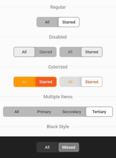
Regular Segment
final _controller = ValueNotifier ('all' );
AdvancedSegment (
controller: _controller,
segments: const {
'all' : 'All' ,
'starred' : 'Starred' ,
},
),
Colorized Segment
AdvancedSegment (
controller: _controller,
segments: const {'all' : 'All' , 'starred' : 'Starred' },
decoration: BoxDecoration (
color: const Color (0xFFFF6B35 ),
borderRadius: BorderRadius .circular (4 ),
),
sliderColor: const Color (0xFFD63B0E ),
activeStyle: const TextStyle (
color: Colors .white,
fontWeight: FontWeight .w600,
),
inactiveStyle: TextStyle (
color: Colors .white.withValues (alpha: 0.7 ),
),
),
Gradient Decoration
AdvancedSegment (
controller: _controller,
segments: const {'all' : 'All' , 'starred' : 'Starred' },
decoration: BoxDecoration (
gradient: const LinearGradient (
colors: [Color (0xFFFF2D55 ), Color (0xFFFF9500 )],
),
borderRadius: BorderRadius .circular (16 ),
),
sliderColor: Colors .white,
activeStyle: const TextStyle (
color: Color (0xFFFF2D55 ),
fontWeight: FontWeight .w700,
),
inactiveStyle: TextStyle (
color: Colors .white.withValues (alpha: 0.85 ),
),
),
Custom Slider Decoration
AdvancedSegment (
controller: _controller,
segments: const {'all' : 'All' , 'starred' : 'Starred' },
decoration: BoxDecoration (
color: const Color (0xFF2C2C2E ),
borderRadius: BorderRadius .circular (50 ),
),
sliderDecoration: BoxDecoration (
color: const Color (0xFFBF5AF2 ),
borderRadius: BorderRadius .circular (50 ),
border: Border .all (
color: const Color (0xFFDA8FFF ),
width: 1.5 ,
),
),
activeStyle: const TextStyle (
color: Colors .white,
fontWeight: FontWeight .w700,
),
inactiveStyle: TextStyle (
color: Colors .white.withValues (alpha: 0.5 ),
),
),
AdvancedSegment Parameters
Parameter
Description
Type
Default
controllerControls segments selection
ValueNotifier
segmentsMap of presented segments
Map<K, V> required
activeStyleActive segment text style
TextStyle fontWeight: FontWeight.w600
inactiveStyleInactive segment text style
TextStyle
decorationLayout decoration (color, border, borderRadius, gradient, etc.)
BoxDecoration color: 0x42000000, borderRadius: 8.0
sliderColorColor of the slider thumb
Color Colors.white
sliderOffsetGap between slider and layout
double 2.0
itemPaddingPadding of each item
EdgeInsets EdgeInsets.symmetric(h: 15, v: 10)
animationDurationSelection animation duration
Duration Duration(milliseconds: 250)
shadowSlider shadow
List<BoxShadow> BoxShadow(blurRadius: 8.0)
sliderDecorationCustom slider decoration (overrides sliderColor, borderRadius, shadow)
BoxDecoration
enableDragWhether drag gesture is enabled
bool true


 v3.2.0