
 v3.1.0
slider_button
Anpassbarer Schieberegler-Button-Widget zum Aktivieren/Deaktivieren eines Ereignisses.
392Likes 517030-Tage-Downloads150Pub-Punkte
AndroidiOS
Ein Flutter-Paket zum Erstellen eines Schieberegler-Button-Widgets.

Englischer Projektschnappschuss. Aktuelle Inhalte auf GitHub.
Open Source Love
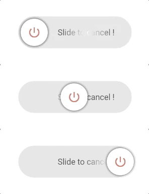
This package provides an easy implementation of a Slider Button to cancel current transaction or screen. Highly customizable iphone alike looking widget.
https://github.com/anirudhsharma392/Slider-Button/blob/master/screenshots/buttons.gif?raw=true
radius to switch between circular and rectangular slider.vibrationFlag).buttonSize, buttonWidth, height, width for full control.disable: true to grey out and prevent sliding (with tooltip).rightToLeftLocale: true for right-to-left slide direction.dismissThresholds).useGlassEffect, glassBlurSigma, glassBorderColor, glassBorderWidth).This is a Circle type widget. You just need to define the border radius to swap between rectangle and circle type widget.
https://github.com/anirudhsharma392/Slider-Button/blob/master/screenshots/button_3.gif?raw=true
This is a Rectangle type widget.
https://github.com/anirudhsharma392/Slider-Button/blob/master/screenshots/button_2.gif?raw=true
import 'package:slider_button/slider_button.dart';
SliderButton(
      action: () async{
        ///Do something here OnSlide
        return true; //return false if you want to avoid dismissing the widget in the tree.
      },

      ///Put label over here
      label: Text(
        "Slide to cancel !",
        style: TextStyle(
            color: Color(0xff4a4a4a),
            fontWeight: FontWeight.w500,
            fontSize: 17),
      ),
      icon: Center(
          child: Icon(
        Icons.power_settings_new,
        color: Colors.white,
        size: 40.0,
        semanticLabel: 'Text to announce in accessibility modes',
      )),

      ///Change All the color and size from here.
      width: 230,
      radius: 10,
      buttonColor: Color(0xffd60000),
      backgroundColor: Color(0xff534bae),
      highlightedColor: Colors.white,
      baseColor: Colors.red,
    );
There are several options that allow for more control:
| Properties | Default | Description |
|---|---|---|
action |
— | (required) Define an action after sliding; return true to dismiss, false to keep. |
buttonKey |
null | Custom key for the button. Useful for dynamic labels. |
child |
null | Your own widget for a fully customizable slider button. |
vibrationFlag |
false | Enable haptic vibration on successful slide. |
height |
70 | Height of the widget. |
width |
270 | Width of the widget. |
buttonSize |
null (→ 60) | Size of the sliding button (square). Must be ≤ height. |
buttonWidth |
null | Width of the button when not squared (e.g. wide sliders). |
backgroundColor |
Color(0xffe0e0e0) | Background color of the track. |
baseColor |
Colors.black87 | Shimmer base color for the label. |
highlightedColor |
Colors.white | Shimmer highlight color for the label. |
buttonColor |
Colors.white | Color of the sliding button. |
label |
null | Widget used as the label (e.g. Text). |
alignLabel |
Alignment(0.6, 0) | Alignment of the label. |
boxShadow |
null | Shadow for the sliding button. |
icon |
null | Widget shown on the sliding button (e.g. icon or text). |
shimmer |
true | Enable or disable shimmer effect on the label. |
dismissThresholds |
0.75 | Drag threshold (0.0–1.0); e.g. 0.75 = 75% of width to dismiss. |
disable |
false | When true, disables sliding and shows disabled state with tooltip. |
rightToLeftLocale |
false | When true, slide direction is right-to-left (for RTL locales). |
useGlassEffect |
false | When true, track uses frosted glass (blur + translucency). |
glassBlurSigma |
20 | Blur strength for the glass track when useGlassEffect is true. |
glassBorderColor |
null | Border color for the glass track (e.g. white); null = no border. |
glassBorderWidth |
1.0 | Border width for the glass track when glassBorderColor is set. |