https://github.com/ankitmishradev/advanced-icon/blob/main/assets/banners/banner.gif?raw=true
Advanced Icon
A flutter package that contains a collection of icon decoration tools (i.e. gradient, opacity) and icon transition features with cool animation effects. See live example.
Pub Version
Build Status
MIT License
codecov
CodeFactor
Installing
With flutter run this command
flutter pub add advanced_icon
This will add a line like this to your package's pubspec.yaml (and run an implicit flutter pub get):
dependencies:
  advanced_icon: <latest version>
Now in your Dart code, you can use:
import 'package:advanced_icon/advanced_icon.dart';
Features at a Glance
- An optional
secondaryIcon property is available to enhance user interaction with minimal manual effort.
- Cool animation effects are available to make a smooth transition between
icon and secondaryIcon.
- In addition to color, icons can also be painted with a gradient.
- Opacity property is available to make opaque icons.
- Inherits all properties of material designed
Icon widget.
Icon Transition
To use the icon transition feature, secondaryIcon must not be null and when it is not null the widget will lookup for state and will show icons according to the current state. To change the icon from icon to secondaryIcon or vice-versa, let's first see about state of AdvancedIcon:
state holds the information about the current state of AdvancedIcon. AdvancedIcon can have any one of the following states:
AdvancedIconState.primaryAdvancedIconState.secondary
Whenever the state changes, it notifies AdvancedIcon and AdvancedIcon changes the current icon following the below rules:
icon will appear for AdvancedIconState.primary.secondaryIcon will appear for AdvancedIconState.secondary.
state can be changed using any of the following methods:
- setState
- provider
- stream
- inheritedWidget
- or any other methods used for state management in flutter.
Let's illustrate state management of AdvancedIcon using setState. First, create a stateful widget. In the private class of the widget, define a property that holds the current state of AdvancedIcon and define a function to change the current state on every user interaction as follows:
AdvancedIconState _state = AdvancedIconState.primary;

void _changeState(){
  setState(() {
    if (_state == AdvancedIconState.primary) {
      _state = AdvancedIconState.secondary;
    } else {
      _state == AdvancedIconState.primary;
    }
  });
}
Then add a GestureDetector or IconButton inside build method and use AdvancedIcon as follows:
GestureDetector(
  onTap: _changeState,
  child: AdvancedIcon(
    icon: Icons.add, //change this icon as per your requirement.
    secondaryIcon: Icons.check, //change this icon as per your requirement.
    state: _state,
  ),
)
In above case when first time _changeState will be called, state will change to AdvancedIconState.secondary and transition will happen from Icons.add to Icons.check following the default bubble animation effect in 300ms.
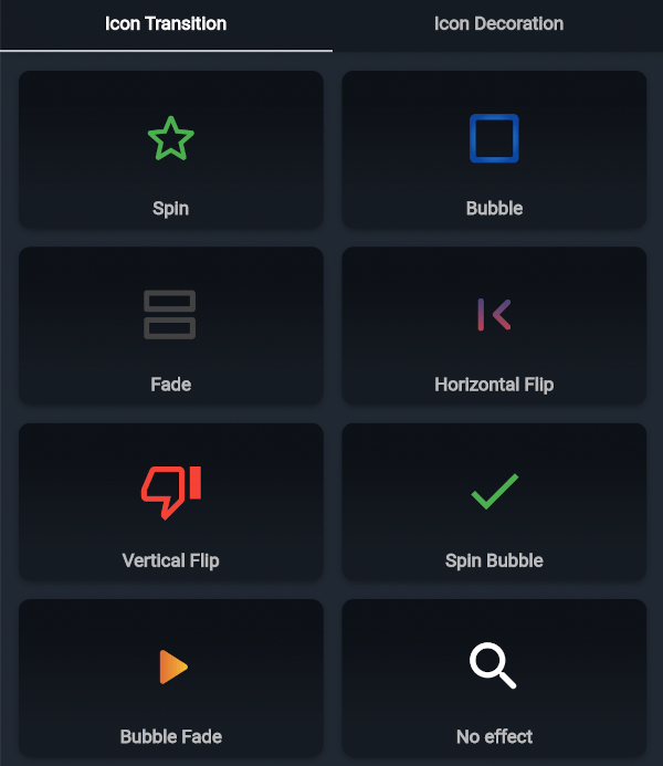
Let's configure it further. There are seven cool transition effects available for icon transition features.
- spin
- bubble
- fade
- flipH
- flipV
- spinBubble
- bubbleFade
- none
Change effect property to try more animation effects as follows:
AdvancedIcon(
  icon: Icons.add, //change this icon as per your requirement.
  secondaryIcon: Icons.check, //change this icon as per your requirement.
  state: _state,
  effect: AdvancedIconEffect.spin, //change effect as per your requirement.
)
To increase or decrease the transition time, change duration property as follows:
AdvancedIcon(
  icon: Icons.add, //change this icon as per your requirement.
  secondaryIcon: Icons.check, //change this icon as per your requirement.
  state: _state,
  duration: Duration(milliseconds: 700),
  effect: AdvancedIconEffect.fade,
)
Give secondaryIcon a more specific color by setting secondaryColor property as follows:
AdvancedIcon(
  icon: Icons.add, //change this icon as per your requirement.
  secondaryIcon: Icons.check, //change this icon as per your requirement.
  color: Colors.blue, //color of primary icon, change it as per your requirement
  secondaryColor: Colors.green, //color of secondary icon, change it as per your requirement
  effect: AdvancedIconEffect.fade,
  state: _state,
)
https://github.com/ankitmishradev/advanced-icon/blob/main/assets/banners/transition_banner.gif?raw=true
To get better understanding, see live example.
Decoration
Gradient
To make icons look more appealing, use gradient to paint the icons. color and secondaryColor will be ignored if gradient is set as follows:
AdvancedIcon(
  icon: Icons.photo_camera,
  color: Colors.red, //color will have no effect
  gradient: const LinearGradient( //change gradient as per your requirement
    colors: <Color>[Colors.red, Colors.white],
    begin: Alignment.topCenter,
    end: Alignment.bottomCenter,
    step: [0.2,0.8],
  ),
)
Opacity
Make opaque icons by setting opacity as follows:
AdvancedIcon(
  icon: Icons.direction_bike,
  color: Colors.red,
  opacity: 0.5, //should be between 0 and 1 inclusive
)
Decoration banner
Changelog
Please see the changelog to know about the latest updates.
Contributions
Contribution to this project are most welcomed.
If you find bugs or want more features, but don't know how to fix/implement them, please fill an issue.
If you fixed bugs or implemented new features, please send a pull request.


 v0.1.2