Englischer Projektschnappschuss. Aktuelle Inhalte auf GitHub.
English | Português
flutter_carousel_intro
by: Eliezer António
see in Flutter Gems: https://fluttergems.dev/packages/flutter_carousel_intro
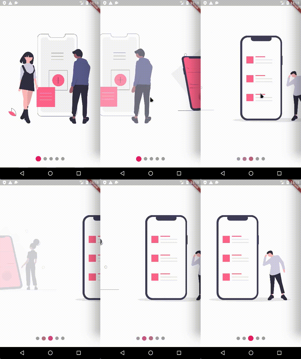
Swipe the carousel to the current clicked indicator
Current Features
[X] Custom child widgets
[X] Slide
[X] Rotate transition
[X] Auto play
[X] Horizontal transition
[X] Vertical transition
[X] Swipe the carousel to the current clicked indicator
[X] Infinite loop (repeat) — works for both autoplay and manual swipe
[X] Built-in navigation buttons — Skip, Next and Done, fully customizable
Supported Platforms
Flutter Android
Flutter iOS
Flutter web
Flutter desktop
Preview
Installation
Add flutter_carousel_intro: ^1.0.13 to your pubspec.yaml dependencies. And import it:
import 'package:flutter_carousel_intro/flutter_carousel_intro.dart' ;
How to use
FlutterCarouselIntro (
slides: [
SliderItem (
title: 'Title 1' ,
subtitle: const Text ('Lorem Ipsum is simply dummy text' ),
widget: SvgPicture .asset ("assets/slide-1.svg" ),
),
SliderItem (
title: 'Title 2' ,
subtitle: const Text ('Lorem Ipsum is simply dummy text' ),
widget: SvgPicture .asset ("assets/slide-2.svg" ),
),
SliderItem (
title: 'Title 3' ,
subtitle: const Text ('Lorem Ipsum is simply dummy text' ),
widget: SvgPicture .asset ("assets/slide-3.svg" ),
),
SliderItem (
title: 'Title 4' ,
subtitle: const Text ('Lorem Ipsum is simply dummy text' ),
widget: SvgPicture .asset ("assets/slide-4.svg" ),
),
SliderItem (
title: 'Title 5' ,
subtitle: const Text ('Lorem Ipsum is simply dummy text' ),
widget: SvgPicture .asset ("assets/slide-5.svg" ),
),
SliderItem (
title: 'Title 5' ,
widget: SvgPicture .asset ("assets/slide-6.svg" ),
subtitle: ElevatedButton (
onPressed: () {},
child: const Text ("skip" ),
),
),
],
);
All SliderItem parameters
String ? title,
TextStyle ? titleTextStyle,
TextAlign ? titleTextAlign,
Widget ? subtitle,
Infinite loop (repeat)
Set repeat: true to turn the carousel into an infinite loop. It works
independently of autoPlay — the user can also swipe past the last slide
and wrap back to the first.
FlutterCarouselIntro (
autoPlay: true ,
repeat: true ,
slides: [...],
);
Under the hood the PageView becomes infinite and the indicator is
synchronized via modulo, so the dots always reflect the current slide.
Built-in navigation buttons (Skip / Next / Done)
For onboarding flows you no longer need to assemble the buttons by hand.
FlutterCarouselIntro ships with opt-in Skip, Next and Done buttons:
FlutterCarouselIntro (
showNextButton: true ,
onSkip: () => Navigator .of (context).pushReplacementNamed ('/home' ),
onDone: () => Navigator .of (context).pushReplacementNamed ('/home' ),
skipLabel: const Text ('Skip' ),
nextLabel: const Text ('Next' ),
doneLabel: const Text ('Done' ),
slides: [...],
);
Behavior:
Skip is shown whenever onSkip != null.Next is shown when showNextButton: true; tapping it advances the page.On the last slide, Next is automatically replaced by Done (when
onDone is provided).
In repeat: true mode there is no last slide, so Next is always visible
and Done is never triggered.
All navigation button parameters
VoidCallback ? onSkip;
VoidCallback ? onDone;
bool showNextButton;
Widget ? skipLabel;
Widget ? nextLabel;
Widget ? doneLabel;
ButtonStyle ? navigationButtonStyle;
NavigationButtonBuilder ? skipButtonBuilder;
NavigationButtonBuilder ? nextButtonBuilder;
NavigationButtonBuilder ? doneButtonBuilder;
AlignmentGeometry skipButtonAlignment;
AlignmentGeometry nextButtonAlignment;
EdgeInsetsGeometry navigationButtonsPadding;
NavigationButtonBuilder is
Widget Function(BuildContext context, VoidCallback onPressed), giving you
full control over the rendered widget while the package still wires the tap
handler (advance / skip / done) for you:
FlutterCarouselIntro (
showNextButton: true ,
onDone: _finish,
nextButtonBuilder: (context, onPressed) => FilledButton .icon (
onPressed: onPressed,
icon: const Icon (Icons .arrow_forward),
label: const Text ('Continue' ),
),
doneButtonBuilder: (context, onPressed) => FilledButton (
onPressed: onPressed,
child: const Text ("Let's go" ),
),
slides: [...],
);
General Example
class MySlideShow extends StatelessWidget const MySlideShow ({Key ? key}) : super (key: key);
@override
Widget build (BuildContext context) {
return FlutterCarouselIntro (
animatedRotateX: false ,
animatedRotateZ: true ,
scale: true ,
autoPlay: true ,
repeat: true ,
animatedOpacity: false ,
autoPlaySlideDuration: const Duration (seconds: 2 ),
autoPlaySlideDurationTransition: const Duration (milliseconds: 1100 ),
primaryColor: Colors .pink,
secondaryColor: Colors .grey,
scrollDirection: Axis .horizontal,
indicatorAlign: IndicatorAlign .bottom,
indicatorEffect: IndicatorEffects .jumping,
showIndicators: true ,
showNextButton: true ,
onSkip: () => debugPrint ('Skip tapped' ),
onDone: () => debugPrint ('Done tapped' ),
skipLabel: const Text ('Skip' ),
nextLabel: const Text ('Next' ),
doneLabel: const Text ('Done' ),
slides: [
SliderItem (
title: 'Title 1' ,
subtitle: const Text ('Lorem Ipsum is simply dummy text' ),
widget: SvgPicture .asset ("assets/slide-1.svg" ),
),
SliderItem (
title: 'Title 2' ,
subtitle: const Text ('Lorem Ipsum is simply dummy text' ),
widget: SvgPicture .asset ("assets/slide-2.svg" ),
),
SliderItem (
title: 'Title 3' ,
subtitle: const Text ('Lorem Ipsum is simply dummy text' ),
widget: SvgPicture .asset ("assets/slide-3.svg" ),
),
SliderItem (
title: 'Title 4' ,
subtitle: const Text ('Lorem Ipsum is simply dummy text' ),
widget: SvgPicture .asset ("assets/slide-4.svg" ),
),
SliderItem (
title: 'Title 5' ,
subtitle: const Text ('Lorem Ipsum is simply dummy text' ),
widget: SvgPicture .asset ("assets/slide-5.svg" ),
),
SliderItem (
title: 'Title 5' ,
widget: SvgPicture .asset ("assets/slide-6.svg" ),
subtitle: ElevatedButton (
onPressed: () {},
child: const Text ("skip" ),
),
),
],
);
}
}
Gif
Normal Example:
Animated Opacity
animatedOpacity: true
Animated Scale
scale: true
Animated Rotation on the X Axis
animatedRotateX: true
Animated Rotation on the Z Axis
animatedRotateZ: true
Contributions
Feel free to contribute to this project.
If you find a bug or want a feature, but don't know how to fix/implement it, please fill an issue .pull request .
My Packages
Flutter Responsivity Widget




 v1.0.13