


 v5.3.1
flutter_smart_dialog
Eine elegante Flutter-Dialoßlösung, einfach Toast, Laden und benutzerdefinierte Dialoge implementieren, die Verwendung des Dialogs erleichtern!
645Likes 17.70030-Tage-Downloads160Pub-Punkte
AndroidiOSWebmacOSWindowsLinux
Eine elegante Flutter-Dialog-Lösung | Eine elegante Flutter-Dialog-Lösung | https://xdd666t.github.io/flutter_use/web/index.html#/smartDialog

Englischer Projektschnappschuss. Aktuelle Inhalte auf GitHub.



Feature and Usage(Must read!):super detailed guide
功能和用法(必看!): 超详细指南
Language: English | 中文
Migrate doc:3.x migrate 4.0 | 3.x 迁移 4.0
Flutter 2:Please use flutter_smart_dialog: 4.2.5
An elegant Flutter Dialog solution.
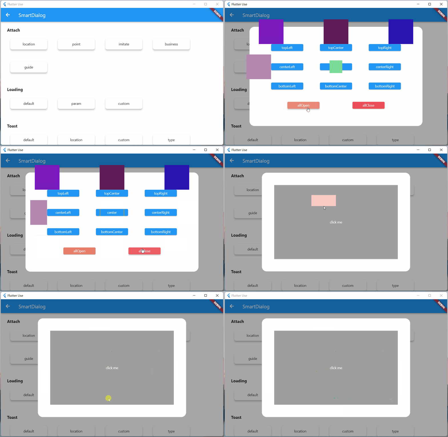
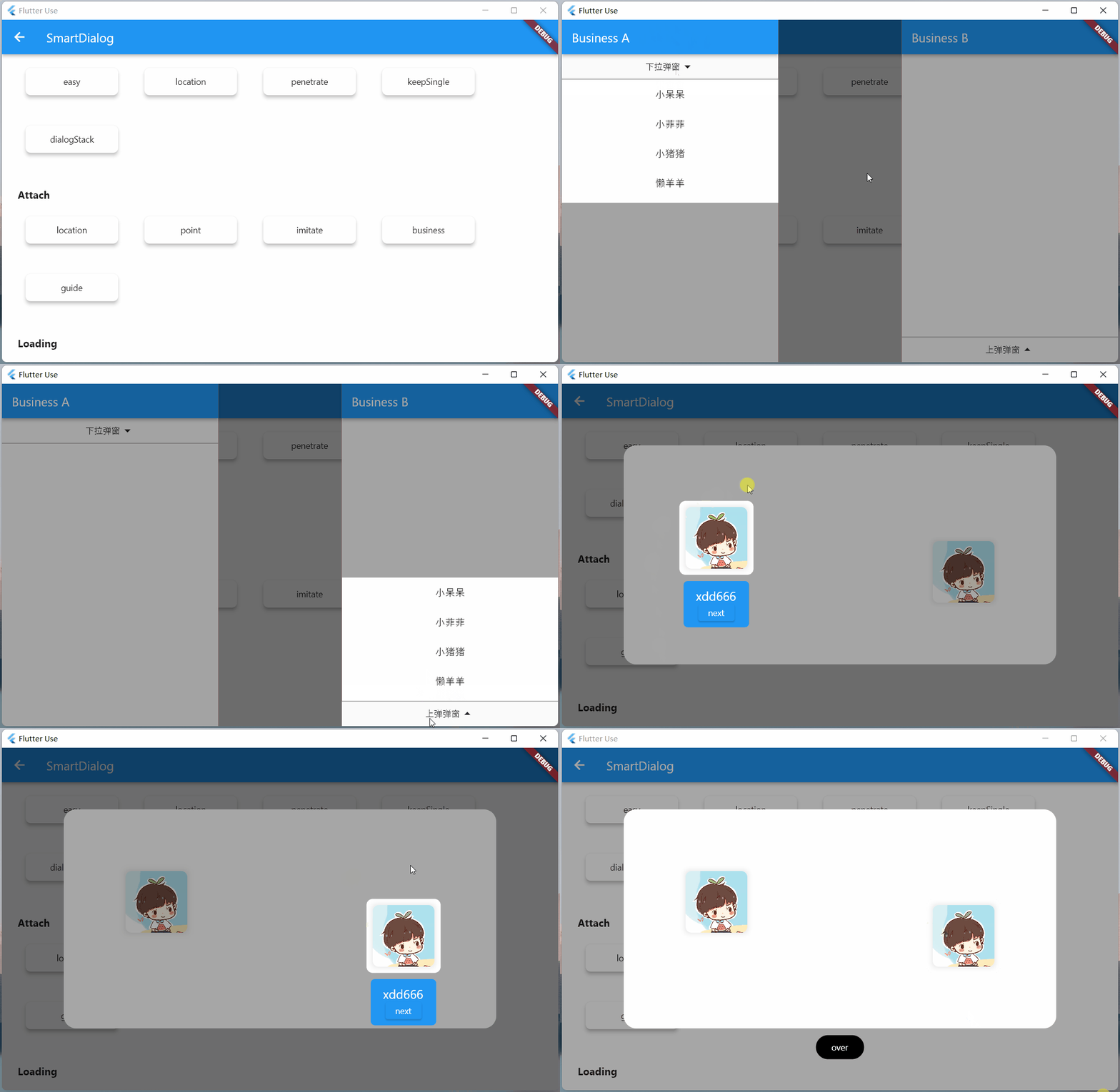
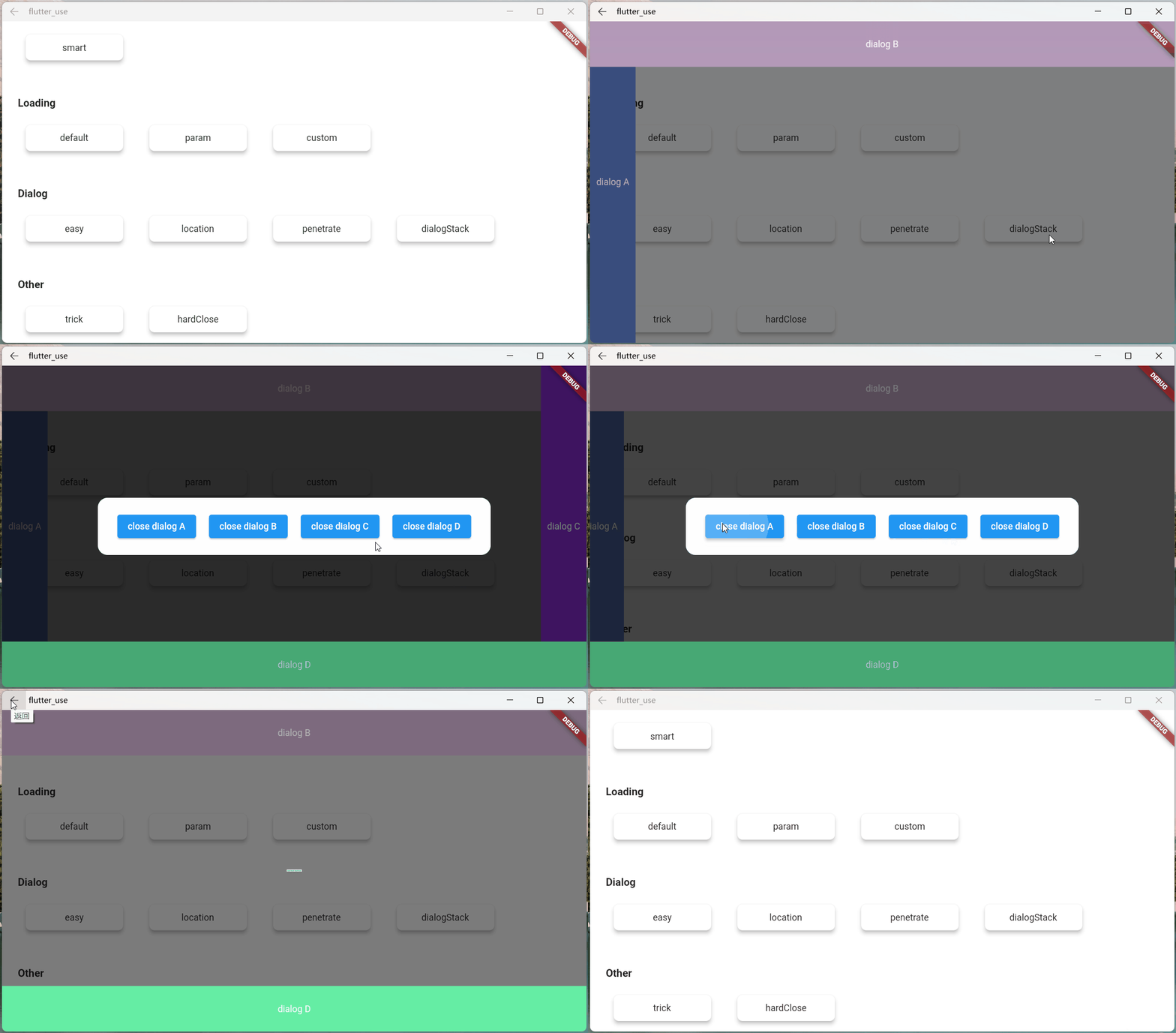
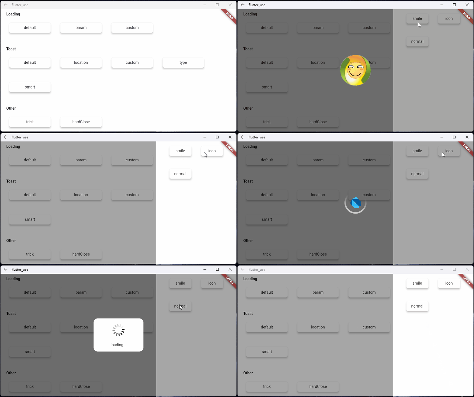
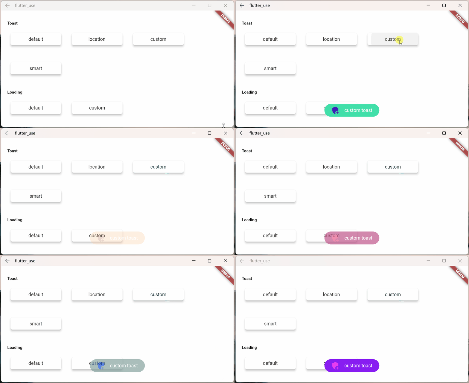
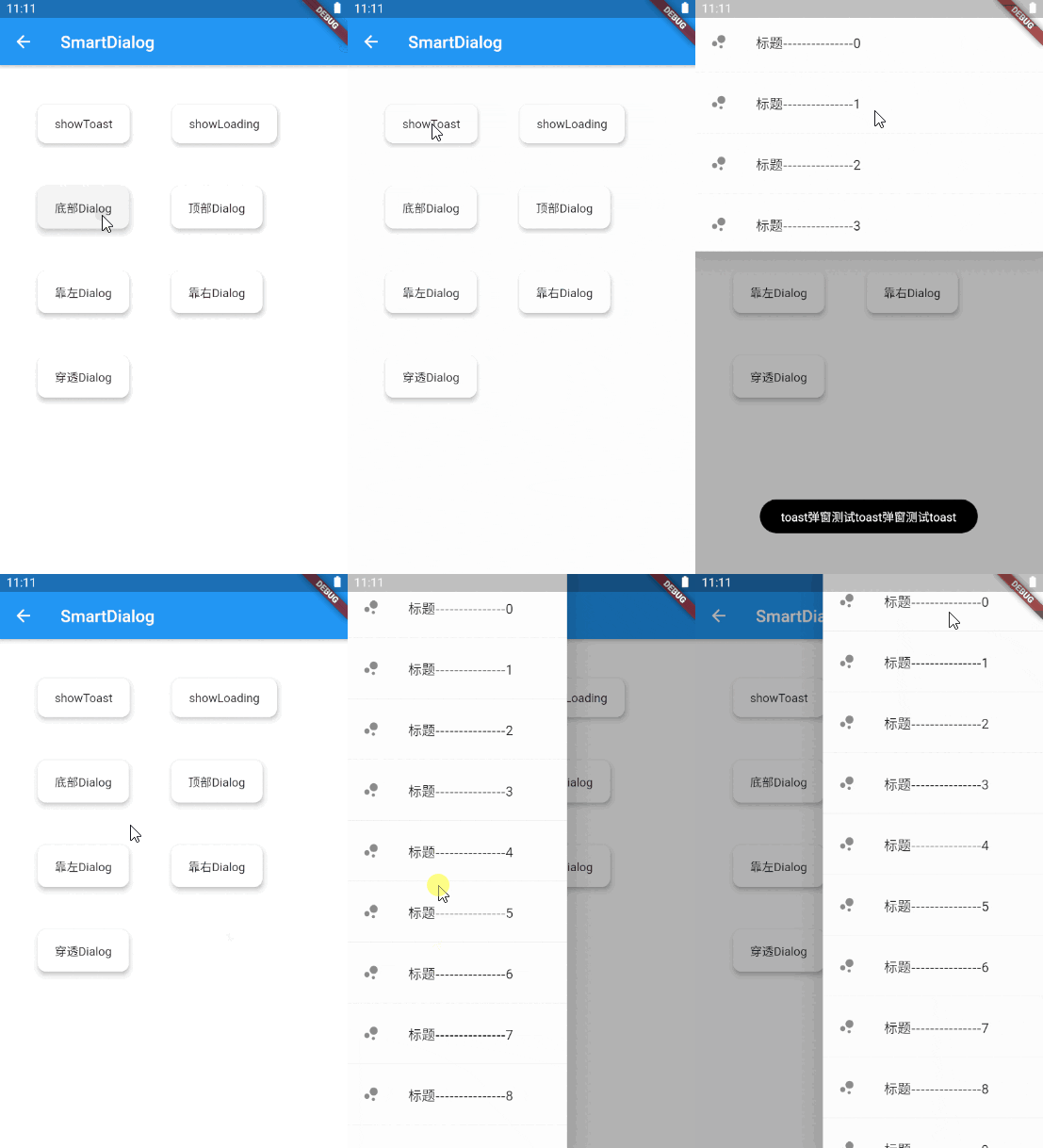
Do not need BuildContext
Can penetrate dark background, click on the page behind dialog
Support dialog stack,close the specified dialog
Support positioning widget, display the specified location dialog
Support highlight feature,dissolve the specified location mask
Easily implement toast,loading,attach dialog,custome dialog,custome notify
initialization
void main() => runApp(MyApp());

class MyApp extends StatelessWidget {
  @override
  Widget build(BuildContext context) {
    return MaterialApp(
      home: HomePage,
      // here
      navigatorObservers: [FlutterSmartDialog.observer],
      // here
      builder: FlutterSmartDialog.init(),
    );
  }
}
Advanced initialization: configure global custom Loading and Toast
SmartDialog's showLoading and showToast provide a default style. Of course, custom param are definitely supported.
SmartDialog.showLoading(builder: (_) => CustomLoadingWidget);SmartDialog.showLoading();Let me show you the following
void main() => runApp(MyApp());

class MyApp extends StatelessWidget {
  @override
  Widget build(BuildContext context) {
    return MaterialApp(
      home: HomePage,
      // here
      navigatorObservers: [FlutterSmartDialog.observer],
      // here
      builder: FlutterSmartDialog.init(
        //custom default toast widget
        toastBuilder: (String msg) => CustomToastWidget(msg: msg),
        //custom default loading widget
        loadingBuilder: (String msg) => CustomLoadingWidget(msg: msg),
        //custom default notify widget
        notifyStyle: FlutterSmartNotifyStyle(
          successBuilder: (String msg) => CustomSuccessWidget(msg: msg),
          failureBuilder: (String msg) => CustomFailureWidget(msg: msg),
          warningBuilder: (String msg) => CustomWarningWidget(msg: msg),
          alertBuilder: (String msg) => CustomAlertWidget(msg: msg),
          errorBuilder: (String msg) => CustomErrorWidget(msg: msg),
        ),
      ),
    );
  }
}
SmartDialog.config
  ..custom = SmartConfigCustom(
    maskColor: Colors.black.withOpacity(0.35),
    useAnimation: true,
  )
  ..attach = SmartConfigAttach(
    animationType: SmartAnimationType.scale,
    usePenetrate: false,
  )
  ..loading = SmartConfigLoading(
    clickMaskDismiss: false,
    leastLoadingTime: const Duration(milliseconds: 0),
  )
  ..toast = SmartConfigToast(
    intervalTime: const Duration(milliseconds: 100),
    displayTime: const Duration(milliseconds: 2000),
  );
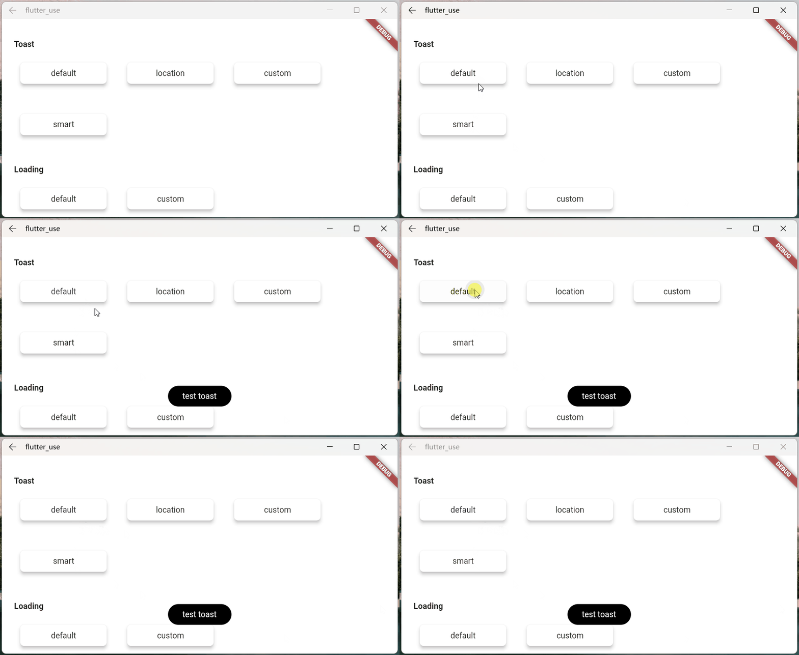
SmartDialog.showToast('test toast');
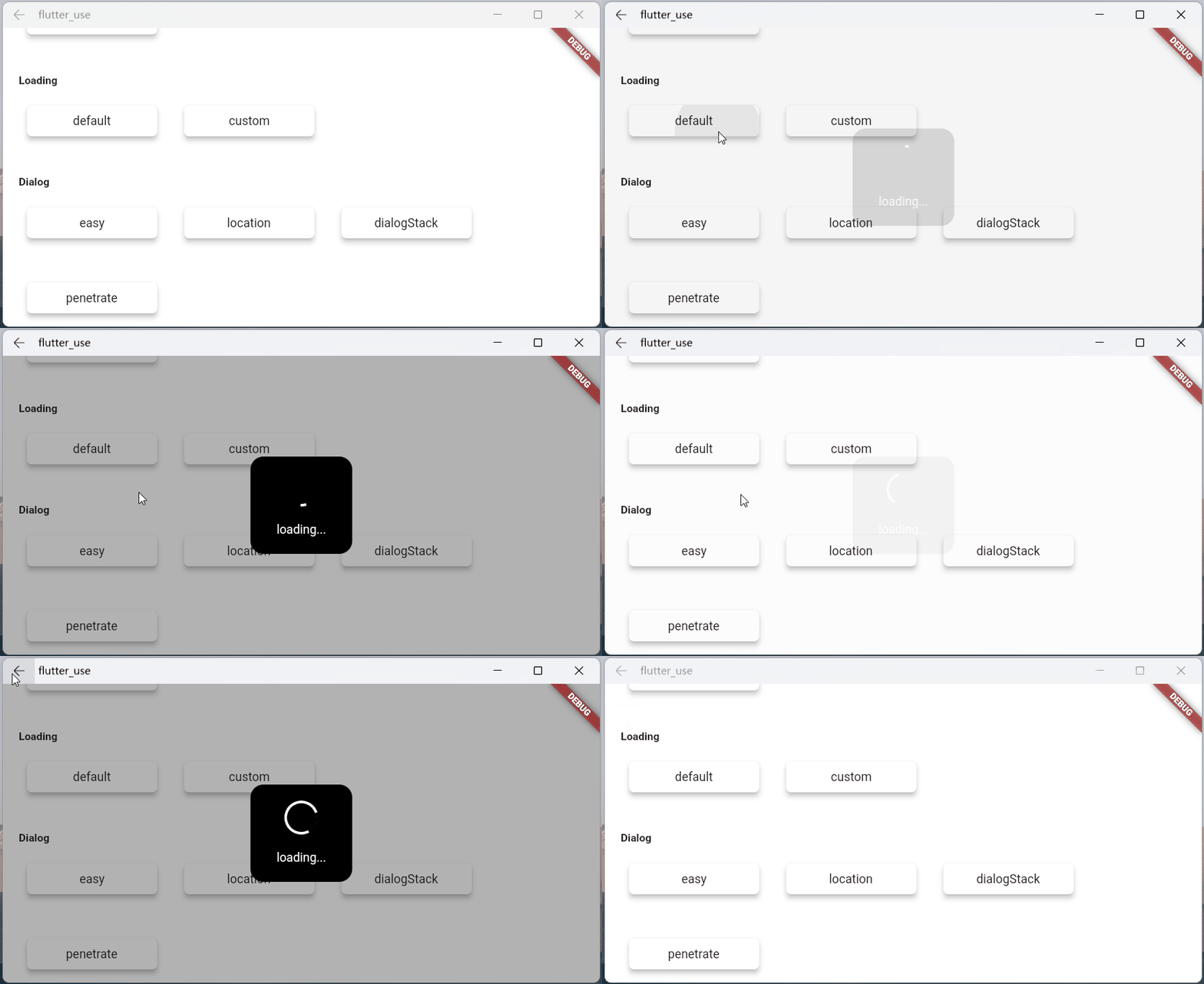
SmartDialog.showLoading();
await Future.delayed(Duration(seconds: 2));
SmartDialog.dismiss();
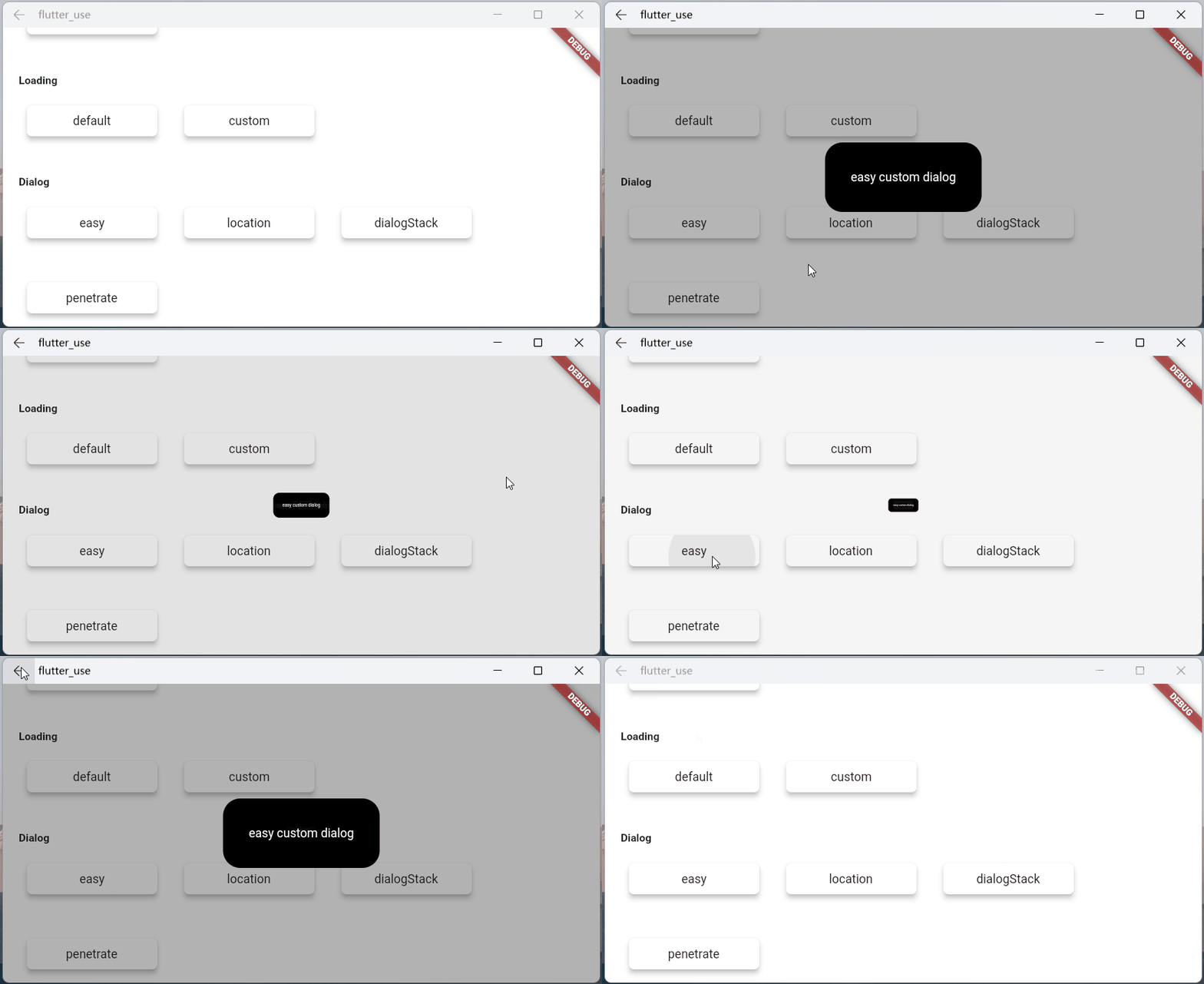
SmartDialog.show(builder: (context) {
  return Container(
    height: 80,
    width: 180,
    decoration: BoxDecoration(
      color: Colors.black,
      borderRadius: BorderRadius.circular(10),
    ),
    alignment: Alignment.center,
    child:
    Text('easy custom dialog', style: TextStyle(color: Colors.white)),
  );
});
Abhängigkeiten 5 Einträge
{"sdk":"flutter"}^1.0.1^1.0.0{"sdk":"flutter"}^6.0.0Nach Anwendungsfall filtern, Aktivität vergleichen und vor der Nutzung das Originalprojekt prüfen.
“A repository is the most basic element of GitHub.”
GitHub Docs — About repositories ↗