
 v0.0.4
numeric_selector
A customizable numeric selector widget for Flutter that supports both vertical and horizontal scrolling.
11Likes 6430-day downloads160Pub points
AndroidiOS
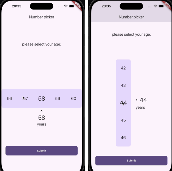
A customizable Numeric Selector package for Flutter, providing both Horizontal and Vertical Numeric Selector with smooth scrolling and optional vibration feedback.

{"sdk":"flutter"}^3.1.2{"sdk":"flutter"}^4.0.0English project snapshot. Visit GitHub for the latest content.
A customizable Numeric Selector package for Flutter, providing both Horizontal and Vertical Numeric Selector with smooth scrolling and optional vibration feedback.
✅ Horizontal and Vertical pickers
✅ Customizable styles and colors
✅ Vibration feedback support
✅ Supports minimum, maximum, and step values
✅ Optional labels and arrow indicators
Add the following dependency to your pubspec.yaml file:
dependencies:
  numeric_selector: latest_version
Then, run:
flutter pub get
| Horizontal Numeric Selector | Vertical Numeric Selector |
|---|---|
| Horizontal Numeric Selector | Vertical Numeric Selector |
HorizontalNumericSelector(
  minValue: 0,
  maxValue: 100,
  step: 1,
  initialValue: 50,
  onValueChanged: (value) {
    print("Selected Value: $value");
  },
  viewPort: 0.3,
  selectedTextStyle: TextStyle(fontSize: 32, fontWeight: FontWeight.bold),
  unselectedTextStyle: TextStyle(fontSize: 24, color: Colors.grey),
  backgroundColor: Colors.white,
  showLabel: true,
  label: "Quantity",
  showArrows: true,
  enableVibration: true,
)
VerticalNumericSelector(
  minValue: 1,
  maxValue: 10,
  step: 1,
  initialValue: 5,
  onValueChanged: (value) {
    print("Selected Value: $value");
  },
  viewPort: 0.3,
  selectedTextStyle: TextStyle(fontSize: 32, fontWeight: FontWeight.bold),
  unselectedTextStyle: TextStyle(fontSize: 24, color: Colors.grey),
  backgroundColor: Colors.white,
  borderRadius: BorderRadius.circular(10),
  showLabel: true,
  label: "Speed",
  showArrows: true,
  enableVibration: true,
)
| Parameter | Type | Description |
|---|---|---|
minValue |
int |
Minimum selectable value |
maxValue |
int |
Maximum selectable value |
step |
int |
Step between values |
initialValue |
int |
Default selected value |
onValueChanged |
ValueChanged<int> |
Callback when value changes |
viewPort |
double |
Fraction of viewport occupied by picker |
selectedTextStyle |
TextStyle? |
Style for selected value |
unselectedTextStyle |
TextStyle? |
Style for unselected values |
backgroundColor |
Color? |
Background color |
borderRadius |
BorderRadius? |
Corner radius for picker background |
showLabel |
bool |
Show label text below selected value |
label |
String? |
Custom label text |
showArrows |
bool |
Show navigation arrows |
arrowIcon |
IconData? |
Custom arrow icon |
enableVibration |
bool |
Enable vibration feedback |
Contributions are welcome! Feel free to submit a PR or open an issue.
👤 Amirmahdi Nourkazemi
LinkedIn
This project is licensed under the MIT License.