
Molten_NavigationBar_Flutter
An animated bottom navigation bar

- Stars
- 8
- Forks
- 8
- Last push (UTC)
- Feb 26, 2024
- Project status
- Active
Original README
English project snapshot. Visit GitHub for the latest content.
molten_navigationbar_flutter
An animated bottom navigation bar with a lot of attributes to teak and have fun with ✔🚀
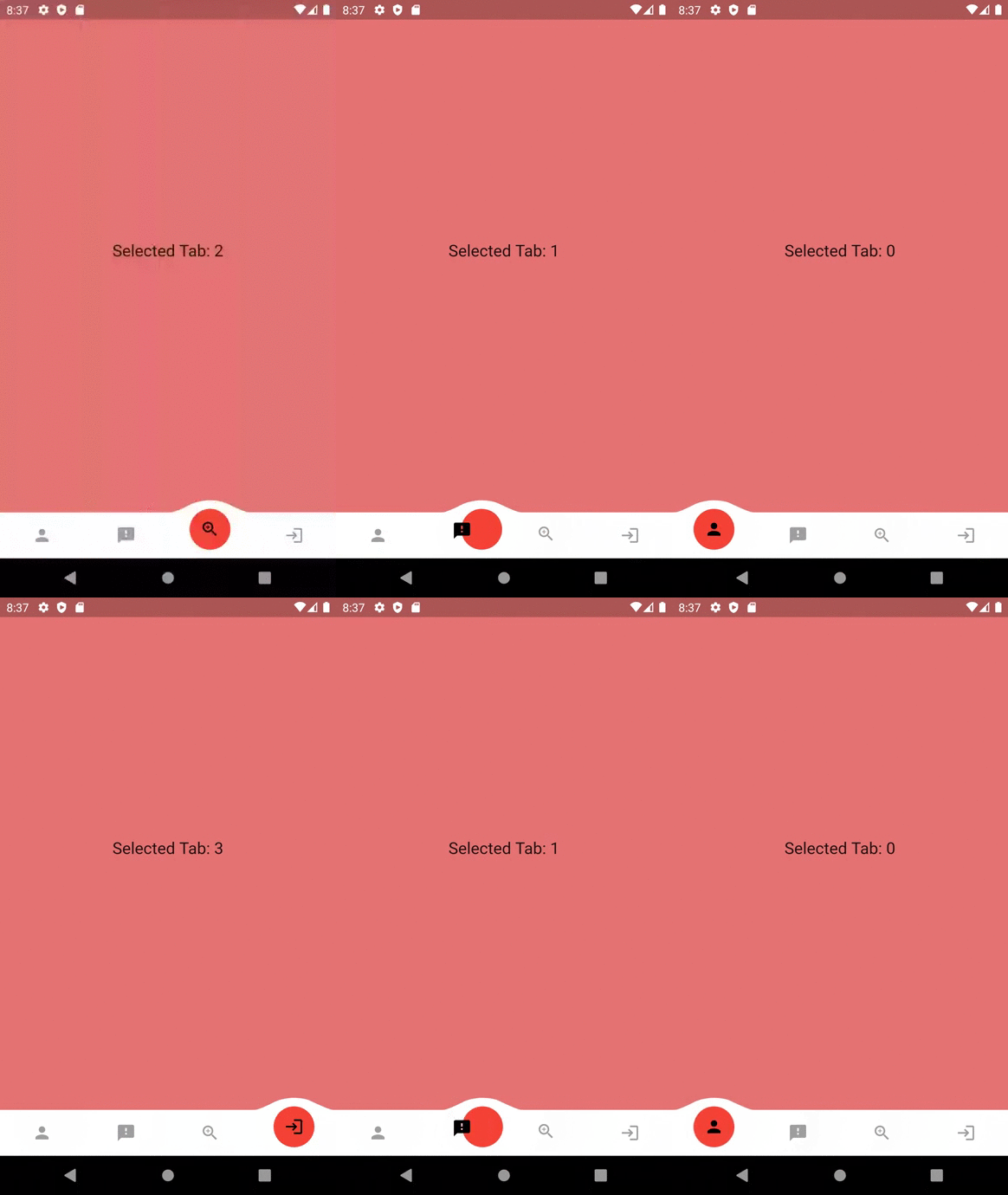 |
 |
 |
|---|
Getting Started
Add this to your package's pubspec.yaml file:
dependencies:
  molten_navigationbar_flutter: ^1.0.0
Import the package
import 'package:molten_navigationbar_flutter/molten_navigationbar_flutter.dart';
How to Use
You can use it in the scaffold's bottomnavigationbar, or anywhere you would like!
Just call the MoltenBottomNavigationBar widget and provide the tabs, onTabChange and selectedIndex attributes.
The rest of the attributes are optional
Scaffold(
   bottomNavigationBar: MoltenBottomNavigationBar(
      selectedIndex: _selectedIndex,
      onTabChange: (clickedIndex) {
        setState(() {
          _selectedIndex = clickedIndex;
        });
      },
      tabs: [
        MoltenTab(
          icon: Icon(Icons.search),
        ),
        MoltenTab(
          icon: Icon(Icons.home),
        ),
        MoltenTab(
          icon: Icon(Icons.person),
        ),
      ],
   ),
),
MoltenBottonNavigationBar's Attributes
| Attribute | Type | Description |
|---|---|---|
| barHeight | double | specify a Height for the bar, Default is kBottomNavigationBarHeight |
| domeHeight | double | specify a Height for the Dome above tabs, Default is 15.0 |
| domeWidth | double | If domeWidth is null, it will be set to 100 |
| domeCircleColor | Color | If a null value is passed, the domeCircleColor will be Theme.primaryColor |
| domeCircleSize | double | The size of the inner circle representing a seleted tab. Note that domeCircleSize must be less than or equal to (barHeight + domeHeight) |
| margin | EdgeInsets | Spacing around the bar |
| barColor | Color | specify a color to be used as a background color, Default is Theme.bottomAppBarColor |
| tabs | List | List of MoltenTab, each wil have an icon as the main widget, selcted color and unselected color |
| selectedIndex | int | The currently selected tab |
| onTabChange | Function(int index) | callback function that will be triggered whenever a [MoltenTab] is clicked, and will return it's index. |
| curve | Curve | Select a Curve value for the dome animation. Default is Curves.linear |
| duration | Duration | How long the animation should last, Default is Duration(milliseconds: 150) |
| borderSize | double | Applied to all 4 border sides, Default is 0 |
| borderColor | Color | Applied to all border sides |
| borderRaduis | BorderRadius | How much each angle is curved. Note that high raduis values may decrease the dome width. |
MoltenTab's Attributes
| Attribute | Type | Description |
|---|---|---|
| icon | double | can be any widget, preferably an icon |
| selectedColor | double | The icon color when the tab is selected, White if not set |
| unselectedColor | double | The icon color when the tab is not selected, Grey if not set |
Example
You can find an example here

GitHub author
Ayman ↗
LanguagesDartSwiftKotlinObjective-C
Dependencies used
Dependency list 1 items
- flutter
{"sdk":"flutter"}
How do I choose a repository?
Start with your use case, compare repository activity, and check the original project before adopting it.
- Search by repository name, owner or description, then narrow the results by topic.
- Compare stars, forks and recent pushes. Stars show community interest, not a guarantee of quality.
- Read the README, license and issues on GitHub before using a project.
Sources and maintenance
“A repository is the most basic element of GitHub.”
GitHub Docs — About repositories ↗