

 v1.0.0
load
Global loading widget, Pure flutter library, not use native code. It is similar to OKToast in use.
22Likes 1.9K30-day downloads130Pub points
AndroidiOSWebmacOSWindowsLinux
CaiJingLong/flutter_load_widget open-source repository details.

English project snapshot. Visit GitHub for the latest content.


Global loading widget, which can be used through simple configuration.
Pure flutter library, not use native code.
It is similar to OKToast in use.
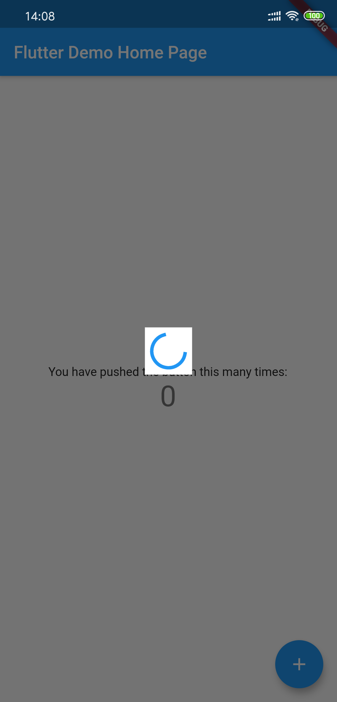
Add to yaml
version is
dependencies:
  load: $latest_version
import 'package:load/load.dart';
void main() {
  runApp(
    LoadingProvider(
      child: MyApp(),
    ),
  );
}

or

LoadingProvider(
  child: MaterialApp(),
);
Debug custom loading widget in Flutter inspector
You can try to use next method to include the widget:
MaterialApp(
  builder: (context, widget) {
    return LoadingProvider(
      child: widget,
    );
  },
);
see example/lib/main.dart
showLoadingDialog();
showCustomLoadingWidget(Container()); // custom dialog
hideLoadingDialog();
Using LoadingThemeData and loadingWidgetBuilder
LoadingProvider(
  themeData: LoadingThemeData(),
  loadingWidgetBuilder: (ctx, data) {
    return Center(
      child: SizedBox(
        width: 30,
        height: 30,
        child: Container(
          child: CupertinoActivityIndicator(),
          color: Colors.blue,
        ),
      ),
    );
  },
  child: MyApp(),
);
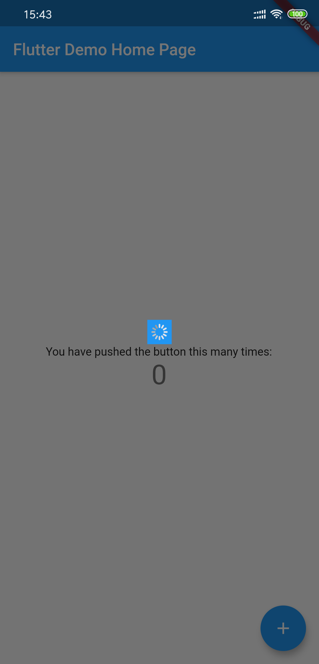
All params is optional
| Params | Type | Default Value | Desc |
|---|---|---|---|
| backgroundColor | Color | Colors.black54 | Background transparent mask |
| tapDismiss | bool | true | Will it close when touching the background? |
| loadingBackgroundColor | Color | Colors.white | Background color for the center Loading Widget |
| loadingPadding | EdgeInsets | EdgeInsets.all(8.0) | Padding for the center Loading Widget |
| loadingSize | Size | Size(55,55) | Size for the center Loading Widget |
| animDuration | Duration | Duration(milliseconds: 300) | Show/Hide Time Duration |
Dependency list 2 items
{"sdk":"flutter"}{"sdk":"flutter"}Start with your use case, compare repository activity, and check the original project before adopting it.
“A repository is the most basic element of GitHub.”
GitHub Docs — About repositories ↗