
 v2.0.0+3
button_animations
A package that helps you make highly customizable animated 3d-buttons.
39Likes 230-day downloads140Pub points
AndroidiOSWebmacOSWindowsLinux
A simple flutter package to make highly customizable Flutter widgets with 3d animations.

{"sdk":"flutter"}{"sdk":"flutter"}—English project snapshot. Visit GitHub for the latest content.
dart flutter pub package https://visitor-badge.glitch.me/badge?page_id=anshrathod.button_animations
The button_animations is a package to make highly customizable Flutter widgets with 3d animations.
To use this plugin, add the latest version of button_animations as a dependency in your pubspec.yaml file.
| Android | iOS | Web | MacOS | Linux | Windows |
|---|---|---|---|---|---|
| ✅ | ✅ | ✅ | ✅ | ✅ | ✅ |
https://raw.githubusercontent.com/anshrathod/button_animations/master/Screen-shots/3.jpg https://raw.githubusercontent.com/anshrathod/button_animations/master/Screen-shots/6.jpg https://raw.githubusercontent.com/anshrathod/button_animations/master/Screen-shots/7.jpg
| Datatype | Parameter | Description | Default Value | Required |
|---|---|---|---|---|
function |
onTap | The function that is called whenever the widget is tapped | -- | Yes |
widget |
child | The child widget | -- | Yes |
PredefinedThemes |
type | There are 16 predefined themes that you can choose from if you dont want to customize the widget yourself | PredefinedThemes.primary | No |
Curve |
animationCurve | The curve that the animation will follow | Curves.easeIn | No |
bool |
enabled | To check whether the button is enabled or not | true | No |
bool |
isMultiColor | To check whether the button has multiple color gradient or not | false | No |
bool |
isOutline | To check whether the button has an outline or not | false | No |
bool |
darkshadow | To check whether the button has dark or light shadow | true | No |
int |
duration | The time that the animation takes in milliseconds | 70 | No |
double |
height | The height of the widget | 64 | No |
double |
width | The width of the widget | 200 | No |
double |
blurRadius | The radius of the blur effect of the widget | 0 | No |
double |
borderRadius | The radius of the borders of the widget | 12 | No |
double |
shadowHeightBottom | The height of the shadow and the animation of the widget from the bottom of the child widget | 4 | No |
double |
shadowHeightLeft | The height of the shadow and the animation of the widget from the left of the child widget | 0 | No |
double |
borderWidth | The width of the border of the widget | 1 | No |
Color |
borderColor | The color of the border of the widget (if type is not null, this will not work & isOutline should be true for this to work) | Colors.black | No |
Color |
blurColor | The color of the blur of the widget(if type is not null, this will not work) | Colors.black | No |
Color |
color | The color of the widget(if type is not null, this will not work) | Colors.blue | No |
Color |
shadowColor | The color of the shadow of the widget(if type is not null, this will not work) | Colors.black | No |
List<Color> |
colors | The list of colors for the gradient for the background of the widget(isMulticolor should be true for this to work) | [] | No |
| Theme Name | Example |
|---|---|
| success | https://raw.githubusercontent.com/anshrathod/button_animations/master/Screen-shots/success.png |
| successOutline | https://raw.githubusercontent.com/anshrathod/button_animations/master/Screen-shots/successout.png |
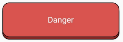
| danger | https://raw.githubusercontent.com/anshrathod/button_animations/master/Screen-shots/danger.png |
| dangerOutline | https://raw.githubusercontent.com/anshrathod/button_animations/master/Screen-shots/dangerout.png |
| warning | https://raw.githubusercontent.com/anshrathod/button_animations/master/Screen-shots/warning.png |
| warningOutline | https://raw.githubusercontent.com/anshrathod/button_animations/master/Screen-shots/warningout.png |
| info | https://raw.githubusercontent.com/anshrathod/button_animations/master/Screen-shots/info.png |
| infoOutline | https://raw.githubusercontent.com/anshrathod/button_animations/master/Screen-shots/infoout.png |
| primary | https://raw.githubusercontent.com/anshrathod/button_animations/master/Screen-shots/primary.jpg |
| primaryOutline | https://raw.githubusercontent.com/anshrathod/button_animations/master/Screen-shots/primaryout.jpg |
| secondary | https://raw.githubusercontent.com/anshrathod/button_animations/master/Screen-shots/secondary.jpg |
| secondaryOutline | https://raw.githubusercontent.com/anshrathod/button_animations/master/Screen-shots/secondaryout.png |
| dark | https://raw.githubusercontent.com/anshrathod/button_animations/master/Screen-shots/dark.jpg |
| darkOutline | https://raw.githubusercontent.com/anshrathod/button_animations/master/Screen-shots/darkout.png |
| light | https://raw.githubusercontent.com/anshrathod/button_animations/master/Screen-shots/light.png |
AnimatedButton(
  child: Text(
    'Danger', // add your text here
    style: TextStyle(
      color: Colors.white,
    ),
  ),
  type: PredefinedTheme.danger,
  isOutline: true,
  borderWidth: 1,
  onTap: () {},
),
AnimatedButton(
  child: Text(
    'Danger', // add your text here
    style: TextStyle(
      color: Colors.white,
    ),
  ),
  type: PredefinedTheme.danger,
  darkshadow: false,
  isOutline: true,
  borderWidth: 1,

  onTap: () {},
),
AnimatedButton(
  child: Text(
    'Dark', // add your text here
    style: TextStyle(
      color: Colors.white,
    ),
  ),
  type: PredefinedTheme.dark,
  blurRadius: 10,
  onTap: () {},
),
AnimatedButton(
  child: Text(
    'Danger', // add your text here
    style: TextStyle(
      color: Colors.white,
    ),
  ),
  type: PredefinedTheme.danger,
  darkshadow: false,
  blurRadius: 10,
  onTap: () {},
),
Row(
  children: [
    Padding(
      padding: const EdgeInsets.all(12.0),
      child: AnimatedButton(
        child: Text("Gradient Button"),
        onTap: () {},
        isMultiColor: true,
        colors: [
          Colors.red[100],
          Colors.blue[200],
        ],
      ),
    ),
    Padding(
      padding: const EdgeInsets.all(12.0),
      child: AnimatedButton(
        child: Text("Gradient Button with outline"),
        onTap: () {},
        isMultiColor: true,
        isOutline: true,
        colors: [
          Colors.red[100],
          Colors.blue[200],
        ],
      ),
    ),
  ],
),
Row(
  children: [
    Padding(
      padding: const EdgeInsets.all(12.0),
      child: AnimatedButton(
        child: Text(
          "Gradient Button",
          style: TextStyle(
            color: Colors.white,
          ),
        ),
        onTap: () {},
        isMultiColor: true,
        colors: [
          Colors.green,
          Colors.blue,
        ],
      ),
    ),
    Padding(
      padding: const EdgeInsets.all(12.0),
      child: AnimatedButton(
        child: Text(
          "Gradient Button with outline",
          style: TextStyle(
            color: Colors.white,
          ),
        ),
        onTap: () {},
        isMultiColor: true,
        isOutline: true,
        colors: [
          Colors.green,
          Colors.blue,
        ],
      ),
    ),
  ],
),
Row(
  children: [
    Padding(
      padding: const EdgeInsets.all(12.0),
      child: AnimatedButton(
        child: Text("Rounded Button"),
        onTap: () {},
        height: 60,
        type: null,
        borderRadius: 30,
        color: Colors.cyan,
      ),
    ),
    Padding(
      padding: const EdgeInsets.all(12.0),
      child: AnimatedButton(
        child: Text("Rounded Button with outline"),
        onTap: () {},
        height: 60,
        type: null,
        borderRadius: 30,
        isOutline: true,
        color: Colors.amber,
      ),
    ),
  ],
),
Row(
  children: [
    Padding(
      padding: const EdgeInsets.all(12.0),
      child: AnimatedButton(
        child: Row(
          mainAxisAlignment: MainAxisAlignment.spaceEvenly,
          children: [
            Icon(Icons.home),
            Text("Button with Icon"),
          ],
        ),
        onTap: () {},
        type: null,
        height: 60,
        borderRadius: 30,
        color: Colors.teal,
      ),
    ),
    Padding(
      padding: const EdgeInsets.all(2.0),
      child: AnimatedButton(
        child: Row(
          mainAxisAlignment: MainAxisAlignment.spaceEvenly,
          children: [
            Icon(Icons.home, color: Colors.white),
            Text("Button with Icon & outline",
                style: TextStyle(color: Colors.white)),
          ],
        ),
        onTap: () {},
        type: null,
        height: 60,
        width: 220,
        borderRadius: 30,
        isOutline: true,
        color: Colors.deepPurple,
      ),
    ),
  ],
),
Row(
  mainAxisAlignment: MainAxisAlignment.spaceEvenly,
  children: [
    Padding(
      padding: const EdgeInsets.all(2),
      child: AnimatedButton(
        child: Icon(
          FontAwesomeIcons.facebookF,
          color: Colors.white,
          size: 25,
        ),
        onTap: () {},
        type: null,
        height: 45,
        width: 45,
        borderRadius: 22.5,
        color: Color(0xFF49659F),
      ),
    ),
    Padding(
      padding: const EdgeInsets.all(2),
      child: AnimatedButton(
        child: Icon(
          FontAwesomeIcons.twitter,
          color: Colors.white,
          size: 25,
        ),
        onTap: () {},
        type: null,
        height: 45,
        width: 45,
        borderRadius: 22.5,
        color: Color(0xFF1DA1F2),
      ),
    ),
    Padding(
      padding: const EdgeInsets.all(2),
      child: AnimatedButton(
        child: Icon(
          FontAwesomeIcons.google,
          color: Colors.white,
          size: 25,
        ),
        onTap: () {},
        type: null,
        height: 45,
        width: 45,
        borderRadius: 22.5,
        color: Colors.blue,
      ),
    ),
    Padding(
      padding: const EdgeInsets.all(2),
      child: AnimatedButton(
        child: Icon(
          FontAwesomeIcons.microsoft,
          color: Colors.lightBlue,
          size: 25,
        ),
        onTap: () {},
        type: null,
        height: 45,
        width: 45,
        borderRadius: 22.5,
        color: Colors.white,
      ),
    ),
    Padding(
      padding: const EdgeInsets.all(2),
      child: AnimatedButton(
        child: Icon(
          FontAwesomeIcons.instagram,
          color: Colors.white,
          size: 25,
        ),
        onTap: () {},
        type: null,
        height: 45,
        width: 45,
        borderRadius: 22.5,
        color: Color(0xFFB81877),
      ),
    ),
  ],
),
Padding(
  padding: const EdgeInsets.all(10),
  child: AnimatedButton(
    child: Row(
      mainAxisAlignment: MainAxisAlignment.spaceAround,
      children: [
        Icon(
          FontAwesomeIcons.linkedinIn,
          color: Colors.white,
          size: 25,
        ),
        Text(
          "Sign in with LinkedIn",
          style: TextStyle(
            color: Colors.white,
            fontSize: 20.0,
          ),
        )
      ],
    ),
    onTap: () {},
    type: null,
    height: 50,
    shadowHeightBottom: 4,
    shadowHeightLeft: 4,
    width: 275,
    borderRadius: 25,
    color: Color(0xFF0077B5),
  ),
),
Padding(
  padding: const EdgeInsets.all(10),
  child: AnimatedButton(
    child: Row(
      mainAxisAlignment: MainAxisAlignment.spaceAround,
      children: [
        Icon(
          FontAwesomeIcons.pinterestP,
          color: Colors.white,
          size: 25,
        ),
        Text(
          "Sign in with Pinterest",
          style: TextStyle(
            color: Colors.white,
            fontSize: 20.0,
          ),
        )
      ],
    ),
    onTap: () {},
    type: null,
    height: 50,
    isOutline: true,
    shadowHeightBottom: 4,
    shadowHeightLeft: 4,
    width: 250,
    borderRadius: 2,
    color: Colors.red,
  ),
),
Padding(
  padding: const EdgeInsets.all(10),
  child: AnimatedButton(
    child: Row(
      mainAxisAlignment: MainAxisAlignment.spaceAround,
      children: [
        Icon(
          FontAwesomeIcons.githubAlt,
          color: Colors.white,
          size: 25,
        ),
        Text(
          "Sign in with GitHub",
          style: TextStyle(
            color: Colors.white,
            fontSize: 20.0,
          ),
        )
      ],
    ),
    onTap: () {},
    type: null,
    height: 50,
    shadowHeightBottom: 4,
    shadowHeightLeft: 4,
    width: 250,
    shadowColor: Colors.grey,
    blurColor: Colors.grey,
    blurRadius: 5,
    borderRadius: 10,
    color: Colors.black,
  ),
),
Padding(
  padding: const EdgeInsets.all(10),
  child: AnimatedButton(
    child: Row(
      mainAxisAlignment: MainAxisAlignment.spaceAround,
      children: [
        Icon(
          FontAwesomeIcons.apple,
          color: Colors.white,
          size: 25,
        ),
        Text(
          "Sign in with Apple",
          style: TextStyle(
            color: Colors.white,
            fontSize: 20.0,
          ),
        )
      ],
    ),
    onTap: () {},
    type: null,
    shadowColor: Colors.pink,
    height: 50,
    width: 250,
    shadowHeightBottom: 6,
    shadowHeightLeft: 4,
    borderRadius: 10,
    color: Color(0xFF333333),
  ),
),
Padding(
  padding: const EdgeInsets.all(10),
  child: AnimatedButton(
    child: Row(
      mainAxisAlignment: MainAxisAlignment.spaceAround,
      children: [
        Icon(
          Icons.mail_outline,
          color: Colors.white,
          size: 25,
        ),
        Text(
          "Sign in with Email",
          style: TextStyle(
            color: Colors.white,
            fontSize: 20.0,
          ),
        )
      ],
    ),
    onTap: () {},
    type: null,
    height: 50,
    width: 250,
    isOutline: true,
    darkShadow: false,
    shadowHeightBottom: 4,
    shadowHeightLeft: 4,
    borderRadius: 10,
    color: Colors.lightBlueAccent,
  ),
),
Padding(
  padding: const EdgeInsets.all(10),
  child: AnimatedButton(
    child: ClipRRect(
      borderRadius: BorderRadius.circular(10.0),
      child: Image.network(
        "my_logo_image_url",
        fit: BoxFit.fill,
      ),
    ),
    onTap: () {},
    type: null,
    height: 144,
    width: 144,
    isOutline: true,
    shadowHeightBottom: 4,
    shadowHeightLeft: 4,
    borderRadius: 10,
    color: Color(0xFF033249),
  ),
),