
 v1.1.5
otp_text_field
A flutter package to create a OTP Text Field widget in your application.
278Likes 28.9K30-day downloads160Pub points
AndroidiOSWebmacOSWindowsLinux
A flutter package for the OTP Field widget.

{"sdk":"flutter"}{"sdk":"flutter"}^3.1.2English project snapshot. Visit GitHub for the latest content.
OtpFieldController (set, clear, focus)From the gallery of designs in the example app:
https://raw.githubusercontent.com/iamvivekkaushik/OTPTextField/master/screenshot/gallery_top.png https://raw.githubusercontent.com/iamvivekkaushik/OTPTextField/master/screenshot/gallery_bottom.png
Add the package to your pubspec.yaml:
dependencies:
  otp_text_field: ^1.1.5
Or install it from the command line:
flutter pub add otp_text_field
Then import it:
import 'package:otp_text_field/otp_text_field.dart';
The single import above exports everything (
OTPTextField,OtpFieldController,OtpFieldStyle,FieldStyle). You can also importotp_field.dart,otp_field_style.dart, andstyle.dartindividually if you prefer.
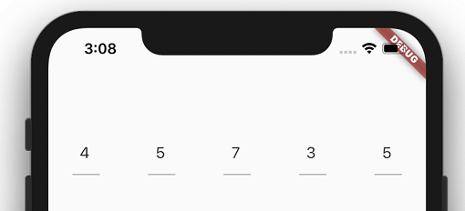
OTPTextField(
  length: 5,
  width: MediaQuery.of(context).size.width,
  fieldWidth: 80,
  style: TextStyle(fontSize: 17),
  textFieldAlignment: MainAxisAlignment.spaceAround,
  fieldStyle: FieldStyle.underline,
  onChanged: (pin) {
    print("Changed: " + pin);
  },
  onCompleted: (pin) {
    print("Completed: " + pin);
  },
),
onChanged fires on every edit with the current (possibly partial) pin.onCompleted fires once every field is filled, with the full pin.OTPTextField(
length: 4,
width: MediaQuery.of(context).size.width,
fieldWidth: 56,
fieldStyle: FieldStyle.box,
outlineBorderRadius: 12,
otpFieldStyle: OtpFieldStyle(
backgroundColor: Colors.grey.shade100,
borderColor: Colors.grey,
focusBorderColor: Colors.deepPurple,
),
style: TextStyle(fontSize: 20, fontWeight: FontWeight.bold),
onCompleted: (pin) => verifyOtp(pin),
),
Attach an OtpFieldController to clear, prefill, or focus the fields from your own code — for example after a failed verification or a "resend code" tap:
final OtpFieldController otpController = OtpFieldController();

OTPTextField(
  controller: otpController,
  length: 4,
  onCompleted: (pin) => verifyOtp(pin),
),

// Later:
otpController.clear();                        // clear all fields, focus the first one
otpController.set(['1', '2', '3', '4']);      // prefill the whole pin
otpController.setValue('7', 2);               // set a single field (position 2)
otpController.setFocus(0);                    // move focus to a field
The controller must be attached to a built
OTPTextFieldbefore calling its methods, otherwise aStateErroris thrown.set()expects exactlylengthentries.
Pass AutofillHints.oneTimeCode to enable one-tap SMS code autofill on iOS and Android. The autofilled code is automatically spread across the fields:
OTPTextField(
  length: 6,
  autofillHints: [AutofillHints.oneTimeCode],
  onCompleted: (pin) => verifyOtp(pin),
),
Set hasError: true to render every field with the errorBorderColor — for example after the server rejects the code:
OTPTextField(
  length: 4,
  hasError: _otpInvalid,
  otpFieldStyle: OtpFieldStyle(errorBorderColor: Colors.red),
  onChanged: (_) => setState(() => _otpInvalid = false),
  onCompleted: (pin) => verifyOtp(pin),
),
OTPTextField(
  length: 4,
  obscureText: true,
  onCompleted: (pin) => verifyPin(pin),
),
For more designs, check out the example app.
OTPTextField| Parameter | Type | Default | Description |
|---|---|---|---|
length |
int |
4 |
Number of OTP fields. Must be greater than 1. |
width |
double |
10 |
Total width of the widget. Usually set to the available screen width. |
fieldWidth |
double |
30 |
Width of each individual field. |
spaceBetween |
double |
0 |
Horizontal space between fields, in addition to textFieldAlignment spacing. |
controller |
OtpFieldController? |
null |
Controller to clear, prefill, or focus the fields programmatically. |
fieldStyle |
FieldStyle |
FieldStyle.underline |
Field shape: FieldStyle.underline or FieldStyle.box. |
outlineBorderRadius |
double |
10 |
Corner radius of the border when fieldStyle is FieldStyle.box. |
otpFieldStyle |
OtpFieldStyle? |
OtpFieldStyle() |
Colors for background and borders — see OtpFieldStyle. |
style |
TextStyle |
TextStyle() |
Text style of the digits being entered. |
contentPadding |
EdgeInsets |
EdgeInsets.symmetric(horizontal: 4, vertical: 8) |
Content padding inside each field. |
isDense |
bool |
false |
Whether the fields use a denser, vertically compact layout. |
textFieldAlignment |
MainAxisAlignment |
MainAxisAlignment.spaceBetween |
How the fields are distributed across width. |
keyboardType |
TextInputType |
TextInputType.number |
Keyboard shown while typing. |
textCapitalization |
TextCapitalization |
TextCapitalization.none |
Capitalization behavior for alphanumeric codes. |
inputFormatter |
List<TextInputFormatter>? |
null |
Input formatters applied while typing and to pasted text. |
obscureText |
bool |
false |
Hide the entered characters (for sensitive PINs). |
showCursor |
bool |
false |
Show the cursor and selection visuals. By default the focused field is indicated only by its focused border. |
hasError |
bool |
false |
Render all fields with the error border color. |
autofocus |
bool |
false |
Focus the first field automatically when the widget is built. |
enabled |
bool |
true |
Whether the fields accept user input. |
autofillHints |
List<String>? |
null |
Autofill hints applied to the first field. Use [AutofillHints.oneTimeCode] for SMS autofill. |
redirectFocusToFirstEmptyField |
bool |
true |
When a later field gains focus while earlier ones are empty, redirect focus to the first empty field so the code is always entered contiguously. Set to false to let users type into any box. |
onChanged |
ValueChanged<String>? |
null |
Called with the current pin whenever it changes. |
onCompleted |
ValueChanged<String>? |
null |
Called with the full pin once every field is filled. |
OtpFieldStyle| Parameter | Type | Default | Description |
|---|---|---|---|
backgroundColor |
Color |
Colors.transparent |
Fill color of each field. |
borderColor |
Color |
Colors.black26 |
Default border color. |
enabledBorderColor |
Color |
Colors.black26 |
Border color when the field is enabled but not focused. |
focusBorderColor |
Color |
Colors.blue |
Border color of the focused field. |
disabledBorderColor |
Color |
Colors.grey |
Border color when enabled is false. |
errorBorderColor |
Color |
Colors.red |
Border color when hasError is true. |
OtpFieldController| Method | Description |
|---|---|
clear() |
Clears all fields, focuses the first one, and calls onChanged with an empty string. |
set(List<String> pin) |
Sets the whole pin. The list length must equal length; throws ArgumentError otherwise. Calls onChanged, and onCompleted if no entry is empty. |
setValue(String value, int position) |
Sets a single field at position (0-based). Calls onChanged. |
setFocus(int position) |
Moves focus to the field at position (0-based). |
inputFormatters, distributed across the fields from the start, and any leftover fields are cleared.OTP Text Field is released under the MIT license. See LICENSE for details.