


 v5.2.0
flutter_slidable
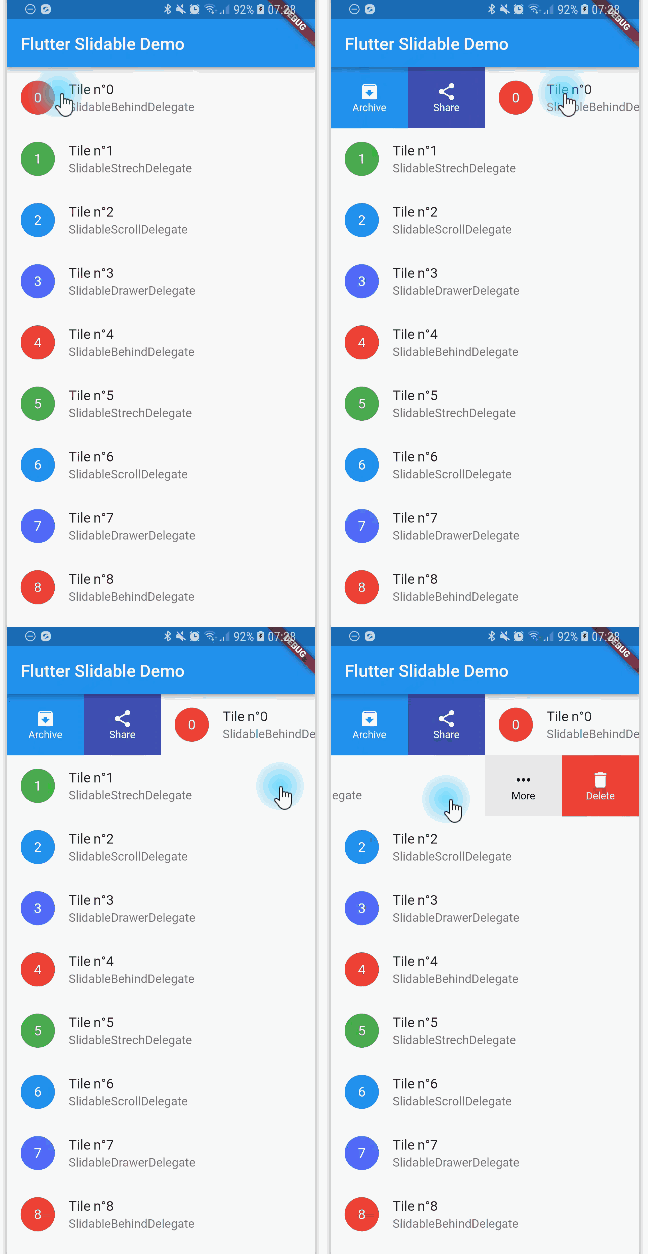
A Flutter implementation of slidable list item with directional slide actions that can be dismissed.
6.2KLikes 807K30-day downloads150Pub points
AndroidiOSWebmacOSWindowsLinux
A Flutter implementation of slidable list item with directional slide actions.

English project snapshot. Visit GitHub for the latest content.

 Slidable is a Flutter Favorite package!
A Flutter implementation of slidable list item with directional slide actions that can be dismissed.
Our top sponsors are shown below! [Become a Sponsor]
 Try the Flutter Chat Tutorial 💬 |
 Your complete platform for sending notifications |
You can read this small guide to migrate from the 0.6 to the 1.0 version: https://github.com/letsar/flutter_slidable/wiki/Migration-from-version-0.6.0-to-version-1.0.0
Scrollable starts to scroll (overridable).In the pubspec.yaml of your flutter project, add the following dependency:
dependencies:
  flutter_slidable: <latest_version>
In your library add the following import:
import 'package:flutter_slidable/flutter_slidable.dart';
Example:
Slidable(
  // Specify a key if the Slidable is dismissible.
  key: const ValueKey(0),

  // The start action pane is the one at the left or the top side.
  startActionPane: ActionPane(
    // A motion is a widget used to control how the pane animates.
    motion: const ScrollMotion(),

    // A pane can dismiss the Slidable.
    dismissible: DismissiblePane(onDismissed: () {}),

    // All actions are defined in the children parameter.
    children: const [
      // A SlidableAction can have an icon and/or a label.
      SlidableAction(
        onPressed: doNothing,
        backgroundColor: Color(0xFFFE4A49),
        foregroundColor: Colors.white,
        icon: Icons.delete,
        label: 'Delete',
      ),
      SlidableAction(
        onPressed: doNothing,
        backgroundColor: Color(0xFF21B7CA),
        foregroundColor: Colors.white,
        icon: Icons.share,
        label: 'Share',
      ),
    ],
  ),

  // The end action pane is the one at the right or the bottom side.
  endActionPane: const ActionPane(
    motion: ScrollMotion(),
    children: [
      SlidableAction(
        // An action can be bigger than the others.
        flex: 2,
        onPressed: doNothing,
        backgroundColor: Color(0xFF7BC043),
        foregroundColor: Colors.white,
        icon: Icons.archive,
        label: 'Archive',
      ),
      SlidableAction(
        onPressed: doNothing,
        backgroundColor: Color(0xFF0392CF),
        foregroundColor: Colors.white,
        icon: Icons.save,
        label: 'Save',
      ),
    ],
  ),

  // The child of the Slidable is what the user sees when the
  // component is not dragged.
  child: const ListTile(title: Text('Slide me')),
),
Any ActionPane has a motion parameter which allow you to define how the pane animates when the user drag the Slidable.
The actions appear as if they where behind the Slidable:

Animate the actions as if they were drawers, when the Slidable is moving:

The actions follow the Slidable while it's moving:

Animate the actions as if they were streched while the Slidable is moving:

You can use SlidableController to open or close the actions programmatically:
final controller = SlidableController();

// ...

Slidable(
  controller: controller,
  // ...
);

// ...

// Open the actions
void _handleOpen() {
  controller.openEndActionPane();
  // OR
  //controller.openStartActionPane();
}

void _handleOpen() {
  controller.close();
}
You can read the FAQ here: https://github.com/letsar/flutter_slidable/wiki/FAQ
I'm working on my packages on my free-time, but I don't have as much time as I would. If this package or any other package I created is helping you, please consider to sponsor me so that I can take time to read the issues, fix bugs, merge pull requests and add features to these packages.
Feel free to contribute to this project.
If you find a bug or want a feature, but don't know how to fix/implement it, please fill an issue.
If you fixed a bug or implemented a feature, please send a pull request.
Dependency list 4 items
{"sdk":"flutter"}{"sdk":"flutter"}^0.3.0—Start with your use case, compare repository activity, and check the original project before adopting it.
“A repository is the most basic element of GitHub.”
GitHub Docs — About repositories ↗