
 v1.0.3
slide_drawer
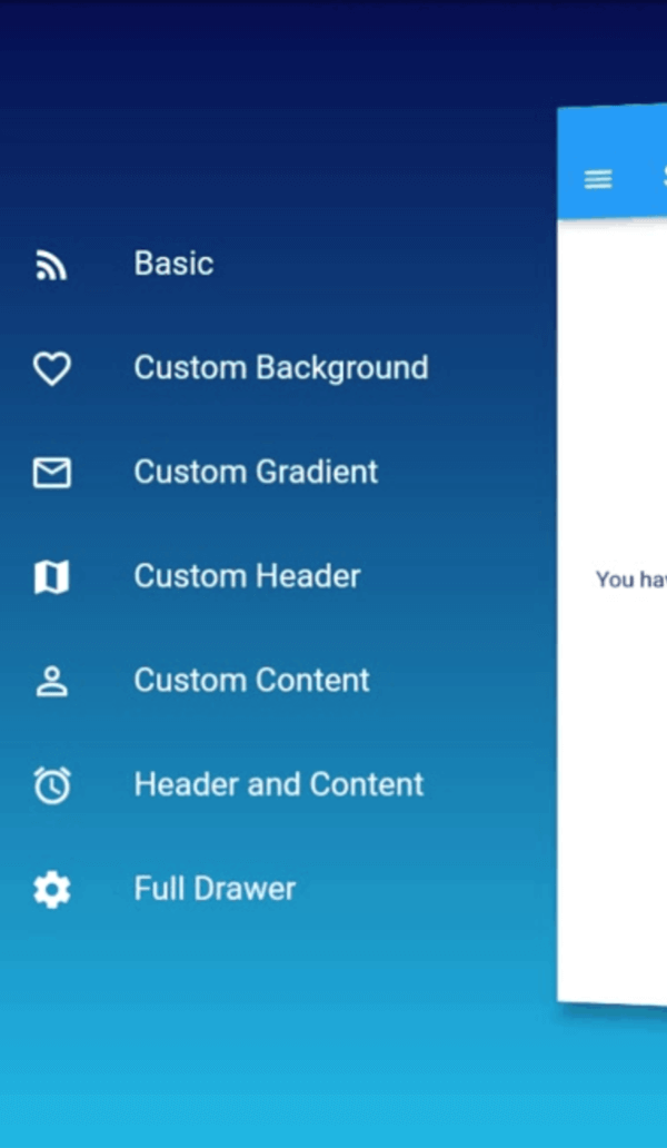
An easy way to use drawer in Flutter with cool sliding animation.
49Likes 3330-day downloads70Pub points
Platforms unavailable
An easy way to use drawer in Flutter with cool sliding animation.

{"sdk":"flutter"}^1.1.0+1{"sdk":"flutter"}English project snapshot. Visit GitHub for the latest content.
An easy way to use drawer in Flutter with cool sliding animation.
https://raw.githubusercontent.com/salkuadrat/slide_drawer/HEAD/example.gif
Add dependency in your flutter project.
$ flutter pub add slide_drawer
or
dependencies:
  slide_drawer: ^1.0.3
Then run flutter pub get.
You can see the example folder to learn many different ways of using SlideDrawer in your app.
As usual, we need to import the package.
import 'package:slide_drawer/slide_drawer.dart';
Then wrap the app home page with SlideDrawer.
To use the basic SlideDrawer, you only need to define items (List of MenuItem) to generate menu in your drawer. The drawer will use your default theme color as drawer background, and theme brightness as drawer brightness.
class App extends StatelessWidget {
  @override
  Widget build(BuildContext context) {
    return MaterialApp(
      title: title,
      // SlideDrawer will use style from this theme
      theme: ThemeData(
        brightness: Brightness.dark,
        primarySwatch: Colors.blue,
        visualDensity: VisualDensity.adaptivePlatformDensity,
      ),
      // wrap your HomePage with SlideDrawer
      home: SlideDrawer(
        items: [
          MenuItem('Home', onTap: (){}),
          MenuItem('Project', onTap: (){}),
          MenuItem('Favourite', onTap: (){}),
          MenuItem('Profile', onTap: (){}),
          MenuItem('Setting', onTap: (){}),
        ],
        child: HomePage(),
      ),
    );
  }
}
Then set onPressed in your AppBar menu button to toggle SlideDrawer.
appBar: AppBar(
  title: Text(title),
  leading: IconButton(
    icon: Icon(Icons.menu),
    // call toggle from SlideDrawer to alternate between open and close
    // when pressed menu button
    onPressed: () => SlideDrawer.of(context).toggle(),
  ),
),
We can also use icon for menu items.
home: SlideDrawer(
  items: [
    MenuItem('Home', icon: Icons.home, onTap: (){}),
    MenuItem('Project', icon:Icons.rss_feed, onTap: (){}),
    MenuItem('Favourite', icon: Icons.favorite_border, onTap: (){}),
    MenuItem('Profile', icon: Icons.person_outline, onTap: (){}),
    MenuItem('Setting', icon: Icons.settings, onTap: (){}),
  ],
  child: HomePage(),
),
SlideDrawer also come with parameter backgroundColor and backgroundGradient.
If we specify backgroundGradient, the drawer will use it as background. If not, it will use backgroundColor. If we also not specify backgroundColor, it will use the default theme color as background.
It's good practice to specify brightness (dark or light) if we use backgroundGradient or backgroundColor. If we set dark color in your backgroundGradient or backgroundColor, use Brightness.dark. If we set light color, use Brightness.light.
// SlideDrawer with custom gradient as background.
home: SlideDrawer(
  items: [
    MenuItem('Home', icon: Icons.home, onTap: (){}),
    MenuItem('Project', icon:Icons.rss_feed, onTap: (){}),
    MenuItem('Favourite', icon: Icons.favorite_border, onTap: (){}),
    MenuItem('Profile', icon: Icons.person_outline, onTap: (){}),
    MenuItem('Setting', icon: Icons.settings, onTap: (){}),
  ],
  brightness: Brightness.dark,
  backgroundGradient: LinearGradient(
    begin: Alignment.topCenter,
    end: Alignment.bottomCenter,
    stops: [0.0, 1.0],
    colors: [
      Color(0xFF000046),
      Color(0xFF1CB5E0),
    ],
  ),
  child: HomePage(),
),
// SlideDrawer with custom color as background.
home: SlideDrawer(
  items: [
    MenuItem('Home', icon: Icons.home, onTap: (){}),
    MenuItem('Project', icon:Icons.rss_feed, onTap: (){}),
    MenuItem('Favourite', icon: Icons.favorite_border, onTap: (){}),
    MenuItem('Profile', icon: Icons.person_outline, onTap: (){}),
    MenuItem('Setting', icon: Icons.settings, onTap: (){}),
  ],
  brightness: Brightness.dark,
  backgroundColor: Colors.blue[900],
  child: HomePage(),
),
It's advisable to set alignment to SlideDrawerAlignment.start when you use headDrawer.
home: SlideDrawer(
  alignment: SlideDrawerAlignment.start,
  headDrawer: Image.asset('boys.png'),
  items: [
    MenuItem('Home', icon: Icons.home, onTap: (){}),
    MenuItem('Project', icon:Icons.rss_feed, onTap: (){}),
    MenuItem('Favourite', icon: Icons.favorite_border, onTap: (){}),
    MenuItem('Profile', icon: Icons.person_outline, onTap: (){}),
    MenuItem('Setting', icon: Icons.settings, onTap: (){}),
  ],
  brightness: Brightness.dark,
  backgroundColor: Colors.blue[900],
  child: HomePage(),
),
In the previous example, we use items and let the SlideDrawer generate menu in the content drawer. But we can also set any custom widget as the content drawer.
home: SlideDrawer(
  brightness: Brightness.dark,
  contentDrawer: Container(
    padding: EdgeInsets.symmetric(horizontal: 5),
    child: Column(
      children: [
        ListTile(title: 'Home', icon: Icons.home, onTap: (){}),
        ListTile(title: 'Project', icon:Icons.rss_feed, onTap: (){}),
        ListTile(title: 'Favourite', icon: Icons.favorite_border, onTap: (){}),
        ListTile(title: 'Profile', icon: Icons.person_outline, onTap: (){}),
        ListTile(title: 'Setting', icon: Icons.settings, onTap: (){}),
      ],
    ),
  ),
  child: HomePage(),
),
If you have your own creative idea for the full widget inside the drawer, don't worry. We can use it in SlideDrawer by passing it to drawer. In this way, SlideDrawer will use style of custom drawer and ignore any value in backgroundColor, gradientColor, and brightness.
home: SlideDrawer(
  drawer: Container(
    color: Colors.teal,
    padding: EdgeInsets.symmetric(vertical: 36, horizontal: 15),
    child: Theme(
      data: ThemeData(brightness: Brightness.dark),
      child: Column(
        mainAxisAlignment: MainAxisAlignment.end,
        crossAxisAlignment: CrossAxisAlignment.stretch,
        children: [
          ListTile(title: 'Home', icon: Icons.home, onTap: (){}),
          ListTile(title: 'Project', icon:Icons.rss_feed, onTap: (){}),
          ListTile(title: 'Favourite', icon: Icons.favorite_border, onTap: (){}),
          ListTile(title: 'Profile', icon: Icons.person_outline, onTap: (){}),
          ListTile(title: 'Setting', icon: Icons.settings, onTap: (){}),
        ],
      ),
    ),
  ),
  child: HomePage(),
),
The default SlideDrawer animate home page by move it to the right (offsetFromRight default to 60), scale it, and rotate it at y axis with some small angle (pi / 24 radian or 180 / 24 degree = 7.5 degree).
If don't want to rotate, we can disable the rotation by setting isRotate to false.
home: SlideDrawer(
  isRotate: false,
  items: [
    MenuItem('Home', icon: Icons.home, onTap: (){}),
    MenuItem('Project', icon:Icons.rss_feed, onTap: (){}),
    MenuItem('Favourite', icon: Icons.favorite_border, onTap: (){}),
    MenuItem('Profile', icon: Icons.person_outline, onTap: (){}),
    MenuItem('Setting', icon: Icons.settings, onTap: (){}),
  ],
  child: HomePage(),
),
Or use a custom rotateAngle if we want to rotate it at a spesific angle.
home: SlideDrawer(
  isRotate: true,
  rotateAngle: pi / 36,
  items: [
    MenuItem('Home', icon: Icons.home, onTap: (){}),
    MenuItem('Project', icon:Icons.rss_feed, onTap: (){}),
    MenuItem('Favourite', icon: Icons.favorite_border, onTap: (){}),
    MenuItem('Profile', icon: Icons.person_outline, onTap: (){}),
    MenuItem('Setting', icon: Icons.settings, onTap: (){}),
  ],
  child: HomePage(),
),
Or change offsetFromRight to make it move a little closer or farther.
home: SlideDrawer(
  offsetFromRight: 80.0,
  items: [
    MenuItem('Home', icon: Icons.home, onTap: (){}),
    MenuItem('Project', icon:Icons.rss_feed, onTap: (){}),
    MenuItem('Favourite', icon: Icons.favorite_border, onTap: (){}),
    MenuItem('Profile', icon: Icons.person_outline, onTap: (){}),
    MenuItem('Setting', icon: Icons.settings, onTap: (){}),
  ],
  child: HomePage(),
),
We can also use custom curve and duration. The default values are linear and 300ms. We can specify curveReverse and durationReverse to change curve and duration of animation in the reverse direction.
home: SlideDrawer(
  curve: Curves.easeInOut,
  duration: Duration(milliseconds: 200),
  items: [
    MenuItem('Home', icon: Icons.home, onTap: (){}),
    MenuItem('Project', icon:Icons.rss_feed, onTap: (){}),
    MenuItem('Favourite', icon: Icons.favorite_border, onTap: (){}),
    MenuItem('Profile', icon: Icons.person_outline, onTap: (){}),
    MenuItem('Setting', icon: Icons.settings, onTap: (){}),
  ],
  child: HomePage(),
),
There it is. Have fun!!!