

 v1.0.0
multi_trigger_autocomplete
A flutter widget to add trigger based autocomplete functionality to your app.
120Likes 2K30-day downloads160Pub points
AndroidiOSWebmacOSWindowsLinux
A flutter widget to add trigger based autocomplete functionality to your app.

English project snapshot. Visit GitHub for the latest content.


A flutter widget to add trigger based autocomplete functionality to your app.
Show some ❤️ and star the repo to support the project
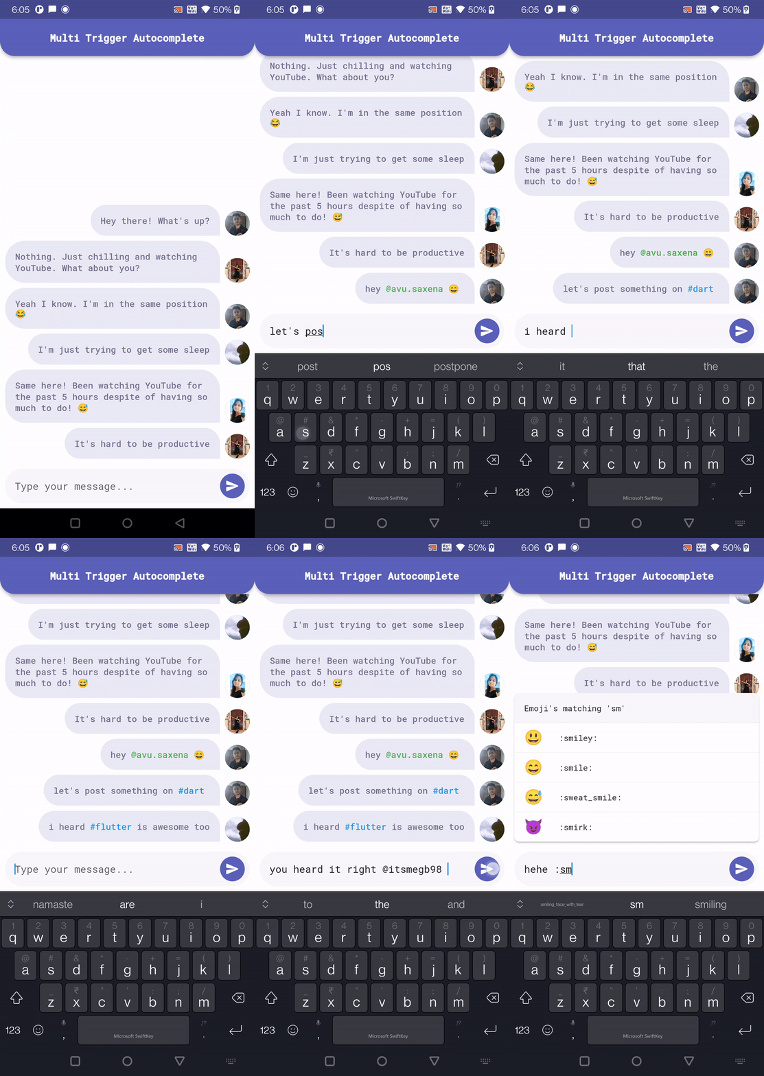
Add the following to your pubspec.yaml and replace [version] with the latest version:
dependencies:
  multi_trigger_autocomplete: ^[version]
To use this package you must first wrap your top most widget with Portal as this package uses flutter_portal to show the options view.
(Credits to: Remi Rousselet)
Portal, is the equivalent of [Overlay].This widget will need to be inserted above the widget that needs to render under your overlays.
If you want to display your overlays on the top of everything, a good place to insert that
Portalis aboveMaterialApp:Portal( child: MaterialApp( ... ) );(works for
CupertinoApptoo)This way
Portalwill render above everything. But you could place it somewhere else to change the clip behavior.
Import the package:
import 'package:multi_trigger_autocomplete/multi_trigger_autocomplete.dart';
Use the widget:
MultiTriggerAutocomplete(
  optionsAlignment: OptionsAlignment.topStart,
  autocompleteTriggers: [
    // Add the triggers you want to use for autocomplete
    AutocompleteTrigger(
      trigger: '@',
      optionsViewBuilder: (context, autocompleteQuery, controller) {
        return MentionAutocompleteOptions(
          query: autocompleteQuery.query,
          onMentionUserTap: (user) {
            final autocomplete = MultiTriggerAutocomplete.of(context);
            return autocomplete.acceptAutocompleteOption(user.id);
          },
        );
      },
    ),
    AutocompleteTrigger(
      trigger: '#',
      optionsViewBuilder: (context, autocompleteQuery, controller) {
        return HashtagAutocompleteOptions(
          query: autocompleteQuery.query,
          onHashtagTap: (hashtag) {
            final autocomplete = MultiTriggerAutocomplete.of(context);
            return autocomplete
                .acceptAutocompleteOption(hashtag.name);
          },
        );
      },
    ),
    AutocompleteTrigger(
      trigger: ':',
      optionsViewBuilder: (context, autocompleteQuery, controller) {
        return EmojiAutocompleteOptions(
          query: autocompleteQuery.query,
          onEmojiTap: (emoji) {
            final autocomplete = MultiTriggerAutocomplete.of(context);
            return autocomplete.acceptAutocompleteOption(
              emoji.char,
              // Passing false as we don't want the trigger [:] to
              // get prefixed to the option in case of emoji.
              keepTrigger: false,
            );
          },
        );
      },
    ),
  ],
  // Add the text field widget you want to use for autocomplete
  fieldViewBuilder: (context, controller, focusNode) {
    return Padding(
      padding: const EdgeInsets.all(8.0),
      child: ChatMessageTextField(
        focusNode: focusNode,
        controller: controller,
      ),
    );
  },
),
| Mention Autocomplete | Hashtag Autocomplete | Emoji Autocomplete |
|---|---|---|
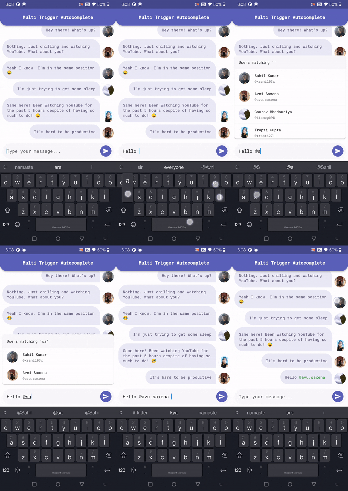 |
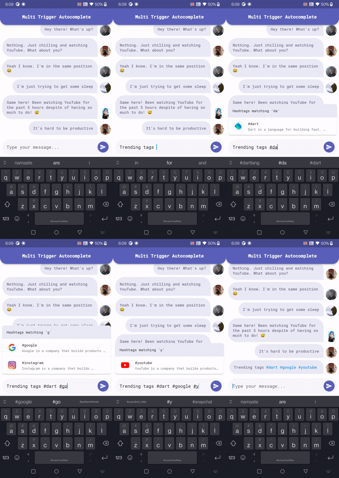 |
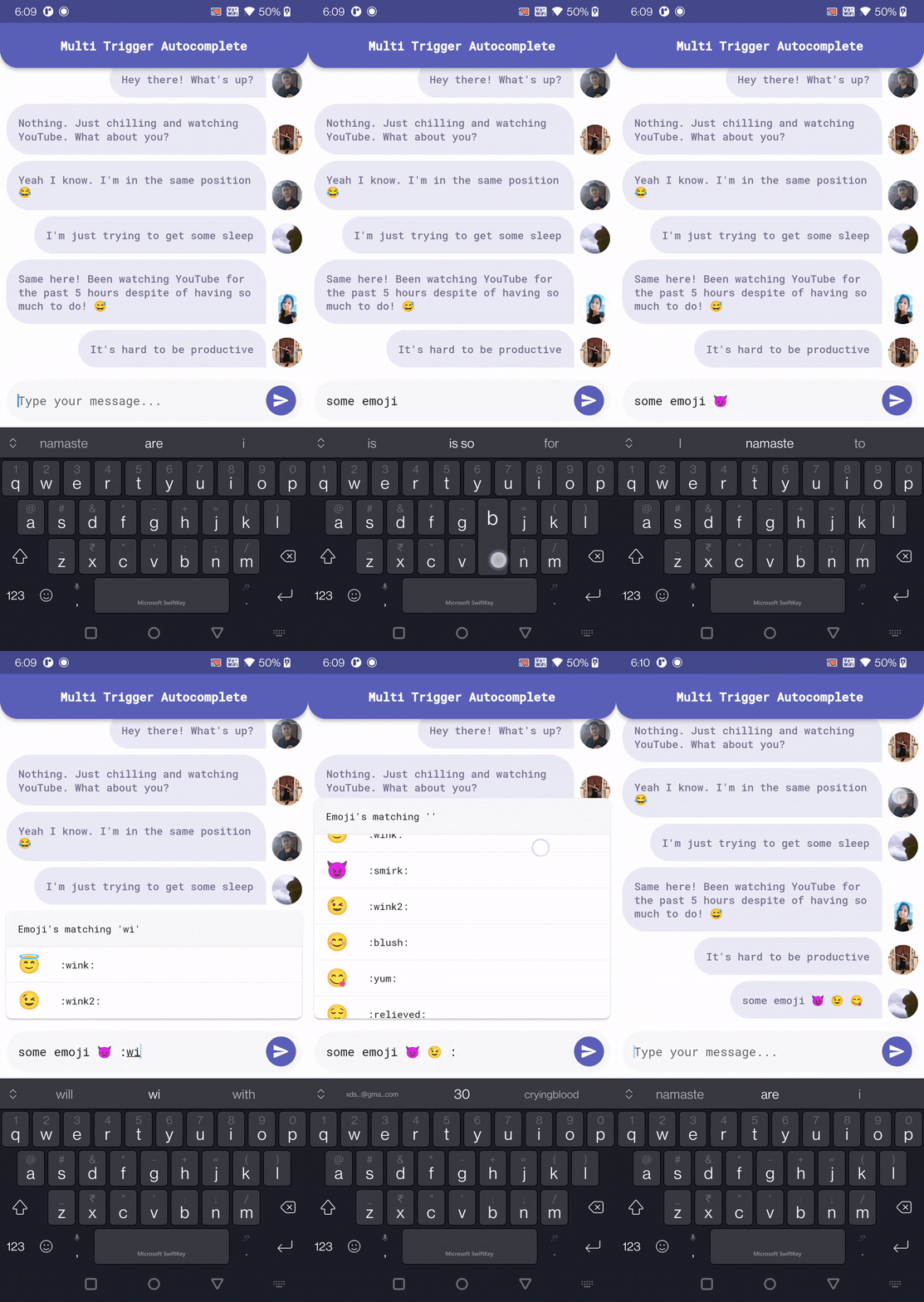 |
MultiTriggerAutocomplete(
  // Defines the autocomplete trigger that will be used to match the
  // text.
  autocompleteTriggers: autocompleteTriggers,

  // Defines the alignment of the options view relative to the
  // fieldView.
  //
  // By default, the options view is aligned to the bottom of the
  // fieldView.
  optionsAlignment: OptionsAlignment.topStart,

  // Defines the width to make the options as a multiple of the width
  // of the fieldView.
  //
  // Setting this to 1 makes the options view width matches the width
  // of the fieldView.
  //
  // Use null to remove this constraint.
  optionsWidthFactor: 1.0,

  // Defines the duration of the debounce period for the
  // [TextEditingController].
  //
  // This is the time between the last character typed and the matching
  // is performed.
  debounceDuration: const Duration(milliseconds: 350),

  // Defines the initial value to set in the internal
  // [TextEditingController].
  //
  // This value will be ignored if [TextEditingController] is provided.
  initialValue: const TextEditingValue(text: 'Hello'),

  // Defines the [TextEditingController] that will be used for the
  // fieldView.
  //
  // If this parameter is provided, then [focusNode] must also be
  // provided.
  textEditingController: TextEditingController(text: 'Hello'),

  // Defines the [FocusNode] that will be used for the fieldView.
  //
  // If this parameter is provided, then [textEditingController] must
  // also be provided.
  focusNode: FocusNode(),

  // Defines the fieldView that will be used to input the text.
  //
  // By default, a [TextFormField] is used.
  fieldViewBuilder: (context, controller, focusNode) {
    return TextField(
      controller: controller,
      focusNode: focusNode,
    );
  },
),
AutocompleteTrigger(
  // The trigger string/character that will be used to trigger the
  // autocomplete.
  trigger: '@',

  // If true, the [trigger] should only be recognised at
  // the start of the input text.
  //
  // valid example: "@luke hello"
  // invalid example: "Hello @luke"
  triggerOnlyAtStart: false,

  // If true, the [trigger] should only be recognised after
  // a space.
  //
  // valid example: "@luke", "Hello @luke"
  // invalid example: "Hello@luke"
  triggerOnlyAfterSpace: true,

  // A minimum number of characters can be provided to only show
  // suggestions after the user has input enough characters.
  //
  // example:
  // "Hello @l" -> Shows zero suggestions.
  // "Hello @lu" -> Shows suggestions for @lu.
  minimumRequiredCharacters: 2,

  // The options view builder is used to build the options view
  // that will be shown when the [trigger] is detected.
  optionsViewBuilder: (context, autocompleteQuery, controller) {
    return MentionAutocompleteOptions(
      query: autocompleteQuery.query,
      onMentionUserTap: (user) {
        // Accept the autocomplete option.
        final autocomplete = MultiTriggerAutocomplete.of(context);
        return autocomplete.acceptAutocompleteOption(user.id);
      },
    );
  },
)
Dependency list 4 items
{"sdk":"flutter"}^1.0.0{"sdk":"flutter"}^2.0.0Start with your use case, compare repository activity, and check the original project before adopting it.
“A repository is the most basic element of GitHub.”
GitHub Docs — About repositories ↗