
Overview
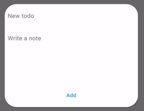
PopupCard is a Flutter package that provides a simple and customizable way to display informative popups that can include user input fields. It enables developers to present contextual information or collect user responses in a clean, intuitive overlay. Ideal for tooltips, form prompts, or quick data entry, it supports multiple platforms including mobile, web, and desktop. The package emphasizes ease of use with minimal setup and flexible styling options.
Use cases
- Displaying form inputs in overlays
- Showing contextual tips or instructions
- Collecting quick user feedback
- Enhancing UI with interactive popups
- Creating lightweight modals for mobile apps
Key features
- Easy integration with minimal code
- Supports user input within popup
- Customizable appearance and positioning
- Cross-platform compatibility
- Lightweight and performant
- Built-in animations for smooth transitions
Suitable for
- Developers seeking simple popup functionality
- Projects needing lightweight modals
- UI/UX enhancements requiring temporary overlays
- Mobile and web applications with interactive elements
- Prototyping rapid interface interactions
Considerations
- Limited to basic popup behavior without complex navigation
- Not suitable for large forms or multi-step workflows
- Requires manual handling of input validation
- Best for transient content rather than persistent dialogs