
Overview
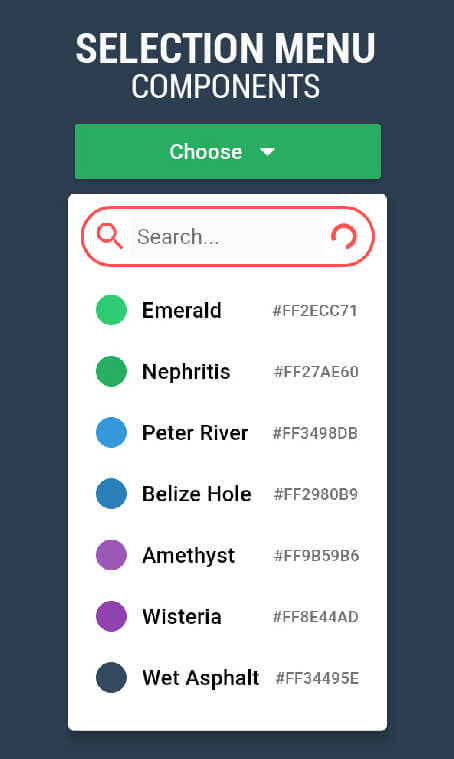
A highly customizable selection menu in Flutter that toggles open or closed with a tap on a trigger widget. It supports optional search functionality, allowing users to filter options dynamically. Designed for flexibility, it enables developers to tailor the appearance and behavior of the menu to match app-specific needs. Ideal for forms, settings, or any UI requiring a clean, interactive choice interface.
Use cases
- Form inputs with dropdown choices
- User preference selection
- Filtering options via search
- Settings panels with multiple choices
- Customizable dropdowns in dashboards
Key features
- Tap-to-open/closed trigger
- Optional built-in search
- Highly customizable styling
- Flexible option rendering
- Supports dynamic data sources
- Accessible interaction design
Suitable for
- Developers needing flexible dropdowns
- Apps with complex selection workflows
- UI-heavy applications
- Custom form components
- Design systems requiring reusable menus
Considerations
- Requires manual handling of state management
- Search feature may need performance optimization for large datasets
- Limited platform-specific defaults
- No built-in animations (customizable)
- May require additional styling for consistency across themes