
 v1.2.0
gradient_elevated_button
具有渐变背景的自定义 Flutter 按钮,用于视觉上吸引人的用户界面。
15喜欢 961近 30 天下载160Pub 分数
AndroidiOSWebmacOSWindowsLinux
具有渐变背景的自定义 Flutter 按钮,用于视觉上吸引人的用户界面。

{"sdk":"flutter"}{"sdk":"flutter"}^6.0.0以下为英文项目原文快照,最新内容请访问 GitHub。
Package Version License Likes Points Popularity
Git Issues
A customizable elevated button with gradient support for your Flutter applications. This package allows you to create buttons with gradient backgrounds, custom foreground colors, and various other customizable properties using the GradientElevatedButton widget.
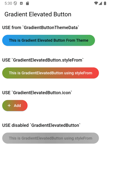
GradientButtonThemeExtension (via ThemeExtension) to apply a consistent style across your app. (Old: GradientButtonThemeData is deprecated)https://raw.githubusercontent.com/ChegzDev/gradient_elevated_button/HEAD/screen_shot/sample.png
The recommended way to theme all gradient buttons is to use GradientButtonThemeExtension with ThemeData.extensions:
MaterialApp(
  theme: ThemeData(
    extensions: <ThemeExtension<dynamic>>[
      GradientButtonThemeExtension(
        style: GradientElevatedButton.styleFrom(
          backgroundGradient: const LinearGradient(
            colors: [Colors.blue, Colors.green],
            begin: Alignment.centerLeft,
            end: Alignment.centerRight,
          ),
          foregroundColor: Colors.black,
        ),
      ),
    ],
  ),
  home: ...,
)
Then use GradientElevatedButton as usual:
GradientElevatedButton(
  onPressed: () {},
  child: Text('Themed Gradient Button'),
)
GradientButtonThemeData is deprecated and will be removed in a future release. Migrate to ThemeExtension as shown above.
// Deprecated usage:
GradientButtonThemeData(
  data: GradientElevatedButton.styleFrom(
    backgroundGradient: const LinearGradient(
      colors: [Colors.blue, Colors.green],
      begin: Alignment.centerLeft,
      end: Alignment.centerRight,
    ),
    foregroundColor: Colors.black,
  ),
  child: MaterialApp(
    // ...
  ),
)
Alternatively, you can style the GradientElevatedButton directly using GradientElevatedButton.styleFrom to define the button's gradient, shape, and other properties:
Widget gradientWidget = GradientElevatedButton(
  onPressed: () {

  },
  style: GradientElevatedButton.styleFrom(
    gradient: const LinearGradient(colors: [
      Color.fromARGB(255, 166, 206, 57),
      Color.fromARGB(255, 0, 175, 173),
    ],
      disabledGradient: const LinearGradient(colors: [
        Colors.grey.withAlpha(200),
        Colors.grey,
        Colors.grey.withAlpha(200),
      ],
        begin: Alignment.topCenter,
        end: Alignment.bottomCenter,
      ),
    ),
  ),
  child: const Text("This is Gradient Elevated Button"),
);
You can fully customize the GradientElevatedButton using the following properties:
LinearGradient (or other types) that defines the background gradient.LinearGradient (or other types) that defines the disabled background gradient.ShapeBorder like RoundedRectangleBorder or StadiumBorder.To migrate from GradientButtonThemeData to the new ThemeExtension approach:
GradientButtonThemeData from your widget tree.GradientButtonThemeExtension to your ThemeData.extensions.GradientButtonThemeExtension.of(context) to access the style if needed.GradientElevatedButton widgets will now use the theme from the extension.See the example and code comments for more details.
click here for example
Please file any issues or provide feedback by visiting the Issues and Feedback for this repository.
For suggestions or further feedback, feel free to send an email to chegz.dev@gmail.com, and we'd be happy to hear from you!