

 v3.1.0
progress_dialog_null_safe
一个轻量级、空安全的 Flutter 包,用于显示可自定义的进度对话框,支持动态内容更新和多种样式选项。
46喜欢 3000近 30 天下载140Pub 分数
AndroidiOSWebmacOSWindowsLinux
CodingFries/progress_dialog open-source repository details.

以下为英文项目原文快照,最新内容请访问 GitHub。
A light weight package to show progress dialog. As it is a stateful widget, you can change the text shown on the dialog dynamically.
This is the original package and it's owner https://github.com/fayaz07/progress_dialog
It was discontinued by him, but i really liked the package so I am trynna revive it :D I added null safety and updated most of the stuff making it null safe and useable again :)
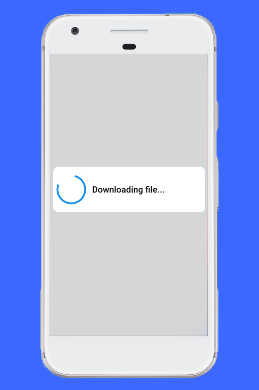
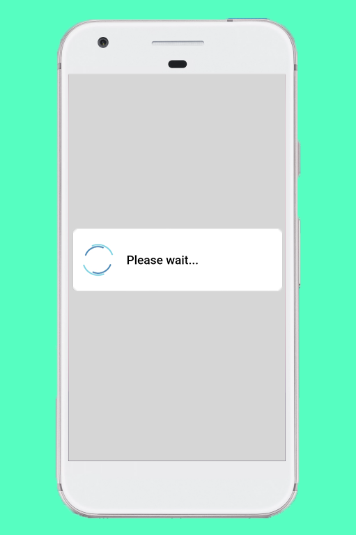
Import the package in your dart file
import 'package:progress_dialog/progress_dialog_null_safe.dart';
Create and initialise a ProgressDialog object inside the build() method passing context to it
final ProgressDialog pr = ProgressDialog(context);
//For normal dialog
pr = ProgressDialog(context,type: ProgressDialogType.Normal, isDismissible: true/false, showLogs: true/false);

//For showing progress percentage
pr =  ProgressDialog(context,type: ProgressDialogType.Download, isDismissible: true/false, showLogs: true/false);
pr.style(
  message: 'Downloading file...',
  borderRadius: 10.0,
  backgroundColor: Colors.white,
  progressWidget: CircularProgressIndicator(),
  elevation: 10.0,
  insetAnimCurve: Curves.easeInOut,
  progress: 0.0,
  textDirection: TextDirection.rtl,
  maxProgress: 100.0,
  progressTextStyle: TextStyle(
     color: Colors.black, fontSize: 13.0, fontWeight: FontWeight.w400),
  messageTextStyle: TextStyle(
     color: Colors.black, fontSize: 19.0, fontWeight: FontWeight.w600)
  );
Note: You don't need to use all parameters, all of them are optional
await pr.show();
pr.update(
  progress: 50.0,
  message: "Please wait...",
  progressWidget: Container(
    padding: EdgeInsets.all(8.0), child: CircularProgressIndicator()),
  maxProgress: 100.0,
  progressTextStyle: TextStyle(
    color: Colors.black, fontSize: 13.0, fontWeight: FontWeight.w400),
  messageTextStyle: TextStyle(
    color: Colors.black, fontSize: 19.0, fontWeight: FontWeight.w600),
  );
Note: You don't need to use all parameters, all of them are optional
pr.hide().then((isHidden) {
  print(isHidden);
});

// or
await pr.hide();
Navigating to next screens must be done after the completion of Future - hide(). See here for example
bool isProgressDialogShowing = pr.isShowing();
print(isProgressDialogShowing);
    pr = ProgressDialog(
      context,
      type: ProgressDialogType.Normal,
      isDismissible: true,
      /// your body here
      customBody: LinearProgressIndicator(
        valueColor: AlwaysStoppedAnimation<Color>(Colors.blueAccent),
        backgroundColor: Colors.white,
      ),
    );


If you don't like to configure/style the dialog and continue with the default style, it's okay but just have a look at our default configuration.
| Attribute | Value |
|---|---|
| Dismissible | true |
| ProgressDialogType | ProgressDialogType.Normal |
| BackgroundColor | Colors.white |
| BorderRadius | RoundedRectangularBorder(radius: 8.0) |
| AnimationCurve | Curves.easeInOut |
| Elevation | 8.0 |
| ProgressWidget | Double_rings_loding_indicator |
| MessageTextStyle | color: Colors.black, fontSize: 19.0, fontWeight: FontWeight.w600 |
| ProgressTextStyle | color: Colors.black, fontSize: 13.0, fontWeight: FontWeight.w400 |
| showLogs | false |
| Attribute | Can be updated during instantiating | Can be updated during styling | Can be updated during dialog is shown |
|---|---|---|---|
| Dismissible | Yes | No | No |
| ProgressDialogType | Yes | No | No |
| BackgroundColor | No | Yes | No |
| BorderRadius | No | Yes | No |
| AnimationCurve | No | Yes | No |
| Elevation | No | Yes | No |
| ProgressWidget | No | Yes | Yes |
| MessageTextStyle | No | Yes | Yes |
| ProgressTextStyle | No | Yes | Yes |
| ShowLogs | Yes | No | No |
Loading indicator -> https://loading.io/
依赖清单 3 项
{"sdk":"flutter"}{"sdk":"flutter"}^5.0.0先按使用场景筛选,再比较项目活跃情况,最后到原始仓库核对使用要求。
“A repository is the most basic element of GitHub.”
GitHub Docs — About repositories ↗