

v1.0.3
flutter_multi_carousel
一个简单的轮播图包,支持多种类型和配置。
30喜欢 53近 30 天下载25Pub 分数
平台暂无数据
一个具有各种配置选项的 Flutter 轮播图包

以下为英文项目原文快照,最新内容请访问 GitHub。
A simple Carousel Widget with multiple configuration option.
...
dependencies:
 ...
 flutter_multi_carousel: ^1.0.0
...
And install it using flutter packages get on your project folder. After that, just import the module and use it:
import 'package:flutter/material.dart';
import 'package:flutter_multi_carousel/carousel.dart';

void main() => runApp(MyApp());

class MyApp extends StatelessWidget {
  // This widget is the root of your application.
  @override
  Widget build(BuildContext context) {
    return MaterialApp(
      title: 'Carousel Demo',
      home: CarouselExample(),
    );
  }
}

class CarouselExample extends StatelessWidget {
  @override
  Widget build(BuildContext context) {
    return Scaffold(
      body: Center(
        child: Carousel(
            height: 350.0,
            width: 350,
            initialPage: 3,
            allowWrap: false,
            type: Types.slideSwiper,
            onCarouselTap: (i) {
              print("onTap $i");
            },
            indicatorType: IndicatorTypes.bar,
            arrowColor: Colors.black,
            axis: Axis.horizontal,
            showArrow: true,
            children: List.generate(
                7,
                (i) => Center(
                      child:
                          Container(color: Colors.red.withOpacity((i + 1) / 7)),
                    ))),
      ),
    );
  }
}
https://github.com/jaiswalshubham84/Flutter-Carousel
| Properties | Type | Default Value | Description |
|---|---|---|---|
| height | Double | null | Defines height of carousel.This field is required |
| width | Double | null | Defines width of carousel. This field is required |
| axis | Axis | Axis.horizontal | Defines axis of carousel. |
| type | Types | "simple" | Defines type of carousel. for ex: Types.simple, Types.slideSwiper, Types.xRotating, Types.yRotating, Types.zRotating, Types.multiRotating |
| onCarouselTap | Function | null | A callback function |
| arrowColor | Color | Colors.white | Define the color of arrow |
| arrowColor | Color | Colors.white | Define the color of arrow |
| showIndicator | Bool | true | Choice to show indicator in carousel |
| indicatorType | IndicatorTypes | bar | Defines the type of indicator. For ex: IndicatorTypes.bar, IndicatorTypes.dot, IndicatorTypes.bubble |
| initialPage | int | 0 | Start your carousel with custom initial page number |
| activeIndicatorColor | Color | Colors.white | Defines the color of active indicator |
| unActiveIndicatorColor | Color | Colors.black | Defines the color of unactive indicator |
| indicatorBackgroundColor | Color | Color(0xff121212) | Defines the background color of indicator |
| indicatorBackgroundOpacity | Double | 0.5 | Defines the opacity of indicator background |
| allowWrap | bool | true | Defines if the carousel should wrap once you reach the end or if your at the begining and go left if it should take you to the end |
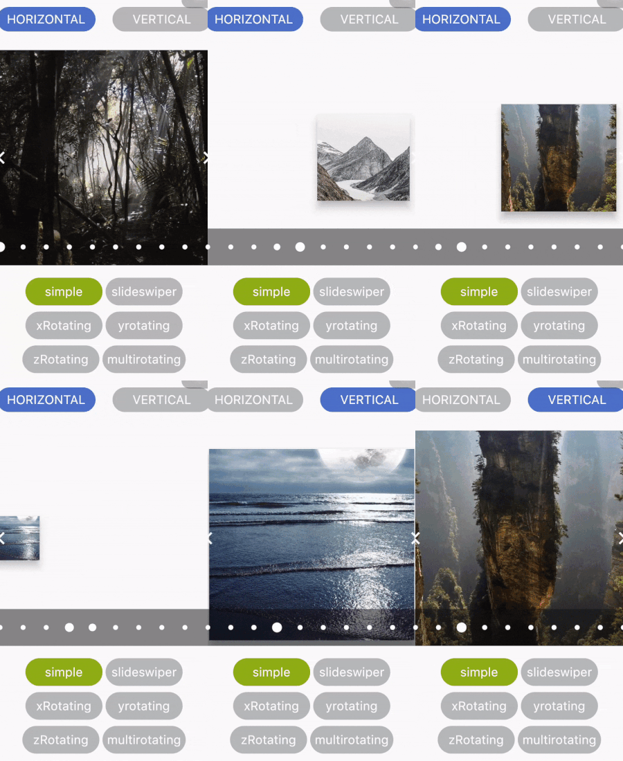 |
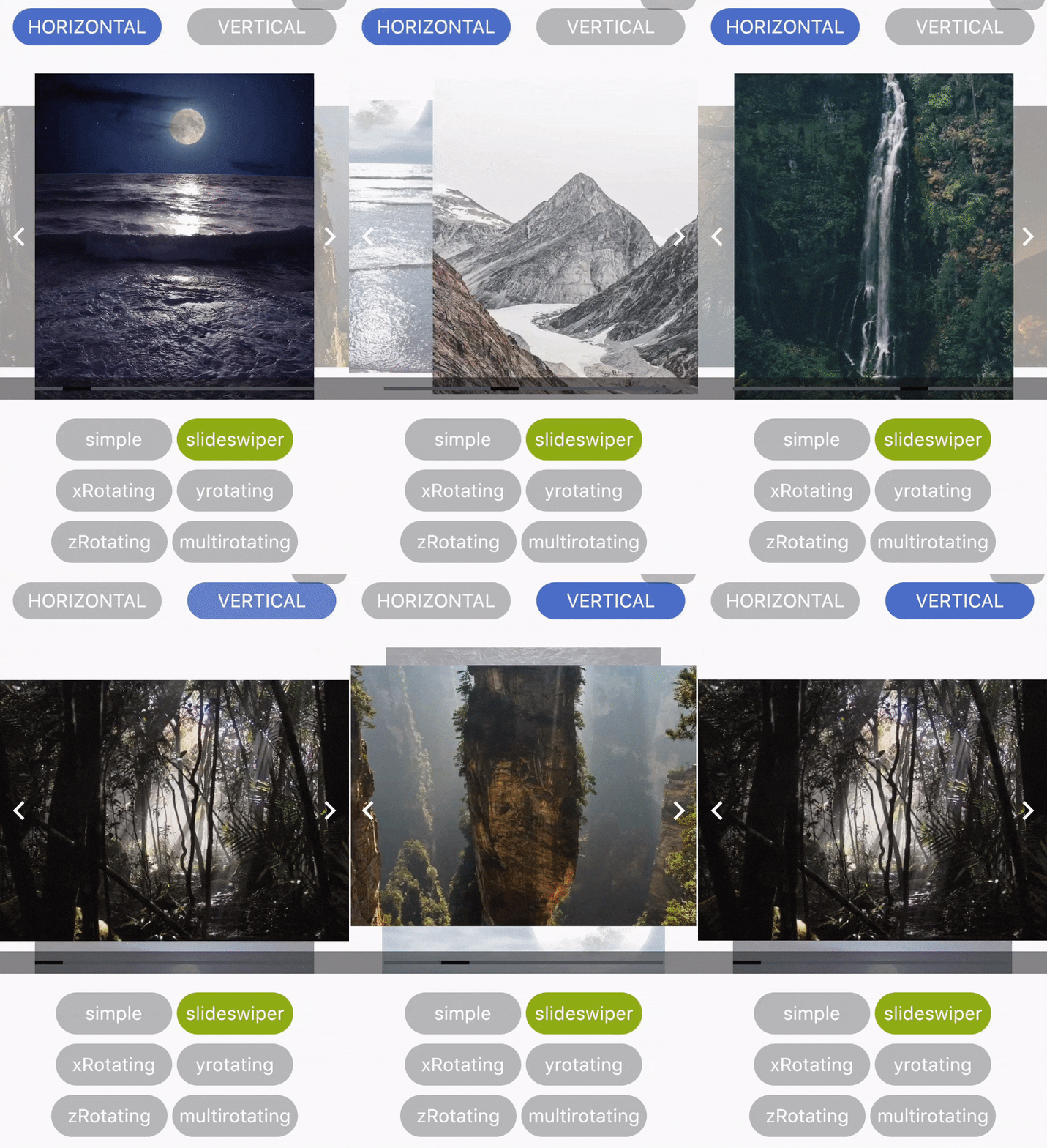 |
|---|---|
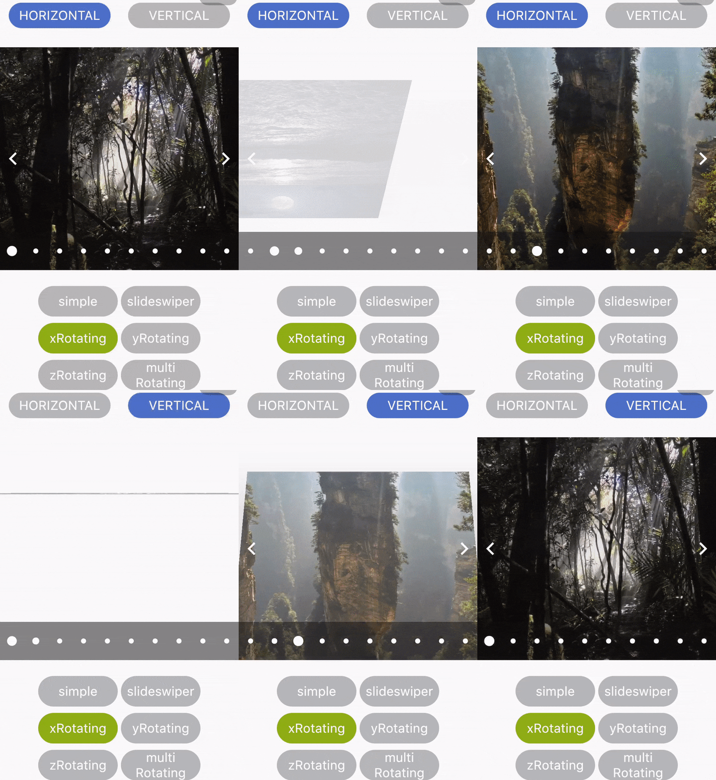 |
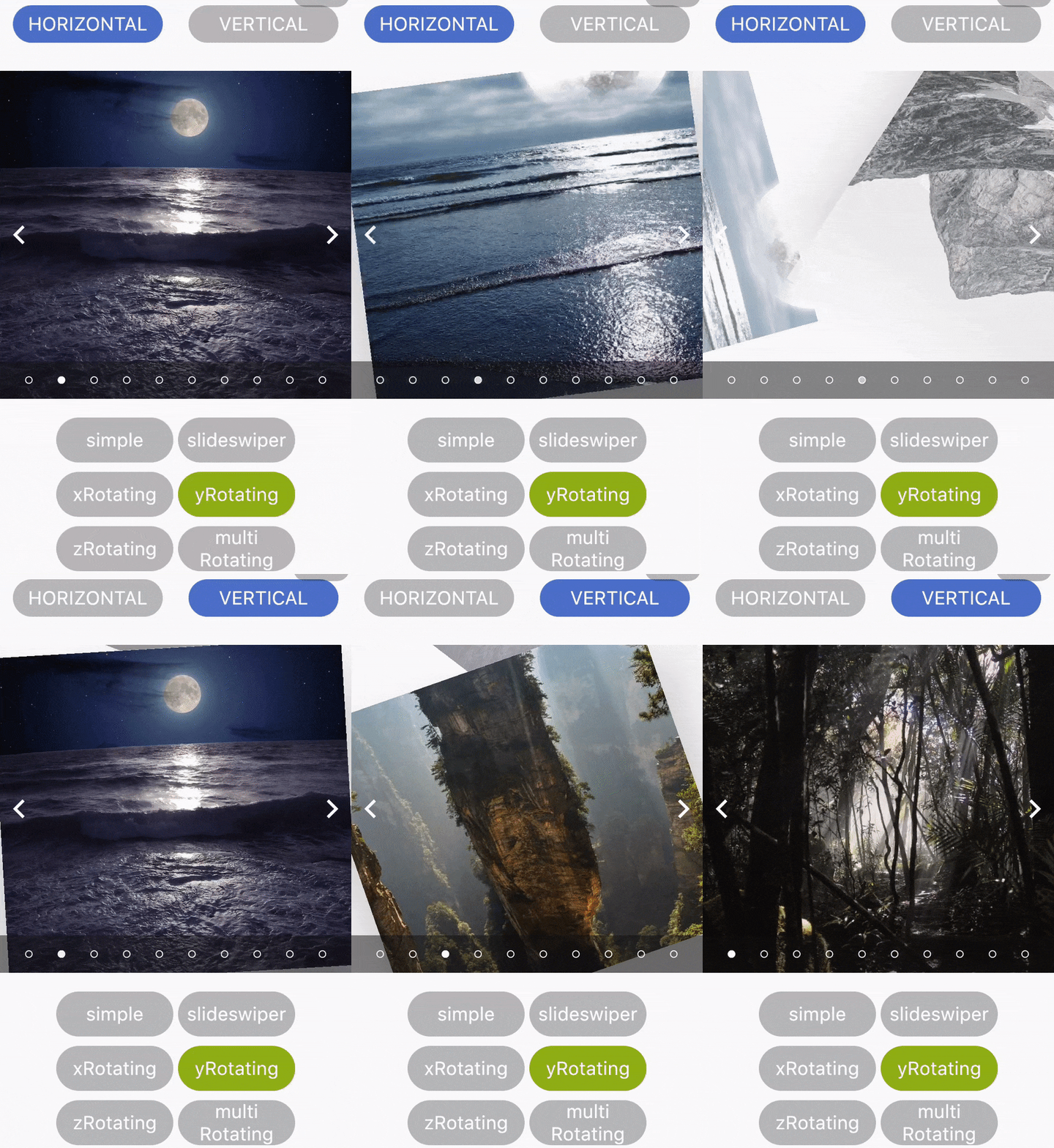 |
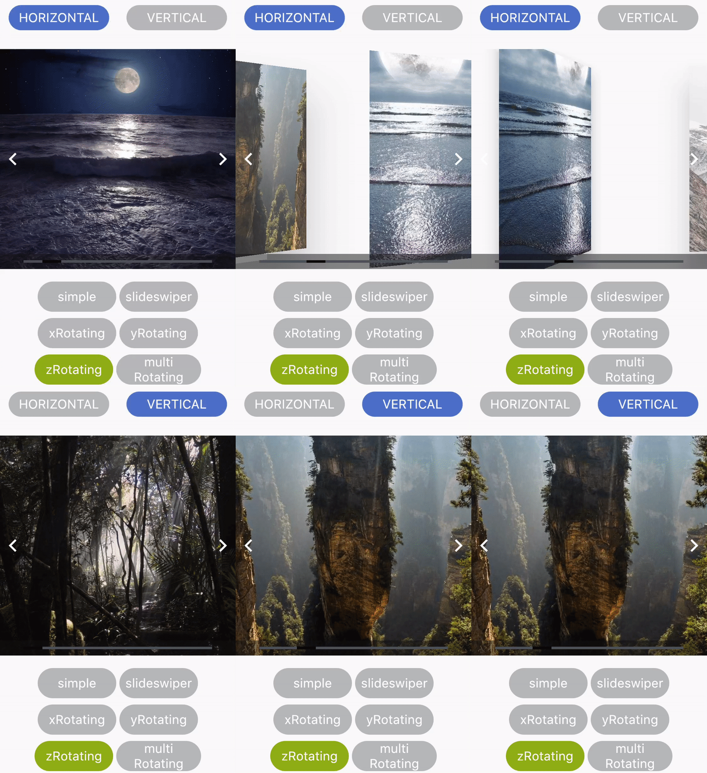 |
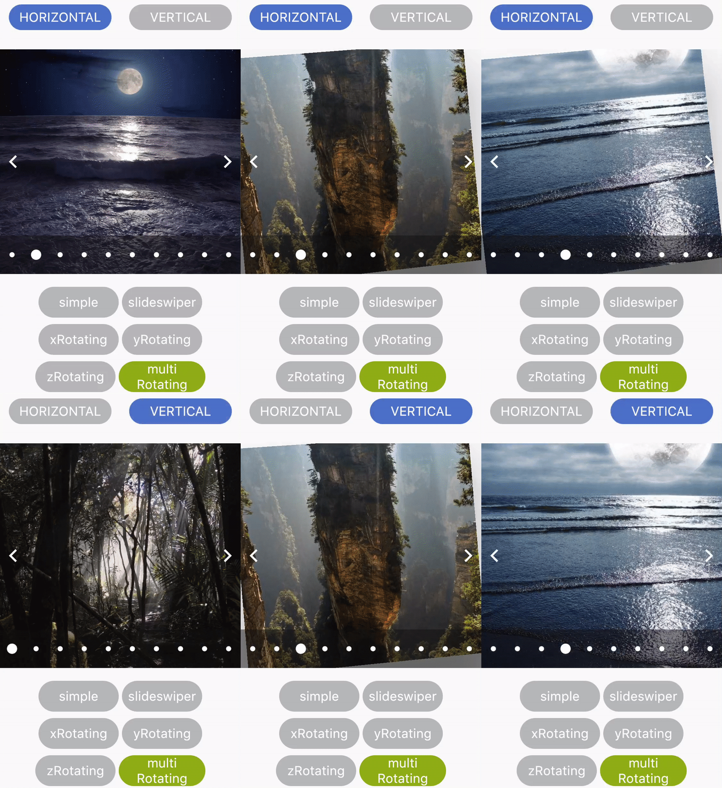 |
Developed by Shubham Jaiswal <jaiswal.shubham84@gmail.com>
Feel free to Contribute!
For help getting started with Flutter, view our online documentation.
依赖清单 2 项
{"sdk":"flutter"}{"sdk":"flutter"}先按使用场景筛选,再比较项目活跃情况,最后到原始仓库核对使用要求。
“A repository is the most basic element of GitHub.”
GitHub Docs — About repositories ↗