
 v3.2.0
groovin_widgets
一个包含 GroovinChip 创建和编辑的自定义小部件的 Flutter 小部件库。
80喜欢 545近 30 天下载150Pub 分数
AndroidiOSWebmacOSWindowsLinux
一个包含 GroovinChip 创建的组件的 Flutter 包。

{"sdk":"flutter"}^2.0.3{"sdk":"flutter"}以下为英文项目原文快照,最新内容请访问 GitHub。
A Flutter package containing widgets and utilities created and edited by GroovinChip.
This package currently contains the following widgets:
This package also contains the following utilities:
HexColor class, which returns a Color based on a hex value StringtextLuminance function, which helps determine the color of a Text based on a given background colorprintFormattedJson function, which prints nicely formatted JSON to the consoleSample image:
Alt Text
Full image gallery: https://imgur.com/gallery/zf6NriP
YouTube video walkthrough: https://www.youtube.com/watch?v=VF-zR9ougi8&feature=youtu.be
Every aspect of the drawer handle can be customized:
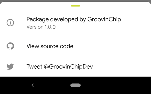
The recommended use of this widget is within the showModalBottomSheet builder.
The ideal use in this case is to return a Container that returns a Column, and the ModalDrawerHandle widget should be the first widget in the Column. I personally wrap the ModalDrawerHandle with a Padding that has a const EdgeInsets.all(8.0). Below is an example of this:
showModalBottomSheet(
  context: context,
  shape: RoundedRectangleBorder(
    borderRadius: BorderRadius.only(
      topLeft: Radius.circular(8),
      topRight: Radius.circular(8),
    ),
  ),
  builder: (builder) {
    return Container(
	  child: Column(
	    mainAxisSize: MainAxisSize.min,
	    children: <Widget>[
		  Padding(
		    padding: const EdgeInsets.all(8.0),
		    child: ModalDrawerHandle(),
		  ),
	    ],
	  ),
    );
  },
);
By default, the ModalDrawerHandle is initialized with the following properties:
  ModalDrawerHandle({
    this.handleRowAlignment = MainAxisAlignment.center,
    this.handleHeight = 5.0,
    this.handleWidth = 25.0,
    Color handleColor,
    this.handleBorderRadius = const BorderRadius.all(Radius.circular(10.0))
  }):
     this.handleColor = handleColor ?? Colors.grey[300];
As such, developers can pass in any or all of their own custom values to the constructor as they choose.
By default, OutlineDropdownButton is initialized with the following properties:
  OutlineDropdownButton({
    this.inputDecoration = const InputDecoration(
      border: OutlineInputBorder(),
      contentPadding: EdgeInsets.all(8.0),
    ),
    this.disabledHint,
    this.elevation = 8, // the default value per the source
    this.hint,
    this.iconSize = 24.0, // the default value per the source
    this.isDense = false, // the default value per the source
    this.isExpanded = true, // here I deviate from the source because this property is great
    this.items,
    this.onChanged,
    this.style,
    this.value,
  });
A default OutlineDropdownButton will look as follows:
Alt Text
final List<DropdownMenuItem<T>> items;
final ValueChanged<T> onChanged;
final FormFieldValidator<T> validator;
final FormFieldSetter<T> onSaved;
This widget builds the InputDecoration explicitly in the widget rather than the constructor due to form validation limitations. However, the decoration is open for customization.
ExpansionTile builds a ListTile for the user to tap on; GroovinExpansionTile builds a custom ListTile so that you can add a subtitle and adjust the border radius of the InkWell the tile is contained in.
As of version 1.2.1 of this library, this widget's default trailing icon will have a set color of
Colors.grey. This icon color is open to customization via the parameter defaultTrailingIconColor.
Example images:
An example of what this looks like is as follows, taken from the example project included in this repository:
Alt text
This widget operates as a Scaffold who's body is a Column with two Flexible widgets to represent the header and the body. Various Scaffold properties are exposed to the developer. If you would like more of the Scaffold properties opened up to customization, please file an issue on GitHub and send me an additional email or tweet.
The widget contains the following properties:
/// Represents the flex property of the Flexible containing the header widget. Defaults to 1.
final int headerFlex;
/// Represents the Widget that will be used as the header
final Widget header;
/// Represents the color for the header widget
final Color headerColor;
/// Represents the flex property of the Flexible containing the body widget. Defaults to 4.
final int bodyFlex;
/// Represents the Widget that will be used as the body
final Widget body;
/// Represents the corner radius for the top left corner of the body
final double topLeftCornerRadius;
/// Represents the corner radius for the top right corner of the body
final double topRightCornerRadius;
/// Represents the color for the body widget
final Color bodyColor;
/// The Scaffold appBar is available for optional use.
final AppBar appBar;
/// The Scaffold FloatingActionButton is available for optional use.
final FloatingActionButton floatingActionButton;
/// The Scaffold FloatingActionButtonLocation is available for optional use.
final FloatingActionButtonLocation floatingActionButtonLocation;
/// The Scaffold BottomNavigationBar is available for optional use.
final BottomNavigationBar bottomNavigationBar;
Screenshots: Alt text Alt text
Example usage:
ScrollControllerBuilder(
  builder: (context, controller) => ListView(
    controller: controller,
    children: [
      Text('Example),
    ],
  ),
),