
 v0.0.4
dashboard
动态仪表板小部件,允许您的用户创建自己的布局。支持调整大小、移动、间接调整大小/移动以及自动重新布局。
230喜欢 2600近 30 天下载150Pub 分数
AndroidiOSWebmacOSWindowsLinux
动态仪表板小部件,允许您的用户创建自己的布局。支持调整大小、移动、间接调整大小/移动和自动重新布局。

{"sdk":"flutter"}{"sdk":"flutter"}^3.0.1以下为英文项目原文快照,最新内容请访问 GitHub。
Dynamic dashboard widget that allows your users to create their own layouts. Rezise, move, indirect resize/move, auto re-layout are supported.
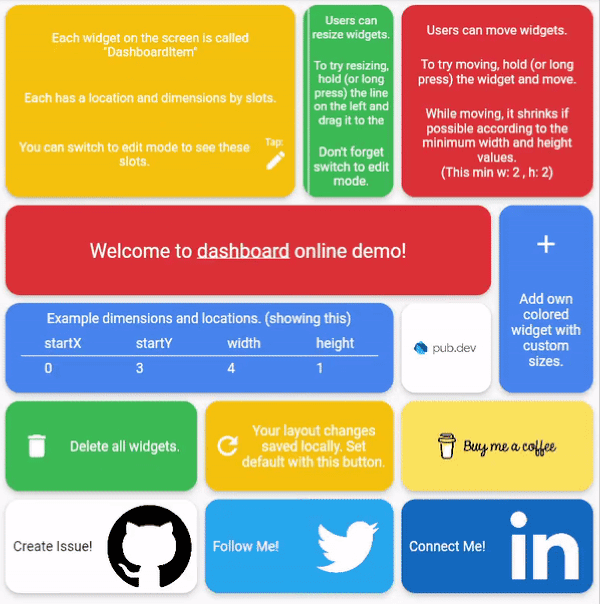
Dashboard can be thought of as a dynamic grid. Your users can create their own layouts, add new widgets or remove widgets.
Layout divides the screen into horizontal slots according to the entered value. The aspect ratio of the slots also determine their height. Widgets called DashboardItem are placed in these slots. This layout can be changed later.
https://github.com/Mehmetyaz/dashboard/blob/master/documentation/slots.png?raw=trueDashboard Items can be resized both by long pressing on mobile and by holding and moving on desktop/browser.
Dashboard Item locations can be changed by long pressing on mobile or by holding and pulling on desktop/browser.
With dynamic slot count, you can re-layout window size changes.
https://github.com/Mehmetyaz/dashboard/blob/master/documentation/re-layout.gif?raw=true>
The layout information of the users can be stored in the database or on the local disk.
Define your storage delegate.
class MyItemStorage extends DashboardItemStorageDelegate {

  @override
  FutureOr<List<DashboardItem>> getAllItems(int slotCount) {
    // return items from db.
  }

  @override
  FutureOr<void> onItemsUpdated(
      List<DashboardItem> items, int slotCount) {
      // save new layouts to db.
  }
  //[...]
}
And use it.
DashboardItemController.withDelegate(
    itemStorageDelegate: MyItemsStorage())
Dashboard(
  dashboardItemController: itemController,
  itemBuilder: (item) {
	//return widget
  },
);
Items can come from the database, or can be defined as fixed.
Fixed:
DashboardItemController(items: [
  DashboardItem(width: 2, height: 3, identifier: "id_1"),
  DashboardItem(
      startX: 3, startY: 4, width: 3, height: 1, identifier: "id_2"),
]);
Or with delegate:
DashboardItemController<ADashboardItemImp>.withDelegate(
    itemStorageDelegate: MyItemStorage())
The Builder is invoked with a DashboardItem and returns a widget.
Dashboard(
  dashboardItemController: itemController,
  itemBuilder: (item) {
	return Text(item.identifier);
  },
);
Each item is wrapped with a Material widget. You can enter the parameters of the Material widget with item style.
All is optional.
ItemStyle(
  color: Colors.red,
  borderRadius: BorderRadius.circular(10),
  shape: const RoundedRectangleBorder(),
  shadowColor: Colors.black,
  animationDuration: const Duration(milliseconds: 200),
  borderOnForeground: false,
  clipBehavior: Clip.antiAliasWithSaveLayer,
  elevation: 10,
  textStyle: const TextStyle(color: Colors.black),
  type: MaterialType.card
);
Slide to top items initially. Auto relayout places items to top as possible.
slideToTop: true
Before:
https://github.com/Mehmetyaz/dashboard/blob/master/documentation/before.png?raw=true>
After:
https://github.com/Mehmetyaz/dashboard/blob/master/documentation/after.png?raw=true>
Shrink items when re-layout or editing is possible.
See code comments for edit mode settings parameters.
All is optional.
    EditModeSettings(

        // animation settings
        curve: Curves.easeInOutCirc,
        duration: const Duration(milliseconds: 200),

        // fill editing item actual size
        fillEditingBackground: true,

        // space that can be held to resize
        resizeCursorSide: 20,

        // draw lines for slots
        paintBackgroundLines: true,

        // shrink items when editing if possible and necessary
        shrinkOnMove: true,

        // long press to edit
        longPressEnabled: true,

        // pan to edit
        panEnabled: true,

        backgroundStyle: const EditModeBackgroundStyle(
            fillColor: Colors.red,
            lineWidth: 1.5,
            lineColor: Colors.black,

            // line by vertical space
            dualLineHorizontal: true,

            // line by horizontal space
            dualLineVertical: true));
TODO