
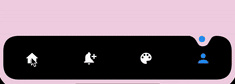
 v0.0.2
dot_curved_bottom_nav
令人惊叹的动画曲线形状环绕指示器导航栏。可调节颜色、背景颜色、动画曲线和动画持续时间。
51喜欢 91近 30 天下载150Pub 分数
AndroidiOSWebmacOSWindowsLinux
为 Flutter 构建的自定义底部导航包,具有惊艳的动画效果,并支持自定义颜色、动画速度等更多选项。

{"sdk":"flutter"}{"sdk":"flutter"}^2.0.0以下为英文项目原文快照,最新内容请访问 GitHub。
Preview
Add the dependency at pubspec.yaml:
dependencies:
  dot_curved_bottom_nav: ^0.0.1
bottomNavigationBar: DotCurvedBottomNav(
    scrollController: _scrollController,
    hideOnScroll: true,
    indicatorColor: Colors.blue,
    backgroundColor: Colors.black,
    animationDuration: const Duration(milliseconds: 300),
    animationCurve: Curves.ease,
    selectedIndex: _currentPage,
    indicatorSize: 5,
    borderRadius: 25,
    height: 70,
    onTap: (index) {
    setState(() => _currentPage = index);
    },
    items: [
    Icon(
        Icons.home,
        color: _currentPage == 0 ? Colors.blue : Colors.white,
    ),
    Icon(
        Icons.notification_add,
        color: _currentPage == 1 ? Colors.blue : Colors.white,
    ),
    Icon(
        Icons.color_lens,
        color: _currentPage == 2 ? Colors.blue : Colors.white,
    ),
    Icon(
        Icons.person,
        color: _currentPage == 3 ? Colors.blue : Colors.white,
    ),
    ],
),
| Property | Description |
|---|---|
| scrollController | Used to listen when the user scrolls and hides the bottom navigation |
| hideOnScroll | Used to enable or disable hide on scroll behavior. (NOTE: scrollController must be provided when hideOnScroll is TRUE) |
| indicatorColor | Color of the indicator displayed on currently selected item |
| backgroundColor | Configures the background color of the bottom navigation |
| animationDuration | Configures animation duration of hiding and indicator movement between items |
| animationCurve | Configures curve of the animation of indicator movement and hide on scroll animation |
| selectedIndex | Configures currently selected item / page |
| indicatorSize | Configures the size of indicator displayed on top of the item |
| borderRadius | Configures border radius of border DotCurvedBottomNav |
| height | Configures height of DotCurvedBottomNav |
| onTap | Configures callback function that is invoked whenever user taps on an item |
| items | Configures list of items of bottom nav |
Feel free to create an issue if you find a bug or if you need new features. Of course PRs are welcome!
If you want to connect with me on LinkedIn: Muzammil Hussain