
 v1.0.0+2
stick_it
flutter_simple_sticker_view 的空安全分支。添加了文档和可选的贴纸旋转功能。
21喜欢 1近 30 天下载140Pub 分数
AndroidiOSWebmacOSWindowsLinux
flutter_simple_sticker_view 的空安全分支。在另一张图像上附加贴纸。贴纸可以应用、删除、移动、缩放,现在还可以旋转。将您创建的组合导出为图像。此包支持空安全,并附带更好的文档。

{"sdk":"flutter"}^2.1.0{"sdk":"flutter"}以下为英文项目原文快照,最新内容请访问 GitHub。
Stick It is a fork of flutter_simple_sticker_view.
Attach stickers on another image. Stickers can be moved, scaled and now also rotated. Export your created composition as image. This package supports null safety and comes with better documentation.
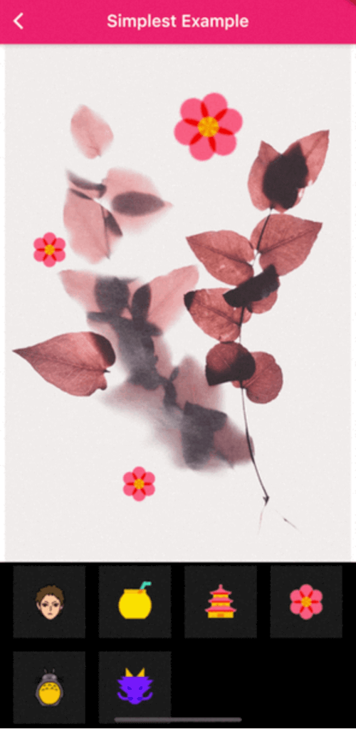
Simplest Example Advanced Example
Add stick_it as a dependency in your pubspec.yaml file. You can also check the installing page. Check out the example page for an advanced example with background image picker, image export, image save and custom settings.
Import the library via
import 'package:stick_it/stick_it.dart';
import 'package:flutter/material.dart';
import 'package:stick_it/stick_it.dart';

class SimplestExample extends StatelessWidget {
  const SimplestExample({Key? key}) : super(key: key);
  static String routeName = 'simplest-example';
  static String routeTitle = 'Simplest Example';
  final String _background =
      'https://images.unsplash.com/photo-1545147986-a9d6f2ab03b5?ixid=MnwxMjA3fDB8MHxwaG90by1wYWdlfHx8fGVufDB8fHx8&ixlib=rb-1.2.1&auto=format&fit=crop&w=934&q=80';

  @override
  Widget build(BuildContext context) {
    return Scaffold(
      appBar: AppBar(
        title: Text(routeTitle),
      ),
      body: StickIt(
        /// The [StickIt] Class only requires two named parameters.
        ///
        /// [Widget] child - the child that the stickers should be placed upon.
        /// [List<Image>] stickerList - the list of stickers available to the user.
        ///
        /// StickIt supports a lot of styling related optional named parameters,
        /// that you can change and check out in the AdvancedExample. (tbd)
        child: Image.network(_background),
        stickerList: [
          Image.asset('assets/icons8-anubis-48.png'),
          Image.asset('assets/icons8-bt21-shooky-48.png'),
          Image.asset('assets/icons8-fire-48.png'),
          Image.asset('assets/icons8-jake-48.png'),
          Image.asset('assets/icons8-keiji-akaashi-48.png'),
          Image.asset('assets/icons8-mate-48.png'),
          Image.asset('assets/icons8-pagoda-48.png'),
          Image.asset('assets/icons8-spring-48.png'),
          Image.asset('assets/icons8-totoro-48.png'),
          Image.asset('assets/icons8-year-of-dragon-48.png'),
        ],
      ),
    );
  }
}
| named parameter | type | required | default | description |
|---|---|---|---|---|
| child | Widget | yes | Content you wish to place stickers upon | |
| stickerList | List < Image > | yes | List of sticker images that should be shown within the bottom panel. Those can be placed on top of your child Widget. | |
| devicePixelRatio | double | no | 3.0 | The devices pixel ratio. See also: https://stackoverflow.com/questions/8785643/what-exactly-is-device-pixel-ratio |
| panelBackgroundColor | Color | no | Colors.black | Background color of the bottom panel. |
| panelHeight | double | no | 200.0 | Height of the bottom panel. |
| panelStickerBackgroundColor | Color | no | Colors.white10 | Background color of the container stickers are placed within. |
| panelStickerCrossAxisCount | int | no | 4 | Defines how many stickers are placed within one row of the grid. |
| panelStickerAspectRatio | double | no | 1.0 | Ratio of the cross-axis to the main-axis extent of each child. |
| stickerMaxScale | double | no | 2.0 | Maximal scaling ratio for your stickers. E.g 2 will allow the sticker to be twice as big! |
| stickerMinScale | double | no | 0.5 | Minimal scaling ratio for your stickers.E.g 0.5 will allow the sticker to be half as big at minimum! |
| stickerRotatable | bool | no | true | Controls whether your stickers should be rotatable, while the scaling event is active.Set to false, if you don't want rotation. |
| stickerSize | double | no | 100.0 | Size of the [Rect] the stickers are on when placed within the [Stack]. Setting this value up will only increase the [Rect] size. So, to display them bigger when placing on the [child] you will have to set something like fit: Boxfit.cover on the image you are providing in the [stickerList]. |
| viewPort | Size | no | Size(constraints.maxWidth, constraints.maxHeight) | [Size] of the viewport that is provided.You don't have to set this manually, it will take the available space per default. |
| function name | returns | description |
|---|---|---|
| exportImage() | Future | Creates an [Uint8List] out of your composition, that you can use to save as [Image].Before that it will clear all selections, so they don't appear on the new creation. |