
 v4.3.2
info_popup
在您选择的控件上向用户显示一些信息的简单方法。
165喜欢 2.8万近 30 天下载150Pub 分数
AndroidiOSWebmacOSWindowsLinux
它允许您在包装的 widget 上轻松显示一个简单且可自定义的弹出窗口。

{"sdk":"flutter"}{"path":"example"}^1.0.0{"sdk":"flutter"}以下为英文项目原文快照,最新内容请访问 GitHub。
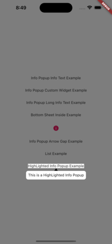
The info_popup package allows you to easily show a simple, customizable popup on your wrapped widget. The highlight feature, which can be activated at will, helps draw the user's attention to the desired location.
You can test it now on the Info Popup preview page. Note that the website experience may be different.
MainPresentation HighlightExample
To use this package, add info_popup as a dependency in your pubspec.yaml file.
dependencies:
  info_popup: ^3.0.0
Alternatively, you can add it to your project by running the following commands in your terminal:
with Dart:
$ dart pub add info_popup
with Flutter:
$ flutter pub add info_popup
To show a popup, wrap the widget that you want to display the popup on with the InfoPopupWidget widget. All you have to do is wrap it in the widget you want to show information with the InfoPopupWidget widget. With the InfoPopupController, you can customize it as you wish, and turn it on and off.
import 'package:info_popup/info_popup.dart';
	InfoPopupWidget(
		contentTitle: 'Info Popup Details',
		child: Icon(
			Icons.info,
			color: Colors.pink,
		),
	),
This is a normal info text displayed using the InfoPopupWidget widget with several optional parameters.
              InfoPopupWidget(
                contentTitle: 'Info Popup Details',
                arrowTheme: InfoPopupArrowTheme(
                  color: Colors.pink,
                  arrowDirection: ArrowDirection.up,
                ),
                contentTheme: InfoPopupContentTheme(
                  infoContainerBackgroundColor: Colors.black,
                  infoTextStyle: TextStyle(color: Colors.white),
                  contentPadding: const EdgeInsets.all(8),
                  contentBorderRadius: BorderRadius.all(Radius.circular(10)),
                  infoTextAlign: TextAlign.center,
                ),
                dismissTriggerBehavior: PopupDismissTriggerBehavior.onTapArea,
                areaBackgroundColor: Colors.transparent,
                indicatorOffset: Offset.zero,
                contentOffset: Offset.zero,
                onControllerCreated: (controller) {
                  print('Info Popup Controller Created');
                },
                onAreaPressed: (InfoPopupController controller) {
                  print('Area Pressed');
                },
                infoPopupDismissed: () {
                  print('Info Popup Dismissed');
                },
                onLayoutMounted: (Size size) {
                  print('Info Popup Layout Mounted');
                },
                child: Icon(
                  Icons.info,
                  color: Colors.pink,
                ),
              ),
"This is a custom popup example created using the InfoPopupWidget widget.
              InfoPopupWidget(
                customContent: Container(
                  decoration: BoxDecoration(
                    color: Colors.blueGrey,
                    borderRadius: BorderRadius.circular(10),
                  ),
                  padding: const EdgeInsets.all(10),
                  child: Column(
                    children: const <Widget>[
                      TextField(
                        decoration: InputDecoration(
                          hintText: 'Enter your name',
                          hintStyle: TextStyle(color: Colors.white),
                          enabledBorder: OutlineInputBorder(
                            borderSide: BorderSide(color: Colors.white),
                          ),
                        ),
                      ),
                      SizedBox(height: 10),
                      Center(
                        child: Text(
                          'Example of Info Popup inside a Bottom Sheet',
                          style: TextStyle(
                            color: Colors.white,
                          ),
                        ),
                      ),
                    ],
                  ),
                ),
                arrowTheme: const InfoPopupArrowTheme(
                  color: Colors.pink,
                  arrowDirection: ArrowDirection.up,
                ),
                dismissTriggerBehavior: PopupDismissTriggerBehavior.onTapArea,
                areaBackgroundColor: Colors.transparent,
                indicatorOffset: Offset.zero,
                contentOffset: Offset.zero,
                onControllerCreated: (controller) {
                  print('Info Popup Controller Created');
                },
                onAreaPressed: (InfoPopupController controller) {
                  print('Area Pressed');
                },
                infoPopupDismissed: () {
                  print('Info Popup Dismissed');
                },
                onLayoutMounted: (Size size) {
                  print('Info Popup Layout Mounted');
                },
                child: Icon(
                  Icons.info,
                  color: Colors.pink,
                ),
              ),
The info_popup package provides a simple and effective way to show a customizable popup on your wrapped widget. With the highlight feature, you can draw the user's attention to the desired location.
This project is licensed under the MIT License - see the LICENSE file for details.