

 v1.0.2
iconify_design
一个 Flutter 包,可让您轻松使用来自 iconify.design API 的图标。
22喜欢 1260近 30 天下载160Pub 分数
AndroidiOSWebmacOSWindowsLinux
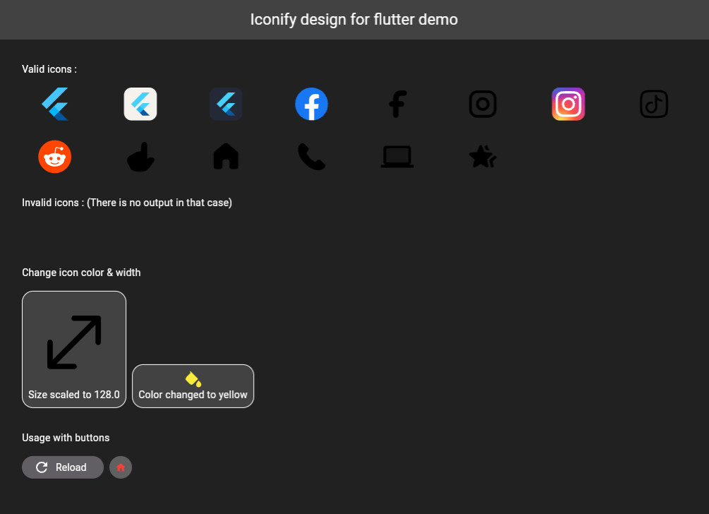
一个 Flutter 包,可轻松使用来自 Iconify.design API 的图标。此包提供了一个名为 IconifyIcon 的小部件,它接受一个图标字符串,并可选择指定图标的大小和颜色。

以下为英文项目原文快照,最新内容请访问 GitHub。
A Flutter package that allows you to use icons from the Iconify.design API with ease. This package provides a widget called IconifyIcon that takes an icon string and optionally allows you to specify the size, color, placeholder, and error widget of the icon.

Add the following to your pubspec.yaml file:
dependencies:
  iconify_design: ^1.0.2
Then run:
flutter pub get
import 'package:iconify_design/iconify_design.dart';
import 'package:flutter/material.dart';
Here is an example of how to use the IconifyIcon widget:
import 'package:flutter/material.dart';
import 'package:iconify_design/iconify_design.dart';

void main() {
  runApp(MyApp());
}

class MyApp extends StatelessWidget {
  @override
  Widget build(BuildContext context) {
    return MaterialApp(
      home: Scaffold(
        appBar: AppBar(
          title: Text('Iconify Flutter Example'),
        ),
        body: Center(
          child: IconifyIcon(
            icon: 'mdi:home',
            size: 48.0,
            color: Colors.blue,
            placeholder: CircularProgressIndicator(),
            errorWidget: Icon(
              Icons.error_outline,
              color: Colors.red,
            ),
          ),
        ),
      ),
    );
  }
}
The IconifyIcon widget has the following parameters:
null also falls back to Black.You can customize the loading and error states:
IconifyIcon(
  icon: 'mdi:home',
  placeholder: const SizedBox(
    width: 24,
    height: 24,
    child: CircularProgressIndicator(strokeWidth: 2),
  ),
  errorWidget: const Icon(
    Icons.error_outline,
    color: Colors.red,
  ),
)
Feel free to open issues or submit pull requests to help improve this package.
This project is licensed under the MIT License - see the LICENSE file for details.
Don't forget to support (if you can).

依赖清单 7 项
^2.2.3^0.10.1^2.0.10+1^5.5.0+1{"sdk":"flutter"}{"sdk":"flutter"}^2.0.0先按使用场景筛选,再比较项目活跃情况,最后到原始仓库核对使用要求。
“A repository is the most basic element of GitHub.”
GitHub Docs — About repositories ↗