


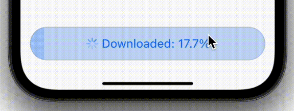
 v2.0.0-beta.1+2
async_button
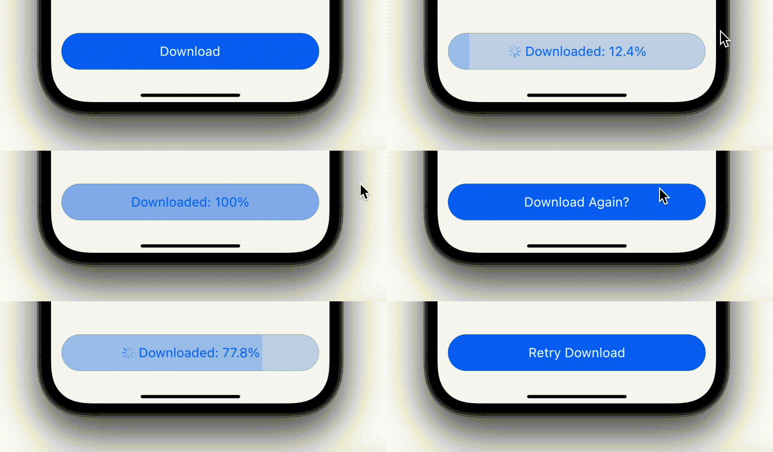
用于异步 onPressed 函数的自定义按钮。支持在 [空闲]、[加载中]、[成功] 和 [失败] 按钮状态之间无缝切换动画。
33喜欢 13近 30 天下载150Pub 分数
AndroidiOSWebmacOSWindowsLinux
用于异步 onPressed 函数的自定义按钮。支持在 [空闲]、[加载中]、[成功] 和 [失败] 按钮状态之间无缝切换动画。
以下为英文项目原文快照,最新内容请访问 GitHub。
Buttons get boring when there is an asynchronous onTap function involved. Users don't get to see if or when the onTap function has finished execution, or if it has even finished sucessfully. To put it simply, this project aims to make them a little un-boring.
This project provides you with the same buttons that you are used to, just with some modifications under the hood. You can manipulate the button state based on whether the onTap function is idle, loading or has finished loading(successfully or unsuccessfully).
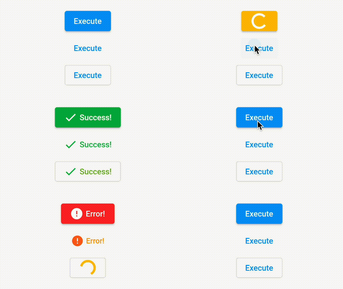
This project provides you with 3 types of buttons. Let's list them below with an example.
Just like ElevatedButton, but for async onPressed
AsyncBtnStatesController btnStateController = AsyncBtnStatesController();

AsyncElevatedBtn(
  asyncBtnStatesController: btnStateController,
  onPressed: () async {
    btnStateController.update(AsyncBtnState.loading);
    try {
      // Await your api call here
      await Future.delayed(const Duration(seconds: 2));
      btnStateController.update(AsyncBtnState.success);
    } catch (e) {
      btnStateController.update(AsyncBtnState.failure);
    }
  },
  // * It is NOT mandatory to define [loadingStyle, successStyle, failureStyle]
  // * if you don't need it.

  // This should ideally be the button's loading state indicator.
  // If [style] or [widget] properties are not defined, we consider the button's
  // corresponding default [style] and [child] property
  loadingStyle: AsyncBtnStateStyle(
    style: ElevatedButton.styleFrom(
      backgroundColor: Colors.amber,
    ),
    widget: const SizedBox.square(
      dimension: 24,
      child: CircularProgressIndicator(
        color: Colors.white,
      ),
    ),
  ),

  // This should ideally be the button's success state indicator.
  // If [style] or [widget] properties are not defined, we consider the button's
  // corresponding default [style] and [child] property
  successStyle: AsyncBtnStateStyle(
    style: ElevatedButton.styleFrom(
      backgroundColor: Colors.green,
      foregroundColor: Colors.white,
    ),
    widget: Row(
      mainAxisSize: MainAxisSize.min,
      children: const [
        Icon(Icons.check),
        SizedBox(width: 4),
        Text('Success!')
      ],
    ),
  ),

  // This should ideally be the button's failure state indicator.
  // If [style] or [widget] properties are not defined, we consider the button's
  // corresponding default [style] and [child] property
  failureStyle: AsyncBtnStateStyle(
    style: ElevatedButton.styleFrom(
      backgroundColor: Colors.red,
      foregroundColor: Colors.white,
    ),
    widget: Row(
      mainAxisSize: MainAxisSize.min,
      children: const [
        Icon(Icons.error),
        SizedBox(width: 4),
        Text('Error!'),
      ],
    ),
  ),
  child: const Text('Execute'),
);
Too much? We have created a custom constructor that uses the exact values for loadingStyle, successStyle and failureStyle as above
AsyncBtnStatesController btnStateController = AsyncBtnStatesController();

AsyncElevatedBtn.withDefaultStyles(
  asyncBtnStatesController: btnStateController,
  onPressed: () async {
    btnStateController.update(AsyncBtnState.loading);
    try {
      // Await your api call here
      await Future.delayed(const Duration(seconds: 2));
      btnStateController.update(AsyncBtnState.success);
    } catch (e) {
      btnStateController.update(AsyncBtnState.failure);
    }
  },
  child: const Text('Execute'),
);
And this is our version of async TextButton
AsyncBtnStatesController btnStateController = AsyncBtnStatesController();

AsyncTextBtn(
  asyncBtnStatesController: btnStateController,
  onPressed: () async {
    btnStateController.update(AsyncBtnState.loading);
    try {
      // Await your api call here
      await Future.delayed(const Duration(seconds: 2));
      btnStateController.update(AsyncBtnState.success);
    } catch (e) {
      btnStateController.update(AsyncBtnState.failure);
    }
  },
  // * It is NOT mandatory to define [loadingStyle, successStyle, failureStyle]
  // * if you don't need it.

  // This should ideally be the button's loading state indicator.
  // If [style] or [widget] properties are not defined, we consider the button's
  // corresponding default [style] and [child] property
  loadingStyle: AsyncBtnStateStyle(
    style: TextButton.styleFrom(
      foregroundColor: Colors.amber,
    ),
    widget: const SizedBox.square(
      dimension: 24,
      child: CircularProgressIndicator(
        color: Colors.amber,
      ),
    ),
  ),


  // This should ideally be the button's success state indicator.
  // If [style] or [widget] properties are not defined, we consider the button's
  // corresponding default [style] and [child] property
  successStyle: AsyncBtnStateStyle(
    style: TextButton.styleFrom(
      foregroundColor: Colors.green,
    ),
    widget: Row(
      mainAxisSize: MainAxisSize.min,
      children: const [
        Icon(Icons.check),
        SizedBox(width: 4),
        Text('Success!')
      ],
    ),
  ),

  // This should ideally be the button's failure state indicator.
  // If [style] or [widget] properties are not defined, we consider the button's
  // corresponding default [style] and [child] property
  failureStyle: AsyncBtnStateStyle(
    style: TextButton.styleFrom(
      foregroundColor: Colors.red,
    ),
    widget: Row(
      mainAxisSize: MainAxisSize.min,
      children: const [
        Icon(Icons.error),
        SizedBox(width: 4),
        Text('Error!')
      ],
    ),
  ),
  child: const Text('Execute'),
);
Here again, you can use the following constructor instead
AsyncBtnStatesController btnStateController = AsyncBtnStatesController();

AsyncTextBtn.withDefaultStyles(
  asyncBtnStatesController: btnStateController,
  onPressed: () async {
    btnStateController.update(AsyncBtnState.loading);
    try {
      // Await your api call here
      await Future.delayed(const Duration(seconds: 2));
      btnStateController.update(AsyncBtnState.success);
    } catch (e) {
      btnStateController.update(AsyncBtnState.failure);
    }
  },
  child: const Text('Execute'),
);
Similarly, here's one for async OutlinedButton
AsyncBtnStatesController btnStateController = AsyncBtnStatesController();

AsyncOutlinedBtn(
  asyncBtnStatesController: btnStateController,
  onPressed: () async {
    btnStateController.update(AsyncBtnState.loading);
    try {
      // Await your api call here
      await Future.delayed(const Duration(seconds: 2));
      btnStateController.update(AsyncBtnState.success);
    } catch (e) {
      btnStateController.update(AsyncBtnState.failure);
    }
  },
  // * It is NOT mandatory to define [loadingStyle, successStyle, failureStyle]
  // * if you don't need it.

  // This should ideally be the button's loading state indicator.
  // If [style] or [widget] properties are not defined, we consider the button's
  // corresponding default [style] and [child] property
  loadingStyle: AsyncBtnStateStyle(
    style: OutlinedButton.styleFrom(
      foregroundColor: Colors.amber,
    ),
    widget: const SizedBox.square(
      dimension: 24,
      child: CircularProgressIndicator(
        color: Colors.amber,
      ),
    ),
  ),

  // This should ideally be the button's success state indicator.
  // If [style] or [widget] properties are not defined, we consider the button's
  // corresponding default [style] and [child] property
  successStyle: AsyncBtnStateStyle(
    style: OutlinedButton.styleFrom(
      foregroundColor: Colors.green,
    ),
    widget: Row(
      mainAxisSize: MainAxisSize.min,
      children: const [
        Icon(Icons.check),
        SizedBox(width: 4),
        Text('Success!')
      ],
    ),
  ),

  // This should ideally be the button's failure state indicator.
  // If [style] or [widget] properties are not defined, we consider the button's
  // corresponding default [style] and [child] property
  failureStyle: AsyncBtnStateStyle(
    style: OutlinedButton.styleFrom(
      foregroundColor: Colors.red,
    ),
    widget: Row(
      mainAxisSize: MainAxisSize.min,
      children: const [
        Icon(Icons.error),
        SizedBox(width: 4),
        Text('Error!')
      ],
    ),
  ),
  child: const Text('Execute'),
);
Here as well, there is an alternative constructor
AsyncBtnStatesController btnStateController = AsyncBtnStatesController();

AsyncOutlinedBtn.withDefaultStyles(
  asyncBtnStatesController: btnStateController,
  onPressed: () async {
    btnStateController.update(AsyncBtnState.loading);
    try {
      // Await your api call here
      await Future.delayed(const Duration(seconds: 2));
      btnStateController.update(AsyncBtnState.success);
    } catch (e) {
      btnStateController.update(AsyncBtnState.failure);
    }
  },
  child: const Text('Execute'),
);
All buttons also supports these arguments - styleBuilder, loadingStyleBuilder, successStyleBuilder and failureStyleBuilder which creates the custom state styles at runtime. This essentially mean that one can create unlimited number of custom state widgets and styles based on different conditions.
There are also scopes for fallback styles and widgets if none of the necessary conditions are met.
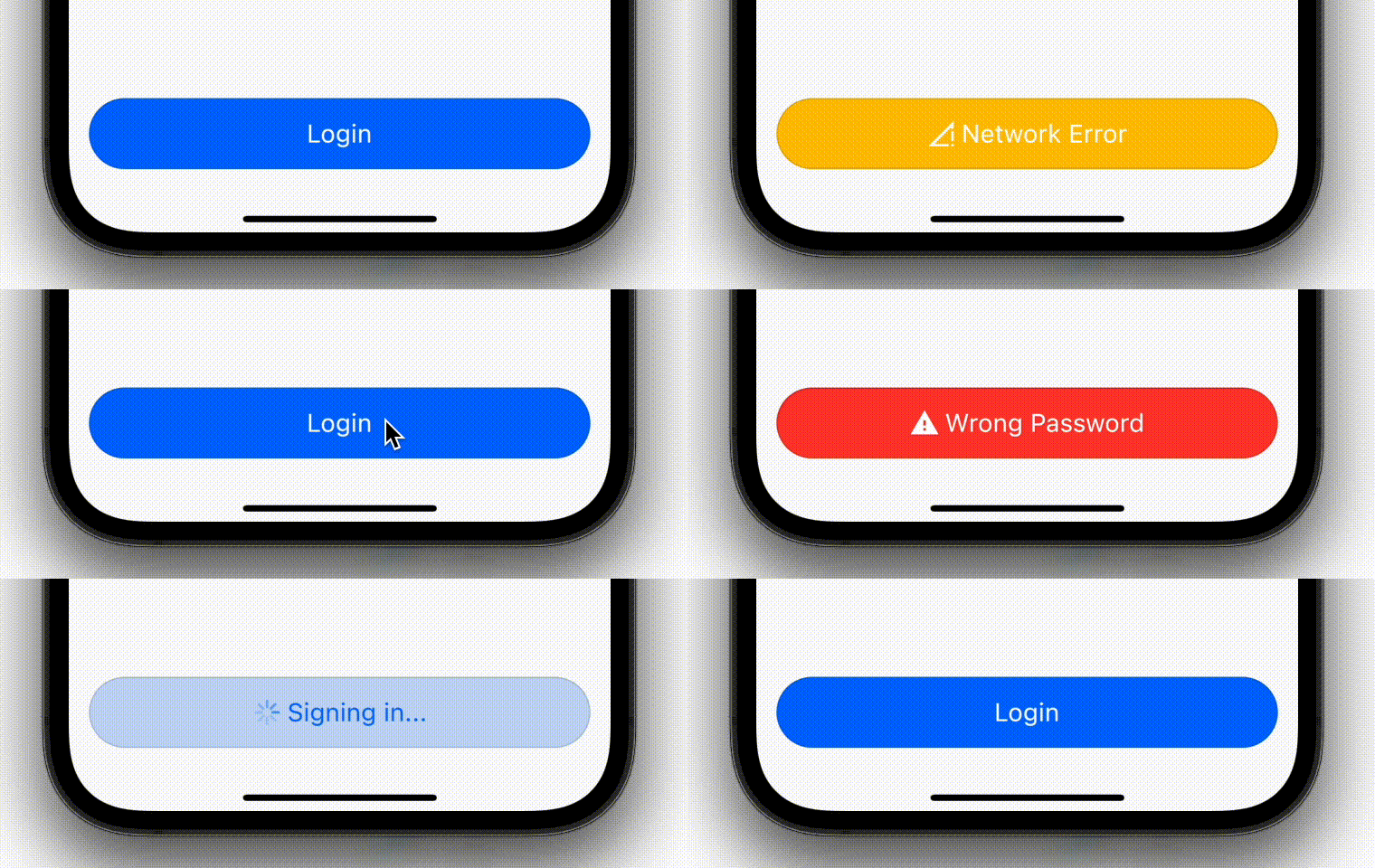
If this library doesn't cater to your requirements. Here are the some similar projects you can explore:
async_button_builder


easy_loading_button
animated_loading_button
The creator always appreciates a helping hand, so don't hesitate before creating a pull request or reporting a bug/issue.
The creator does aspire to help grow the flutter community. So if you have a question related to this project, your project, or anything flutter, connect with him over the following links. Don't worry, it's free!😉

依赖清单 3 项
{"sdk":"flutter"}{"sdk":"flutter"}^2.0.0先按使用场景筛选,再比较项目活跃情况,最后到原始仓库核对使用要求。
“A repository is the most basic element of GitHub.”
GitHub Docs — About repositories ↗