

 v3.0.0
flutter_screen_scaler
一个根据屏幕百分比缩放控件和字体大小的包,配有便捷的扩展方法(例如 `50.h`、`30.w`、`16.sp`)。
27喜欢 124近 30 天下载160Pub 分数
AndroidiOSWebmacOSWindowsLinux
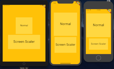
一个用于根据屏幕尺寸使用百分比来调整小部件大小的包。

以下为英文项目原文快照,最新内容请访问 GitHub。
A Flutter package to effortlessly scale widget dimensions and font sizes based on screen percentages, now with convenient extension methods like 50.h, 30.w, and 16.sp.
This package helps you create responsive UIs that adapt to various screen sizes by simplifying the process of using screen-relative dimensions.
ScreenScaler.I.ScreenScaler.init(context).value.h: Percentage of screen height.value.w: Percentage of screen width.value.sp: Responsive font size, scales linearly with screen width.getWidth() and getHeight() now provide straightforward percentage-based values.scaleWidthFrom(parentSize, percentage) and scaleHeightFrom(parentSize, percentage).EdgeInsets (padding, margins) and BorderRadius.Add this to your package's pubspec.yaml file:
dependencies:
  flutter_screen_scaler: ^3.0.0
Install packages from the command line:
flutter pub get
Import it in your Dart code:
import 'package:flutter_screen_scaler/flutter_screen_scaler.dart';
Before using any screen-relative scaling methods or extension getters (.h, .w, .sp), you must initialize the ScreenScaler with a BuildContext. This is typically done once in your app, for example, in the build method of your main app widget or a root page.
@override
Widget build(BuildContext context) {
  // Initialize the ScreenScaler
  ScreenScaler.init(context);

  return MaterialApp(
    // ... your app code
  );
}
If ScreenScaler.init(context) is not called, a debug warning will be printed, and the scaler will operate with default (potentially incorrect) screen dimensions.
Once initialized, you can use the extension methods or call methods on ScreenScaler.I.
Use the .h and .w extension getters on any num (int or double) for concise scaling.
// In your widget's build method (after ScreenScaler.init has been called elsewhere)
Container(
  height: 50.h,   // 50% of screen height
  width: 80.w,    // 80% of screen width
  color: Colors.blue,
  child: Center(child: Text('Scaled Container')),
);
Use the .sp extension getter for font sizes that scale linearly with screen width.
Text(
  'Responsive Text',
  style: TextStyle(
    fontSize: 16.sp, // Font size 16, scaled for screen width
  ),
);
You can also call methods directly on the ScreenScaler.I instance:
Container(
  height: ScreenScaler.I.getHeight(50),   // 50% of screen height
  width: ScreenScaler.I.getWidth(80),     // 80% of screen width
  child: Text(
    'More Text',
    style: TextStyle(
      fontSize: ScreenScaler.I.getResponsiveFontSize(16), // Scaled font size 16
    ),
  ),
);
To scale a widget based on its parent's dimensions, use scaleWidthFrom or scaleHeightFrom within a LayoutBuilder.
LayoutBuilder(
  builder: (BuildContext context, BoxConstraints constraints) {
    Size parentSize = constraints.biggest; // Get parent's size

    return Container(
      width: ScreenScaler.I.scaleWidthFrom(parentSize, 50), // 50% of parent's width
      height: ScreenScaler.I.scaleHeightFrom(parentSize, 30), // 30% of parent's height
      color: Colors.green,
      child: Center(child: Text('Scales with parent')),
    );
  },
)
The package continues to provide utility methods for creating scaled EdgeInsets and BorderRadius values. These methods internally use the core screen scaling logic.
// Example using screen-relative scaling
Container(
  padding: ScreenScaler.I.getPaddingAll(5.w), // Padding of 5% of screen width on all sides
  margin: ScreenScaler.I.getMarginLTRB(2.w, 1.h, 2.w, 1.h),
  decoration: BoxDecoration(
    color: Colors.lightBlueAccent,
    borderRadius: ScreenScaler.I.getBorderRadiusCircular(10.sp), // Radius scaled using .sp logic
  ),
  child: Text('Styled Container'),
);
getTextSize and getFullScreenThe methods getTextSize(percentage) (alias for getFullScreen(percentage)) are still available. However, please note that getFullScreen calculates its value using the formula (percentage / 100)^2 * (screenWidth + screenHeight). This results in a quadratic scaling for the percentage, which might not be intuitive for typical font size scaling. For standard linear font scaling, prefer using the .sp extension or ScreenScaler.I.getResponsiveFontSize().
When developing Flutter applications, you often define widget sizes explicitly. While this works on your test device, these fixed sizes can lead to UI overflows or awkward layouts on devices with different screen dimensions.
flutter_screen_scaler solves this by allowing you to define sizes and font scales as percentages of the screen dimensions (or parent dimensions). This approach, similar to using percentages in web development, helps create UIs that are more adaptive and look consistent across a wider range of devices.
Refer to the updated example/lib/main.dart for a comprehensive demonstration of the new API and features.

依赖清单 2 项
{"sdk":"flutter"}{"sdk":"flutter"}先按使用场景筛选,再比较项目活跃情况,最后到原始仓库核对使用要求。
“A repository is the most basic element of GitHub.”
GitHub Docs — About repositories ↗