
 v6.5.0
flutter_awesome_select
轻松将您常用的单选/多选或下拉菜单转换为页面、对话框或底部弹出层,并支持多种选择输入方式,如单选按钮、复选框、开关、标签芯片或自定义组件。
127喜欢 609近 30 天下载70Pub 分数
平台暂无数据
源自 https://github.com/davigmacode/flutter_smart_select,更新了旧版代码,迁移到了空安全并进行了更多改进。AwesomeSelect 可轻松将您常用的表单选择或下拉菜单转换为动态页面、弹出对话框或滑动底部面板,支持多种选择输入方式,如单选按钮、复选框、开关、标签等,甚至支持自定义输入。支持单选和多选。

{"sdk":"flutter"}^1.16.0{"sdk":"flutter"}^2.0.1以下为英文项目原文快照,最新内容请访问 GitHub。
Pub Version GitHub
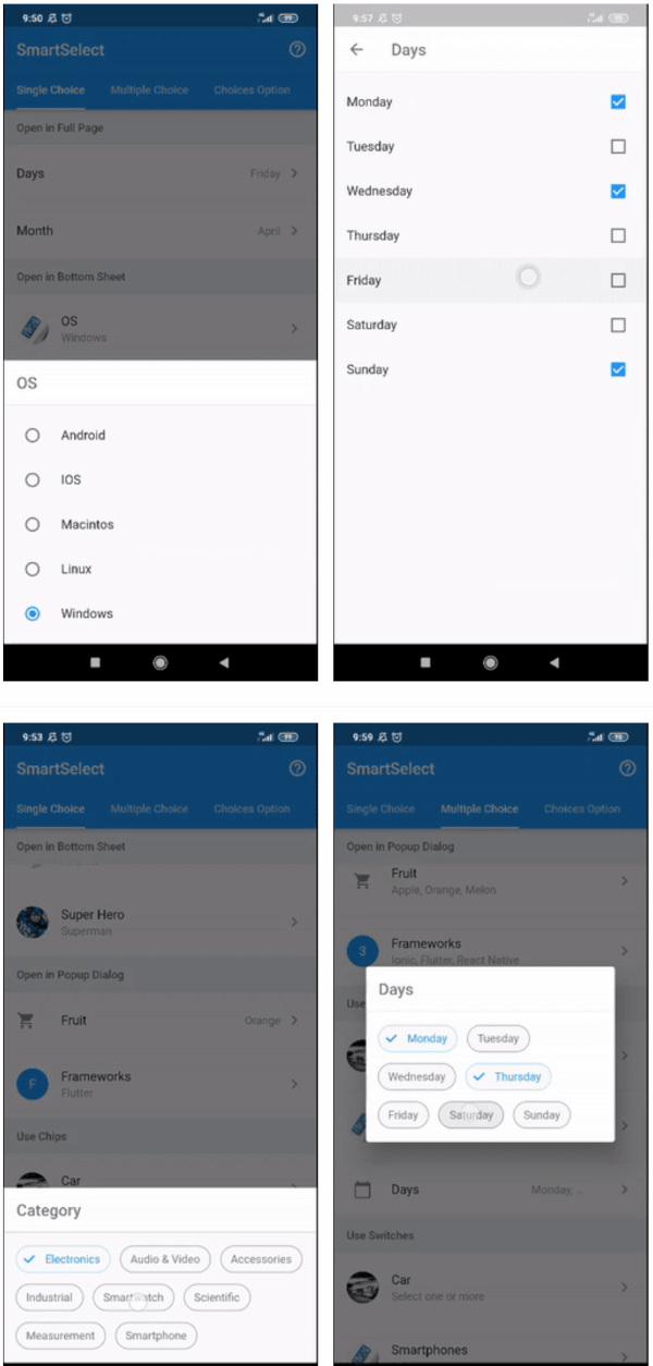
SmartSelect allows you to easily convert your usual form select or dropdown into dynamic page, popup dialog, or sliding bottom sheet with various choices input such as radio, checkbox, switch, chips, or even custom input. Supports single and multiple choice. Inspired by Smart Select component from Framework7.
copyWith and mergeStatefulWidget as state managementmodalValidation function nows should return String to indicates the changes value is not valid and null or empty String to indicates the changes value is valid
To display tile with chips use param S2Tile.body and S2TileChips, instead of S2ChipsTile
The parameter options is removed, instead use choiceItems
Simplify class name and enum
SmartSelectTile to S2TileSmartSelectOption to S2ChoiceSmartSelectChoiceConfig to S2ChoiceConfigSmartSelectChoiceStyle to S2ChoiceStyleSmartSelectChoiceType to S2ChoiceTypeSmartSelectModalConfig to S2ModalConfigSmartSelectModalStyle to S2ModalStyleSmartSelectModalHeaderStyle to S2ModalHeaderStyleSmartSelectModalType to S2ModalTypeThe parameter builder now is a collection of builder (S2SingleBuilder or S2MultiBuilder), instead use tileBuilder to create trigger tile widget.
The parameters dense, enabled, isLoading, isTwoLine, leading, loadingText, padding, selected, trailing is removed from SmartSelect class, instead use builder.tile or tileBuilder and return S2Tile widget, it's has all these parameters.
The parameter onChange nows return S2SingleState state or S2MultiState state instead of T value or List<T> value
The parameter choiceConfig.useWrap is removed, instead use choiceConfig.layout = S2ChoiceLayout.wrap
The parameter choiceConfig.builder moved to builder.choice or choiceBuilder
The parameter choiceConfig.titleBuilder moved to builder.choiceTitle or choiceTitleBuilder
The parameter choiceConfig.subtitleBuilder moved to builder.choiceSubtitle or choiceSubtitleBuilder
The parameter choiceConfig.secondaryBuilder moved to builder.choiceSecondary or choiceSecondaryBuilder
The parameter choiceConfig.dividerBuilder moved to builder.choiceDivider or choiceDividerBuilder
The parameter choiceConfig.emptyBuilder moved to builder.choiceEmpty or choiceEmptybuilder
The parameter choiceConfig.glowingOverscrollIndicatorColor is removed, instead use choiceConfig.overscrollColor
The parameter choiceConfig.spacing and choiceConfig.runSpacing moved to choiceConfig.style.spacing and choiceConfig.style.runSpacing
The parameter choiceConfig.useCheckmark moved to choiceConfig.style.showCheckmark
The parameter choiceConfig.padding moved to choiceConfig.style.wrapperPadding
The default of grouped choice is not using sticky header now, instead use groupBuilder like this:
dependencies:
  sticky_headers: "^0.1.8"
import 'package:sticky_headers/sticky_headers.dart';

SmartSelect<T>.single/multiple(
  ...,
  ...,
  choiceGroupBuilder: (context, header, choices) {
    return StickyHeader(
      header: header,
      content: choices,
    );
  },
);
| Single Choice | Multiple Choice | |
|---|---|---|
| Modal Type | Single Choice Modal | Multiple Choice Modal |
| Chips Widget | Single Choice Chips | Multiple Choice Chips |
| Switch Widget | None | Multiple Choice Switch |
| Custom Tile | Customize Tile | |
| Modal Filter | Modal Filter | |
| Modal Confirm | Modal Confirm | |
| Modal Validation | Modal Validation | |
| Modal Selector | Modal Selector | |
| Modal Shape | Modal Shape | |
| Choice Items | Choice Items | |
| Choice Grouped | Choice Grouped | |
| Choice Builder | Choice Builder | |
| Download APK | Demo App | |
ListFor a complete usage, please see the example.
To read more about classes and other references used by smart_select, see the API Reference.
// available configuration for single choice
SmartSelect<T>.single({

  // The primary content of the widget.
  // Used in trigger widget and header option
  String title,

  // The text displayed when the value is null
  String placeholder = 'Select one',

  // The current value of the single choice widget.
  required T value,

  // Called when single choice value changed
  required ValueChanged<S2SingleState<T>> onChange,

  // choice item list
  List<S2Choice<T>> choiceItems,

  // other available configuration
  // explained below
  ...,
  ...,

})
// simple usage

String value = 'flutter';
List<S2Choice<String>> options = [
  S2Choice<String>(value: 'ion', title: 'Ionic'),
  S2Choice<String>(value: 'flu', title: 'Flutter'),
  S2Choice<String>(value: 'rea', title: 'React Native'),
];

@override
Widget build(BuildContext context) {
  return SmartSelect<String>.single(
    title: 'Frameworks',
    value: value,
    choiceItems: options,
    onChange: (state) => setState(() => value = state.value)
  );
}
// available configuration for multiple choice
SmartSelect<T>.multiple({

  // The primary content of the widget.
  // Used in trigger widget and header option
  String title,

  // The text displayed when the value is null
  String placeholder = 'Select one',

  // The current value of the single choice widget.
  required List<T> value,

  // Called when single choice value changed
  required ValueChanged<S2MultiState<T>> onChange,

  // choice item list
  List<S2Choice<T>> choiceItems,

  // other available configuration
  // explained below
  ...,
  ...,

})
// a simple usage

List<int> value = [2];
List<S2Choice<int>> frameworks = [
  S2Choice<int>(value: 1, title: 'Ionic'),
  S2Choice<int>(value: 2, title: 'Flutter'),
  S2Choice<int>(value: 3, title: 'React Native'),
];

@override
Widget build(BuildContext context) {
  return SmartSelect<int>.multiple(
    title: 'Frameworks',
    value: value,
    choiceItems: options,
    onChange: (state) => setState(() => value = state.value),
  );
}
// configuration
SmartSelect<T>.[single|multiple]({

  // other configuration
  ...,
  ...,

  // choice item list
  List<S2Choice<T>> choiceItems,

  // other configuration
  ...,
  ...,

});
choiceItems can be input directly as in the example below, more info about S2Choice can be found on the API Reference
SmartSelect<T>.[single|multiple](
  ...,
  ...,
  choiceItems: <S2Choice<T>>[
    S2Choice<T>(value: 1, title: 'Ionic'),
    S2Choice<T>(value: 2, title: 'Flutter'),
    S2Choice<T>(value: 3, title: 'React Native'),
  ],
);
choiceItems also can be created from any list using helper provided by this package, like the example below
List<Map<String, String>> days = [
  { 'value': 'mon', 'title': 'Monday' },
  { 'value': 'tue', 'title': 'Tuesday' },
  { 'value': 'wed', 'title': 'Wednesday' },
  { 'value': 'thu', 'title': 'Thursday' },
  { 'value': 'fri', 'title': 'Friday' },
  { 'value': 'sat', 'title': 'Saturday' },
  { 'value': 'sun', 'title': 'Sunday' },
];

SmartSelect<String>.[single|multiple](
  ...,
  ...,
  choiceItems: S2Choice.listFrom<String, Map<String, String>>(
    source: days,
    value: (index, item) => item['value'],
    title: (index, item) => item['title'],
  ),
);
Please follow these example
More info about S2ModalConfig can be found on the API Reference
// available configuration
SmartSelect<T>.[single|multiple]({

  // other configuration
  ...,
  ...,

  // Modal validation of single choice widget
  ValidationCallback<T> modalValidation,

  // Modal configuration
  S2ModalConfig modalConfig,

  // Configure modal style
  // shortcut to [modalConfig.style]
  S2ModalStyle modalStyle,

  // Configure modal header style
  // shortcut to [modalConfig.headerStyle]
  S2ModalHeaderStyle modalHeaderStyle,

  // Modal type to display choices
  // shortcut to [modalConfig.type]
  S2ModalType modalType,

  // Use different title with the trigger widget title
  // shortcut to [modalConfig.title]
  String modalTitle,

  // Whether the option list need to confirm
  // to return the changed value
  // shortcut to [modalConfig.useConfirm]
  bool modalConfirm,

  // Whether the options list modal use header or not
  // shortcut to [modalConfig.useHeader]
  bool modalHeader,

  // Whether the option list is filterable or not
  // shortcut to [modalConfig.useFilter]
  bool modalFilter,

  // Whether the filter is autocomplete or need confirmation
  // shortcut to [modalConfig.filterAuto]
  bool modalFilterAuto,

  // Custom searchbar hint
  // shortcut to [modalConfig.filterHint]
  String modalFilterHint,

  // other configuration
  ...,
  ...,

});
By default SmartSelect will open choices modal in full page. You can change it by changing with this value:
// Available option
enum S2ModalType {

  // open in full page
  fullPage,

  // open in popup dialog
  popupDialog,

  // open in sliding bottom sheet
  bottomSheet,

}
// Available option to configure modal style
S2ModalStyle({

  // Modal border shape
  // used in popup dialog and bottom sheet
  ShapeBorder shape,

  // Modal elevation
  // used in popup dialog and bottom sheet
  double elevation,

  // Modal background color
  Color backgroundColor,

  // Modal clip behavior
  Clip clipBehavior,

})
// Available option to configure modal header style
S2ModalHeaderStyle({

  // Header border shape
  ShapeBorder shape,

  // Header elevation
  double elevation,

  // Header background color
  Color backgroundColor,

  // Header brightness
  Brightness brightness,

  // Whether the header title is centered
  bool centerTitle,

  // Whether the header use automaticallyImplyLeading or not
  bool useLeading,

  // Header text style
  // used by title and search field
  TextStyle textStyle,

  // Header icon theme
  IconThemeData iconTheme,

  // Header actions icon theme
  IconThemeData actionsIconTheme,

})
More info about S2ChoiceConfig can be found on the API Reference
// Available option to configure choices
SmartSelect<T>.[single|multiple]({

  // other configuration
  ...,
  ...,

  // choice configuration
  S2ChoiceConfig choiceConfig,

  // configure choice style
  // shortcut to [choiceConfig.style]
  S2ChoiceStyle choiceStyle,

  // configure choices group header style
  // shortcut to [choiceConfig.headerStyle]
  S2ChoiceHeaderStyle choiceHeaderStyle,

  // choice widget type
  // shortcut to [choiceConfig.type]
  S2ChoiceType choiceType,

  // choice layout to display items
  // shortcut to [choiceConfig.layout]
  S2ChoiceLayout choiceLayout,

  // choice list scroll direction
  // currently only support when
  // [layout] is [S2ChoiceLayout.wrap]
  // shortcut to [choiceConfig.direction]
  Axis choiceDirection,

  // Whether the choices list is grouped
  // shortcut to [choiceConfig.isGrouped]
  bool choiceGrouped,

  // Whether the choices item use divider or not
  // shortcut to [choiceConfig.useDivider]
  bool choiceDivider,

  // For grid choice layout
  // shortcut to [choiceConfig.gridDelegate]
  SliverGridDelegate choiceGrid,

  // other configuration
  ...,
  ...,

});
By default SmartSelect will use radios for single choice and checkboxes for multiple choice, but it can change by changing with this value:
// Type of choice input
enum S2ChoiceType {

  // use radio widget
  // for single choice
  radios,

  // use checkbox widget
  // for multiple choice
  checkboxes,

  // use switch widget
  // for multiple choice
  switches,

  // use chip widget
  // for single and multiple choice
  chips,

}
By default SmartSelect will use list, but it can change by changing with this value:
// Layout of choice item
enum S2ChoiceLayout {

  // use list view widget
  list,

  // use wrap view widget
  wrap,

  // use grid view widget
  grid,

}
// Available option to configure choice style
S2ChoiceStyle({

  // How much space to place between children in a run in the main axis.
  // When use [SmartSelectChoiceType.chips] or [useWrap] is [true]
  double spacing,

  // How much space to place between the runs themselves in the cross axis.
  // When use [SmartSelectChoiceType.chips] or [useWrap] is [true]
  double runSpacing,

  // choices wrapper padding
  EdgeInsetsGeometry wrapperPadding,

  // Choices item padding
  EdgeInsetsGeometry padding,

  // choices item title style
  TextStyle titleStyle,

  // choices item subtitle style
  TextStyle subtitleStyle,

  // whether the chips use checkmark or not
  bool showCheckmark,

  // Where to place the control in widgets that use
  // [ListTile] to position a control next to a label.
  S2ChoiceControl control,

  // Highlight color
  Color highlightColor,

  // Primary color of selected choice item
  Color activeColor,

  // Primary color of unselected choice item
  Color color,

  // Secondary color of selected choice item
  Color activeAccentColor,

  // Secondary color of unselected choice item
  Color accentColor,

  // Brightness for selected Chip
  Brightness activeBrightness,

  // Brightness for unselected Chip
  Brightness brightness,

  // Opacity for selected Chip border, only effect when
  // [activeBrightness] is [Brightness.light]
  double activeBorderOpacity,

  // Opacity for unselected chip border, only effect when
  // [brightness] is [Brightness.light]
  double borderOpacity,

  // Shape clip behavior
  Clip clipBehavior,

})
// Available option to configure choices group header widget style
S2ChoiceHeaderStyle({

  // Group header background color
  Color backgroundColor,

  // Highlight color
  Color highlightColor,

  // Group header text style
  TextStyle textStyle,

  // Group header padding
  EdgeInsetsGeometry padding,

  // Group header height
  double height,

})
// available builder configuration
// for single choice
SmartSelect<T>.single({

  // other configuration
  ...,
  ...,

  // Builder collection of single choice widget
  S2SingleBuilder<T> builder,

  // Builder for custom tile widget
  // shortcut to [builder.tile]
  S2WidgetBuilder<S2SingleState<T>> tileBuilder,

  // Builder for custom modal widget
  // shortcut to [builder.modal]
  S2WidgetBuilder<S2SingleState<T>> modalBuilder,

  // Builder for custom modal header widget
  // shortcut to [builder.modalHeader]
  S2WidgetBuilder<S2SingleState<T>> modalHeaderBuilder,

  // Builder for custom modal actions widget
  // shortcut to [builder.modalActions]
  S2ListWidgetBuilder<S2SingleState<T>> modalActionsBuilder,

  // Builder for custom modal confirm action widget
  // shortcut to [builder.modalConfirm]
  S2WidgetBuilder<S2SingleState<T>> modalConfirmBuilder,

  // Builder for divider widget between header, body, and footer modal
  // shortcut to [builder.modalDivider]
  S2WidgetBuilder<S2SingleState<T>> modalDividerBuilder,

  // Builder for custom footer widget
  // shortcut to [builder.modalFooter]
  S2WidgetBuilder<S2SingleState<T>> modalFooterBuilder,

  // other configuration
  ...,
  ...,

});
// available builder configuration
// for multiple choice
SmartSelect<T>.multiple({

  // other configuration
  ...,
  ...,

  // Builder collection of single choice widget
  S2MultiBuilder<T> builder,

  // Builder for custom tile widget
  // shortcut to [builder.tile]
  S2WidgetBuilder<S2MultiState<T>> tileBuilder,

  // Builder for custom modal widget
  // shortcut to [builder.modal]
  S2WidgetBuilder<S2MultiState<T>> modalBuilder,

  // Builder for custom modal header widget
  // shortcut to [builder.modalHeader]
  S2WidgetBuilder<S2MultiState<T>> modalHeaderBuilder,

  // Builder for custom modal actions widget
  // shortcut to [builder.modalActions]
  S2ListWidgetBuilder<S2MultiState<T>> modalActionsBuilder,

  // Builder for custom modal confirm action widget
  // shortcut to [builder.modalConfirm]
  S2WidgetBuilder<S2MultiState<T>> modalConfirmBuilder,

  // Builder for divider widget between header, body, and footer modal
  // shortcut to [builder.modalDivider]
  S2WidgetBuilder<S2MultiState<T>> modalDividerBuilder,

  // Builder for custom footer widget
  // shortcut to [builder.modalFooter]
  S2WidgetBuilder<S2MultiState<T>> modalFooterBuilder,

  // other configuration
  ...,
  ...,

});
// another builder configuration
SmartSelect<T>.[single|multiple]({

  // other configuration
  ...,
  ...,

  // Builder for modal filter widget
  // shortcut to [builder.modalFilter]
  S2WidgetBuilder<S2Filter> modalFilterBuilder,

  // Builder for modal filter toggle widget
  // shortcut to [builder.modalFilterToggle]
  S2WidgetBuilder<S2Filter> modalFilterToggleBuilder,

  // Builder for each custom choices item widget
  // shortcut to [builder.choice]
  S2ChoiceBuilder<T> choiceBuilder,

  // Builder for each custom choices item title widget
  // shortcut to [builder.choiceTitle]
  S2ChoiceBuilder<T> choiceTitleBuilder,

  // Builder for each custom choices item subtitle widget
  // shortcut to [builder.choiceSubtitle]
  S2ChoiceBuilder<T> choiceSubtitleBuilder,

  // Builder for each custom choices item secondary widget
  // shortcut to [builder.choiceSecondary]
  S2ChoiceBuilder<T> choiceSecondaryBuilder,

  /// Builder for custom divider widget between choices item
  // shortcut to [builder.choiceDivider]
  IndexedWidgetBuilder choiceDividerBuilder,

  // Builder for custom empty display
  // shortcut to [builder.choiceEmpty]
  S2WidgetBuilder<String> choiceEmptyBuilder,

  // A widget builder for custom choices group
  // shortcut to [builder.choiceGroup]
  S2ChoiceGroupBuilder choiceGroupBuilder,

  // A widget builder for custom header choices group
  // shortcut to [builder.choiceHeader]
  S2ChoiceHeaderBuilder choiceHeaderBuilder,

  // other configuration
  ...,
  ...,

});
// Default tile/trigger widget
S2Tile<T>({

  // The value of the selected option.
  String value,

  // The primary content of the list tile.
  Widget title,

  // A widget to display before the title.
  // Typically an [Icon] or a [CircleAvatar] widget.
  Widget leading,

  // A widget to display after the title.
  // Typically an [Icon] widget.
  Widget trailing,

  // Whether this list tile is intended to display loading stats.
  bool isLoading,

  // String text used as loading text
  String loadingText,

  // Whether this list tile is intended to display two lines of text.
  bool isTwoLine,

  // Whether this list tile is interactive.
  bool enabled,

  // If this tile is also [enabled] then icons and text are rendered with the same color.
  bool selected,

  // Whether this list tile is part of a vertically dense list.
  bool dense,

  // Whether the [value] is displayed or not
  bool hideValue,

  // The tile's internal padding.
  EdgeInsetsGeometry padding,

  // Called when the user taps this list tile.
  GestureTapCallback onTap,

  // widget to display below the tile
  // usually used to display chips with S2TileChips
  Widget body,

})
// usage example
SmartSelect<T>.single(
  ...,
  ...,
  tileBuilder: (context, state) {
    return S2Tile<dynamic>(
      title: state.titleWidget,
      value: state.valueDisplay,
      onTap: state.showModal,
      isLoading: true,
    );
  },
);

// usage example from state
SmartSelect<T>.multiple(
  ...,
  ...,
  tileBuilder: (context, state) {
    return S2Tile.fromState(
      state,
      isLoading: true,
    );
  },
);
// Chips tile/trigger widget
S2TileChips({

  // List of value of the selected choices.
  int chipLength,

  // Widget builder for chip label item
  IndexedWidgetBuilder chipLabelBuilder,

  // Widget builder for chip avatar item
  IndexedWidgetBuilder chipAvatarBuilder,

  // Widget builder for chip item
  IndexedWidgetBuilder chipBuilder,

  // Called when the user delete the chip item.
  ValueChanged<int> chipOnDelete,

  // Chip color
  Color chipColor,

  // Chip border opacity
  double chipBorderOpacity,

  // Chip brightness
  Brightness chipBrightness,

  // Chip delete button color
  Color chipDeleteColor,

  // Chip delete button icon
  Icon chipDeleteIcon,

  // Chip spacing
  double chipSpacing,

  // Chip run spacing
  double chipRunSpacing,

  // Chip shape border
  ShapeBorder chipShape,

  // The [Widget] displayed when the [values] is null
  Widget placeholder,

  // Whether the chip list is scrollable or not
  bool scrollable,

  // Chip list padding
  EdgeInsetsGeometry padding,

})
/// usage example
SmartSelect<String>.multiple(
  ...,
  ...,
  value: users,
  tileBuilder: (context, state) {
    return S2Tile.fromState(
      state,
      hideValue: true,
      body: S2TileChips(
        chipLength: state.valueObject.length,
        chipLabelBuilder: (context, i) {
          return Text(state.valueObject[i].title);
        },
        chipAvatarBuilder: (context, i) {
          return CircleAvatar(
            backgroundImage: NetworkImage(state.valueObject[i].meta['picture']['thumbnail'])
          );
        },
        chipOnDelete: (i) {
          setState(() => users.remove(state.valueObject[i].value));
        },
        chipColor: Colors.blue,
        chipBrightness: Brightness.dark,
        chipBorderOpacity: .5,
      ),
    );
  },
);
Copyright (c) 2021 Akbar Pulatov

Permission is hereby granted, free of charge, to any person obtaining a copy
of this software and associated documentation files (the "Software"), to deal
in the Software without restriction, including without limitation the rights
to use, copy, modify, merge, publish, distribute, sublicense, and/or sell
copies of the Software, and to permit persons to whom the Software is
furnished to do so, subject to the following conditions:

The above copyright notice and this permission notice shall be included in all
copies or substantial portions of the Software.

THE SOFTWARE IS PROVIDED "AS IS", WITHOUT WARRANTY OF ANY KIND, EXPRESS OR
IMPLIED, INCLUDING BUT NOT LIMITED TO THE WARRANTIES OF MERCHANTABILITY,
FITNESS FOR A PARTICULAR PURPOSE AND NONINFRINGEMENT. IN NO EVENT SHALL THE
AUTHORS OR COPYRIGHT HOLDERS BE LIABLE FOR ANY CLAIM, DAMAGES OR OTHER
LIABILITY, WHETHER IN AN ACTION OF CONTRACT, TORT OR OTHERWISE, ARISING FROM,
OUT OF OR IN CONNECTION WITH THE SOFTWARE OR THE USE OR OTHER DEALINGS IN THE
SOFTWARE.