
 v1.1.2
slide_switcher
用于创建具有广泛自定义选项的切换小部件的包
60喜欢 618近 30 天下载160Pub 分数
AndroidiOSWebmacOSWindowsLinux
用于创建切换小部件的包

{"sdk":"flutter"}{"sdk":"flutter"}^1.0.0以下为英文项目原文快照,最新内容请访问 GitHub。
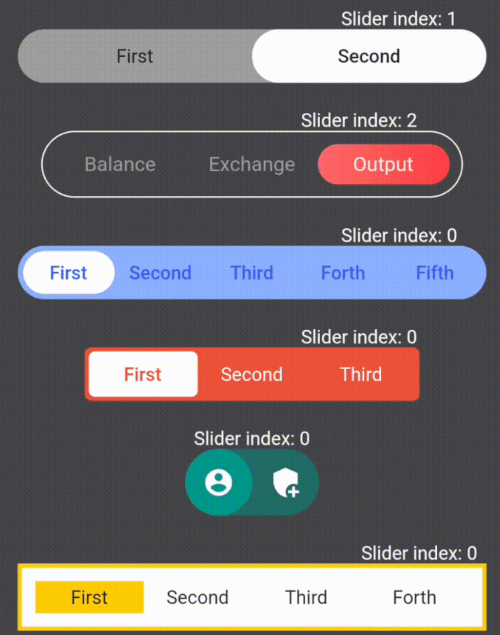
Here are some examples of the library's features:
https://raw.githubusercontent.com/chahohbily/slide_switcher/HEAD/.github/switchers_example.gif
https://raw.githubusercontent.com/chahohbily/slide_switcher/HEAD/.github/container_sliders.png
The library lets you change the style of containers and sliders using the fields in the table below
| Fields | Description |
|---|---|
| children | Widgets that placed inside sliders / required |
| onSelect | The function takes an index variable that changes depending on the index of the current slider / required |
| containerHeight | Container height / required |
| containerWight | Container width / required |
| slidersColors | The color of each slider. A single color in the array will fill all sliders / white by default |
| slidersGradients | The gradient of each slider. A single gradient in the array will fill all sliders |
| containerBorder | Container border widget |
| slidersBorder | Slider border widget |
| containerBorderRadius | Container corner rounding radius |
| containerColor | Container fill color / grey by default |
| indents | Indents between the container and sliders (the same on all sides) / 0 by default |
| direction | Defining the direction of the slider swipe / horizontal by default |
| isAllContainerTap | A shadow cast by a box |
| containerBoxShadow | Ability to tap on the current slider and change its index to the opposite (available only for 2 children) / false by default |
| initialIndex | Initial index of the slider, which is rendering for the first time |
SlideSwitcher is an ordinary widget. In order to create it you have to specify the obligatory parameters: "children" - texts, icons, pictures and any other widgets that will be stored in the sliders; "onSelect" - the function which will be executed during the change of the focused slider; "containerHeight" - container height; "containerWight" - container width. To customize the widget you should use the optional parameters from the table above.
SlideSwitcher(
  children: [
    Text('First'),
    Text('Second'),
  ],
  onSelect: (index) {},
  containerHeight: 40,
  containerWight: 350,
),
To change the state of the screen it is recommended to create a variable storing the index of the current slider and call its setState in the "onSelect" function
int switcherIndex1 = 0;

Column(
  children: [
    SlideSwitcher(
      children: [
        Text('First'),
        Text('Second'),
      ],
      onSelect: (index) => setState(() => switcherIndex1 = index),
      containerHeight: 40,
      containerWight: 350,
    ),
    const SizedBox(height: 20),
    if (switcherIndex1 == 0) ...[
      Container(height: 100, width: 100, color: Colors.red,)
    ]
    else ...[
      Container(height: 100, width: 100, color: Colors.green,)
    ],
  ],
),
| List of exceptions |
|---|
| All widgets from the list of "children" do not fit into the given container size |
| The "isAllContainerTap" parameter can be "true" only when "children" length is 2 |
The first error from the table occurs when the smallest side of the container (determined by the direction of the swipe) multiplied by the length of the "children" by half is greater than the largest side of the container. Only occurs when the borders of the container are maximum rounded
https://raw.githubusercontent.com/chahohbily/slide_switcher/HEAD/.github/vertical_switchers.png
The direction parameter of this library is responsible for the direction of the switch's movement. Just add direction: Axis.vertical to your widget:
SlideSwitcher(
  children: [
    Text('First'),
    Text('Second'),
  ],
  onSelect: (index) {},
  containerHeight: 350,
  containerWight: 40,
  direction: Axis.vertical
),
https://raw.githubusercontent.com/chahohbily/slide_switcher/HEAD/.github/switch_on.png
If you need a switch with two children to determine whether to turn something on or off, then add empty containers to children parameters and parameter isAllContainerTap: true:
SlideSwitcher(
  children: [
    Container(),
    Container(),
  ],
  onSelect: (index) {},
  isAllContainerTap: true,
  containerHeight: 30,
  containerWight: 60,
),