
flutter_easy_search_bar
eunicevassoa/flutter_easy_search_bar open-source repository details.

- 星标
- 13
- 复刻
- 22
- 最近推送(UTC)
- 2024年8月13日
- 项目状态
- 已归档
原始 README
以下为英文项目原文快照,最新内容请访问 GitHub。
Easy Search Bar

A Flutter plugin to help you handle search inside your application. Can be used inside appBar or inside your application body depending on your necessities.
Preview
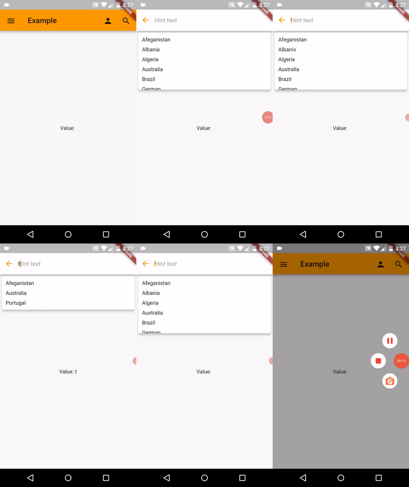
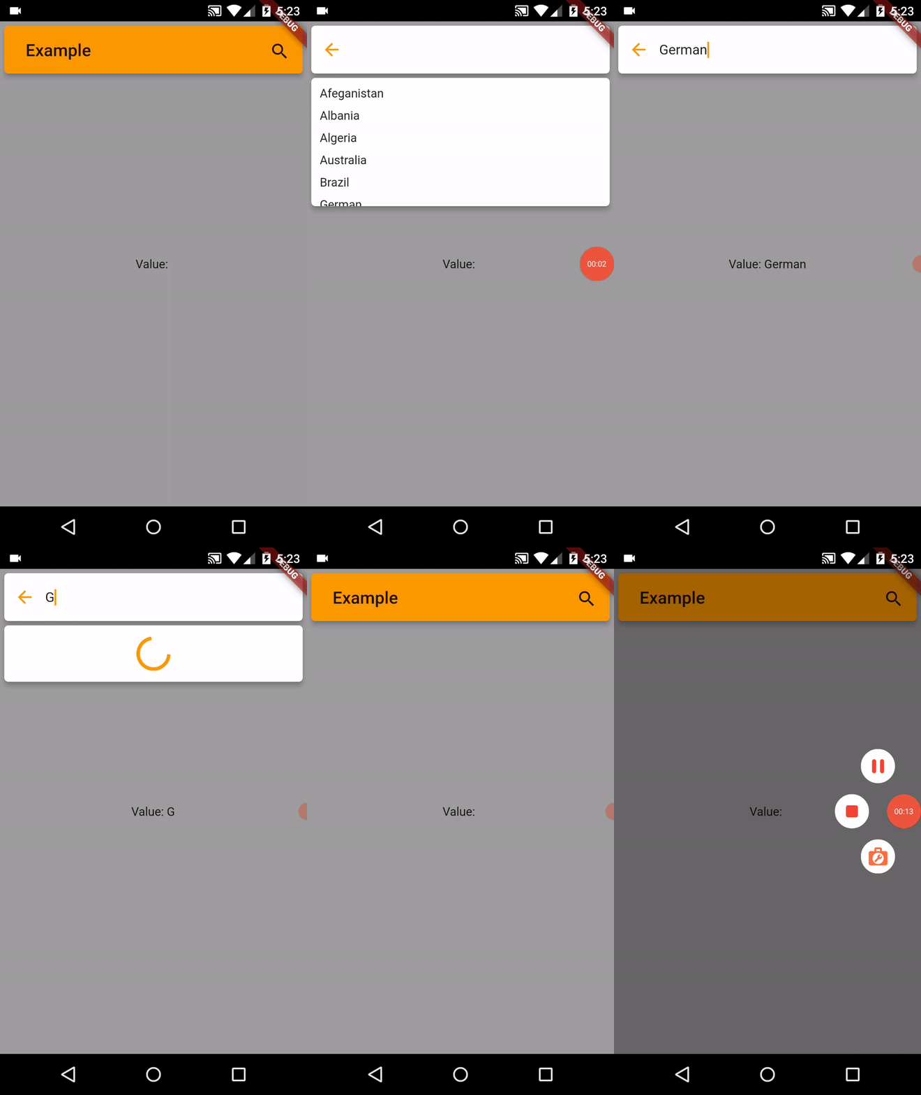
Installation
In the pubspec.yaml of your flutter project, add the following dependency:
dependencies:
  ...
  easy_search_bar: ^2.5.0
Migrating from 1.x.x to 2.x.x
Now instead of using the EasySearchBar widget inside AppBar widget, you can replace the AppBar with it.
This is what you used before:
Scaffold(
  appBar: AppBar(
    title: EasySearchBar(
      title: 'Example',
      onSearch: (value) => setState(() => searchValue = value)
    )
  )
)
And this is what it is supposed to look like now:
Scaffold(
  appBar: EasySearchBar(
    title: Text('Example'),
    onSearch: (value) => setState(() => searchValue = value)
  )
)
Basic example with suggestions
You can create a simple searchbar example widget with suggestions with the following example:
import 'package:easy_search_bar/easy_search_bar.dart';
import 'package:flutter/material.dart';

void main() {
  runApp(const MyHomePage());
}

class MyHomePage extends StatefulWidget {
  const MyHomePage({Key? key}) : super(key: key);

  @override
  State<MyHomePage> createState() => _MyHomePageState();
}

class _MyHomePageState extends State<MyHomePage> {
  String searchValue = '';
  final List<String> _suggestions = ['Afeganistan', 'Albania', 'Algeria', 'Australia', 'Brazil', 'German', 'Madagascar', 'Mozambique', 'Portugal', 'Zambia'];

  @override
  Widget build(BuildContext context) {
    return  MaterialApp(
      title: 'Example',
      theme: ThemeData(
        primarySwatch: Colors.orange
      ),
      home: Scaffold(
        appBar: EasySearchBar(
          title: const Text('Example'),
          onSearch: (value) => setState(() => searchValue = value),
          suggestions: _suggestions
        ),
        drawer: Drawer(
          child: ListView(
            padding: EdgeInsets.zero,
            children: [
              const DrawerHeader(
                decoration: BoxDecoration(
                  color: Colors.blue,
                ),
                child: Text('Drawer Header'),
              ),
              ListTile(
                title: const Text('Item 1'),
                onTap: () => Navigator.pop(context)
              ),
              ListTile(
                title: const Text('Item 2'),
                onTap: () => Navigator.pop(context)
              )
            ]
          )
        ),
        body: Center(
          child: Text('Value: $searchValue')
        )
      )
    );
  }
}
Note: If you want to create a FloatingAppBar and want the body content to go behind the AppBar you need to set extendBodyBehindAppBar Scaffold property to true. And it's also recommended to wrap your Scaffold inside a SafeArea.
API
| Attribute | Type | Required | Description | Default value |
|---|---|---|---|---|
| title | Widget |
:heavy_check_mark: | The title to be displayed inside AppBar | |
| onSearch | Function(String) |
:heavy_check_mark: | Returns the current search value.When search is closed, this method returns an empty value to clear the current search | |
| actions | List<Widget> |
:x: | Extra custom actions that can be displayed inside AppBar | |
| leading | Widget |
:x: | Can be used to add leading icon to AppBar | |
| backgroundColor | Color |
:x: | Can be used to change AppBar background color | |
| foregroundColor | Color |
:x: | Can be used to change AppBar foreground color | |
| elevation | double |
:x: | Can be used to change AppBar elevation | 5 |
| iconTheme | IconThemeData |
:x: | Can be used to set custom icon theme for AppBar icons | |
| appBarHeight | double |
:x: | Can be used to change AppBar height | 56 |
| animationDuration | Duration |
:x: | Can be used to set a duration for the AppBar search show and hide animation | Duration(milliseconds: 450) |
| isFloating | bool |
:x: | Can be used to determine if it will be a normal or floating AppBar | false |
| openOverlayOnSearch | bool |
:x: | Can be used to determine if the suggestions overlay will be opened when clicking search | false |
| titleTextStyle | TextStyle |
:x: | Can be used to set the AppBar title style | |
| searchBackgroundColor | Color |
:x: | Can be used to set the search input background color | |
| searchCursorColor | Color |
:x: | Can be used to set search textField cursor color | |
| searchHintText | String |
:x: | Can be used to set search textField hint text | |
| searchHintStyle | TextStyle |
:x: | Can be used to set search textField hint style | |
| searchTextStyle | TextStyle |
:x: | Can be used to set search textField text style | |
| searchTextKeyboardType | KeyboardType |
:x: | Can be used to set search textField keyboard type | |
| searchBackIconTheme | IconThemeData |
:x: | Can be used to set custom icon theme for the search textField back button | |
| systemOverlayStyle | SystemUiOverlayStyle |
:x: | Can be used to set SystemUiOverlayStyle to the AppBar | |
| suggestions | List<String> |
:x: | Can be used to create a suggestions list | |
| asyncSuggestions | Future<List<String>> Function(String value) |
:x: | Can be used to set async suggestions list | |
| suggestionsElevation | double |
:x: | Can be used to change suggestion list elevation | 5 |
| suggestionLoaderBuilder | Widget Function() |
:x: | A function that can be used to create a widget to display a custom suggestions loader | |
| suggestionTextStyle | TextStyle |
:x: | Can be used to change the suggestions text style | |
| suggestionBackgroundColor | Color |
:x: | Can be used to change suggestions list background color | |
| suggestionBuilder | Widget Function(String data) |
:x: | Can be used to create custom suggestion item widget | |
| onSuggestionTap | Function(String data) |
:x: | Instead of using the default suggestion tap action that fills the textField, you can set your own custom action for it | |
| debounceDuration | Duration |
:x: | Can be used to set the debounce time for async data fetch | Duration(milliseconds: 400) |
| showClearSearchIcon | bool |
:x: | Can be used to show search clear textField button | false |
| searchClearIconTheme | IconThemeData |
:x: | Can be used to set custom icon theme for the search clear textField button | |
| searchTextDirection | TextDirection |
:x: | Can be used to change text direction | TextDirection.ltr |
| putActionsOnRight | bool |
:x: | Can be used to determine if the actions button will be placed at right of the appbar | false |
| cancelableSuggestions | bool |
:x: | Can be used to allow the user to cancel the suggestions overlay by pressing escape or the back button on mobile | false |
Issues & Suggestions
If you encounter any issue you or want to leave a suggestion you can do it by filling an issue.
Contributions
Here's the list of our awesome contributors:
Thank you for the support!

Eunice Vassoa ↗
使用的依赖
依赖清单 3 项
- flutter
{"sdk":"flutter"} - flutter_test开发依赖
{"sdk":"flutter"} - flutter_lints开发依赖
^1.0.0
如何选择适合项目的代码仓?
先按使用场景筛选,再比较项目活跃情况,最后到原始仓库核对使用要求。
- 通过仓库名、作者或描述搜索,再按技术分类缩小范围。
- 结合星标、复刻与最近推送比较项目;星标反映社区关注,不代表质量保证。
- 使用前在 GitHub 核对 README、许可证与 Issues。
来源与维护
“A repository is the most basic element of GitHub.”
GitHub Docs — About repositories ↗