
 v2.1.0
like_button
Like Button 是一个 Flutter 库,允许你创建一个类似于 Twitter 点赞时心形动画效果的按钮。
1420喜欢 1.9万近 30 天下载150Pub 分数
AndroidiOSWebmacOSWindowsLinux
Like Button 是一个 Flutter 库,可让您创建一个带有动画效果的按钮,类似于在 Twitter 上点赞时的心形动画以及点赞数增加的动画效果。

{"sdk":"flutter"}{"sdk":"flutter"}以下为英文项目原文快照,最新内容请访问 GitHub。
pub package GitHub stars GitHub forks GitHub license GitHub issues FlutterCandies QQ 群
Like Button is a flutter library that allows you to create a button with animation effects similar to Twitter's heart when you like something and animation effects to increase like count.
Reference codes from jd-alexander and 吉原拉面 ,thank them for open source code.
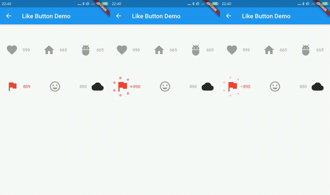
https://github.com/fluttercandies/Flutter_Candies/blob/master/gif/like_button/like_button.gif
the default effects is Icons.favorite
LikeButton(),
and you can also define custom effects.
  LikeButton(
          size: buttonSize,
          circleColor:
              CircleColor(start: Color(0xff00ddff), end: Color(0xff0099cc)),
          bubblesColor: BubblesColor(
            dotPrimaryColor: Color(0xff33b5e5),
            dotSecondaryColor: Color(0xff0099cc),
          ),
          likeBuilder: (bool isLiked) {
            return Icon(
              Icons.home,
              color: isLiked ? Colors.deepPurpleAccent : Colors.grey,
              size: buttonSize,
            );
          },
          likeCount: 665,
          countBuilder: (int count, bool isLiked, String text) {
            var color = isLiked ? Colors.deepPurpleAccent : Colors.grey;
            Widget result;
            if (count == 0) {
              result = Text(
                "love",
                style: TextStyle(color: color),
              );
            } else
              result = Text(
                text,
                style: TextStyle(color: color),
              );
            return result;
          },
        ),
    LikeButton(
      onTap: onLikeButtonTapped,
    ),
  Future<bool> onLikeButtonTapped(bool isLiked) async{
    /// send your request here
    // final bool success= await sendRequest();

    /// if failed, you can do nothing
    // return success? !isLiked:isLiked;

    return !isLiked;
  }
| parameter | description | default |
|---|---|---|
| size | size of like widget | 30.0 |
| animationDuration | animation duration to change isLiked state | const Duration(milliseconds: 1000) |
| bubblesSize | total size of bubbles | size * 2.0 |
| bubblesColor | colors of bubbles | const BubblesColor(dotPrimaryColor: const Color(0xFFFFC107),dotSecondaryColor: const Color(0xFFFF9800),dotThirdColor: const Color(0xFFFF5722),dotLastColor: const Color(0xFFF44336),) |
| circleSize | final size of circle | size * 0.8 |
| circleColor | colors of circle | const CircleColor(start: const Color(0xFFFF5722), end: const Color(0xFFFFC107) |
| onTap | tap call back of like button,you can handle your request in this call back | |
| isLiked | whether it is liked(if it's null, always show like animation and increase like count) | false |
| likeCount | if null, will not show) | null |
| mainAxisAlignment | MainAxisAlignment for like button | MainAxisAlignment.center |
| likeBuilder | builder to create like widget | null |
| countBuilder | builder to create like count widget | null |
| likeCountAnimationDuration | animation duration to change like count | const Duration(milliseconds: 500) |
| likeCountAnimationType | animation type to change like count(none,part,all) | LikeCountAnimationType.part |
| likeCountPadding | padding for like count widget | const EdgeInsets.only(left: 3.0) |
| countPostion | top,right,bottom,left of like button widget | CountPostion.right |
| countDecoration | decoration of like count widget | null |
| postFrameCallback | call back of first frame with LikeButtonState | null |