

 v0.0.4
slideable
适用于 Flutter 应用的灵活且可自定义的滑动列表项。添加多个操作按钮,控制动画,并轻松自动关闭打开的项目。
29喜欢 320近 30 天下载160Pub 分数
AndroidiOSWebmacOSWindowsLinux
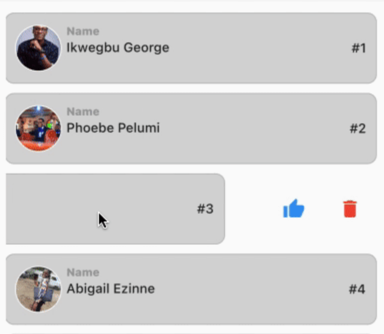
一个强大的 Flutter 包,允许用户滑动小部件以显示操作。

以下为英文项目原文快照,最新内容请访问 GitHub。
This is a flexible slideable implementation that will allow you to pass simple widgets(icons or anything at all) as action items, and also control various backgrounds for the action item, and closes an already slide item in your list.
This is a side project that I have reused severally on lots of my project and decided to turn it into a package for anyone that wants more flexibility than the usual flutter_slidable package.
Control flexibility on the type of widget to use as your action item.
A predefined callback function that automatically closes an already slid item in your list.
Can contain a maximum of 6 action items.
You can control the animation curver and animation speed.
In the pubspec.yaml of you flutter project, add the following dependency:
dependencies:
 slideable: <latest_version>
In your screen or page, add the below import, to expose the package:
import 'package:slideable/Slideable.dart';

ActionItems, controls the actions widget you would want to have in the display. This is a List<ActionItems>, where, each actionItem consists of the required icon widget, which can be any accepted Flutter Widget, a required onPress function, that executes what you want that ActionItem to do, a defaulted backgroundColor of transparent, which is totally flexible to change and a radius, just incase you want to add a tweak to your design to match the Slidable child's borderRadius.
 ActionItems(
    icon: const Icon(
       Icons.thumb_up,
       color: Colors.blue,
    ),
    onPress: () {},
    backgroudColor: Colors.transparent,
),
Slideable, requires the ActionItems item widget list and the child, which will be the initial point of contact in our case.
The other values includes the backgroundColor, which by default is set to transparent' but can be changed to suit your design. resetSlide, which is a boolean value used to notifiy the Slideable to close all the slid item, unless set to false by an external false. A duration, which is used to control the the slide time and the curve, which is used to control the speed or motion of the slide animation.
// This is used to monitor the item index in the list, and later used to closeup or leave open the slide.

int resetSlideIndex = 0;

Slideable(
 resetSlide: resetSlide,
 items: <ActionItems>[
    ActionItems(
      icon: const Icon(
         Icons.thumb_up,
         color: Colors.blue,
      ),
      onPress: () {},
      backgroudColor: Colors.transparent,
    ),
 ],
 child: Container(
   padding: const EdgeInsets.symmetric(
      horizontal: 10,
      vertical: 12,
   ),
   decoration: BoxDecoration(
      color: const Color.fromARGB(255, 214, 214, 214),
      border: Border.all(
         width: 1,
         color: const Color.fromARGB(124, 158, 158, 158),
      ),
      borderRadius: BorderRadius.circular(10),
      ),
   child: Row(
     crossAxisAlignment: CrossAxisAlignment.center,
     children: [
       Container(
         height: 50,
         width: 50,
         decoration: BoxDecoration(
            color: Colors.grey[350],
            shape: BoxShape.circle,
            border: Border.all(
               width: 1,
               color: Colors.white,
            ),
         ),
         child: ClipRRect(
            borderRadius: BorderRadius.circular(100),
            child: Image.network(         "https://images.pexels.com/photos/2379429/pexels-photo-2379429.jpeg?auto=compress&cs=tinysrgb&w=1600",
            fit: BoxFit.cover,
           ),
         ),
     ),
       const SizedBox( width: 5),
       Expanded(
          child: Column(
            crossAxisAlignment: CrossAxisAlignment.start,
            children: [
               const Text(
                  "Name",
                  style: TextStyle(
                    color: Colors.grey,
                    fontSize: 12,
                    fontWeight:
                    FontWeight.w800,
                  ),
               ),
               const SizedBox(height: 2),
               const Text(
                  "George Ikwegbu",
                  style: const TextStyle(
                    fontWeight: FontWeight.w500,
                  ),
               ),
          ]
        ),
       ),
       Text(
         "#1",
         style: const TextStyle(
            fontWeight: FontWeight.w500,
         ),
       ),
     ],
    ),
   ),
  );
import 'package:flutter/material.dart';
import 'package:slideable/Slideable.dart';

void main() => runApp(const MyApp());

class MyApp extends StatelessWidget {
  const MyApp({
    Key? key,
  }) : super(key: key);

  @override
  Widget build(BuildContext context) {
    return const MaterialApp(
      debugShowCheckedModeBanner: false,
      title: 'Slideable Widget',
      home: Home(),
    );
  }
}

class Home extends StatefulWidget {
  const Home({
    Key? key,
  }) : super(key: key);

  @override
  State<Home> createState() => _HomeState();
}

class _HomeState extends State<Home> {
  // This is used to monitor the item index in the list, and later used to closeup or leave open the slide.
  int resetSlideIndex = 0;

  @override
  Widget build(BuildContext context) {
    return Scaffold(
      appBar: AppBar(
        title: const Text("Class List"),
      ),
      body: ListView.separated(
        itemCount: _classList.length,
        padding: const EdgeInsets.symmetric(
          horizontal: 16,
          vertical: 20,
        ),
        itemBuilder: (context, index) {
          Map<String, dynamic> _student = _classList[index];
          return GestureDetector(
            onLongPressDown: (val) {
              // This allows you the time taken for a user to slide upon the widget in the list.
              // NB: Using the onTap or onHorizontalDragStart seemed to have caused a seizure in the widget, hence my resulting to onLongPressDown
              setState(() {
                // This updates the widget, and inturn rebuilds it, thereby notifying the Slidable widget to close an already slide item
                resetSlideIndex = index;
              });
            },
            child: _listItem(
              context: context,
              student: _student,
              index: index,
              resetSlide: index == resetSlideIndex ? false : true,
              // Reverse engineering the notion, meaning the Slidable widget will close all slid item, except one with false, i.e the currently slide item
            ),
          );
        },
        separatorBuilder: (context, index) => const SizedBox(height: 10),
      ),
    );
  }

  Slideable _listItem({
    required BuildContext context,
    required Map<String, dynamic> student,
    required int index,
    required bool resetSlide,
  }) {
    return Slideable(
      resetSlide: resetSlide,
      items: <ActionItems>[
        ActionItems(
          icon: const Icon(
            Icons.thumb_up,
            color: Colors.blue,
          ),
          onPress: () => _likeUser(student["name"]),
          backgroudColor: Colors.transparent,
        ),
        ActionItems(
          icon: const Icon(
            Icons.delete,
            color: Colors.red,
          ),
          onPress: () => _deleteUser(student["name"]),
          backgroudColor: Colors.transparent,
        ),
      ],
      child: Container(
        padding: const EdgeInsets.symmetric(
          horizontal: 10,
          vertical: 12,
        ),
        decoration: BoxDecoration(
          color: const Color.fromARGB(255, 214, 214, 214),
          border: Border.all(
            width: 1,
            color: const Color.fromARGB(124, 158, 158, 158),
          ),
          borderRadius: BorderRadius.circular(10),
        ),
        child: Row(
          crossAxisAlignment: CrossAxisAlignment.center,
          children: [
            Container(
              height: 50,
              width: 50,
              decoration: BoxDecoration(
                color: Colors.grey[350],
                shape: BoxShape.circle,
                border: Border.all(
                  width: 1,
                  color: Colors.white,
                ),
              ),
              child: ClipRRect(
                borderRadius: BorderRadius.circular(100),
                child: Image.network(
                  student["img"],
                  fit: BoxFit.cover,
                ),
              ),
            ),
            const SizedBox(
              width: 5,
            ),
            Expanded(
              child: Column(
                crossAxisAlignment: CrossAxisAlignment.start,
                children: [
                  const Text(
                    "Name",
                    style: TextStyle(
                      color: Colors.grey,
                      fontSize: 12,
                      fontWeight: FontWeight.w800,
                    ),
                  ),
                  const SizedBox(height: 2),
                  Text(
                    student["name"],
                    style: const TextStyle(
                      fontWeight: FontWeight.w500,
                    ),
                  ),
                ],
              ),
            ),
            Text(
              "#${index + 1}",
              style: const TextStyle(
                fontWeight: FontWeight.w500,
              ),
            ),
          ],
        ),
      ),
    );
  }

  _deleteUser(user) {
    ScaffoldMessenger.of(context).showSnackBar(
      SnackBar(
        content: Text("$user, will be deleted."),
        backgroundColor: Colors.grey[450],
      ),
    );
  }

  _likeUser(user) {
    ScaffoldMessenger.of(context).showSnackBar(
      SnackBar(
        content: Text("You gave $user a thumbs up, pretty cool 🥰"),
        backgroundColor: Colors.grey[450],
      ),
    );
  }

  final List<Map<String, dynamic>> _classList = [
    {
      "name": "Ikwegbu George",
      "img":
          "https://images.pexels.com/photos/2379429/pexels-photo-2379429.jpeg?auto=compress&cs=tinysrgb&w=1600",
    },
    {
      "name": "Phoebe Pelumi",
      "img":
          "https://images.pexels.com/photos/3986672/pexels-photo-3986672.jpeg?auto=compress&cs=tinysrgb&w=1600&lazy=load",
    },
    {
      "name": "James Mike",
      "img":
          "https://images.pexels.com/photos/11828983/pexels-photo-11828983.jpeg?auto=compress&cs=tinysrgb&w=1600&lazy=load",
    },
    {
      "name": "Abigail Ezinne",
      "img":
          "https://images.pexels.com/photos/3030252/pexels-photo-3030252.jpeg?auto=compress&cs=tinysrgb&w=1600&lazy=load",
    },
    {
      "name": "Chioma Chinedu",
      "img":
          "https://images.pexels.com/photos/4491630/pexels-photo-4491630.jpeg?auto=compress&cs=tinysrgb&w=1600",
    },
  ];
}
You can find the example code here
依赖清单 3 项
{"sdk":"flutter"}{"sdk":"flutter"}^1.0.0先按使用场景筛选,再比较项目活跃情况,最后到原始仓库核对使用要求。
“A repository is the most basic element of GitHub.”
GitHub Docs — About repositories ↗