

 v2.0.0
fitted_text_field_container
一个自动调整大小以适应 Material TextField 文本值的 Container。
27喜欢 45近 30 天下载70Pub 分数
平台暂无数据
一个 Flutter Container,可自动调整大小以适应 Material TextField 的文本值。

以下为英文项目原文快照,最新内容请访问 GitHub。
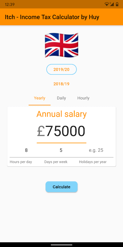
A Container that automatically resizes it's width to fit the containing TextField's text value.
Read the short blog: https://medium.com/@huyffs/fitted-textfield-container-for-flutter-c9c63644441c
| Param | Type | Default | Description |
|---|---|---|---|
child |
TextField |
* required | The TextField to fit |
calculator |
CalculateFunction |
FittedTextFieldCalculator.fitVisible |
A function to calculate the width. The default function fits the visible content & decorations (i.e. it collapses to the content/label's width when hint text disappears) |
builder |
Widget Function(BuildContext context, TextField child) |
null |
A builder that can be used to build complex layouts. The child TextField is provided to the build function |
FittedTextFieldContainer(
    child: TextField(
        controller: someTextEditingController,
        textAlign: TextAlign.right,
        decoration: InputDecoration(
            prefixText: "£",
            labelText: "Amount",
        ),
    ),
)
All params from FittedTextFieldContainer plus the following
| Param | Type | Default | Description |
|---|---|---|---|
growCurve |
Curve |
Curves.easeOutCirc |
The curve to use in the grow animation |
growDuration |
Duration |
Duration(milliseconds: 300) |
Duration to animate the container's width when TextField grows |
shrinkCurve |
Curve |
Curves.easeInCirc |
The curve to use in the shrink animation |
shrinkDuration |
Duration |
Duration(milliseconds: 600) |
Duration to animate the container's width when TextField shrinks |
AnimatedFittedTextFieldContainer(
    growDuration: Duration(milliseconds: 300),
    shrinkDuration: Duration(milliseconds: 600),
    growCurve: Curves.easeOutCirc,
    shrinkCurve: Curves.easeInCirc,
    child: TextField(
        controller: someTextEditingController,
        textAlign: TextAlign.right,
        decoration: InputDecoration(
            prefixText: "£",
            labelText: "Amount",
        ),
    ),
)
FittedTextFieldMeasurerA class that takes a TextField and TextStyle and returns the following measurements:
textField The fitted textfieldtextStyle The fitted textfield's style or the default styletextWidth Width of the text contentlabelWidth Width of the labelhintWidth Width of the hint textfixedWidths Width of fixed elements (prefixText, suffixText, contentPadding and cursorWidth)CalculateFunctionThis function takes measured values and returns a width value.
double CalculateFunction(FittedTextFieldMeasurer)
FittedTextFieldContainer(
    calculator: (m) =>
        m.fixedWidths +
        max(m.labelWidth, max(m.hintWidth, m.textWidth)),
    child: TextField(
        controller: someTextEditingController,
        textAlign: TextAlign.right,
        decoration: InputDecoration(
            hintText: "Width of hint text",
        ),
    ),
);
A few calculators are provided for common use-cases
fitAll fits content, label and hint textsfitVisible fits the visible content & decorations (i.e. it collapses to the content/label's width when hint text disappears)fitVisibleWithPadding(double padding) in addition to fitting visible content it adds a fixed padding valuefitVisibleWithRange(double min, double max) in addition to fitting visible content it enforces a minimum and (optional) maximum widthFit all
FittedTextFieldContainer(
    calculator: FittedTextFieldCalculator.fitAll,
    child: ...
);
Fit visible with minimum
FittedTextFieldContainer(
    calculator: FittedTextFieldCalculator.fitVisibleWithRange(120),
    child: ...
);
Fit visible with maximum
FittedTextFieldContainer(
    calculator: FittedTextFieldCalculator.fitVisibleWithRange(0, 180),
    child: ...
);
builderAnimatedFittedTextFieldContainer(
child: TextField(
controller: someTextEditingController,
textAlign: TextAlign.right,
decoration: InputDecoration(
labelText: "Twinkle twinkle",
),
),
builder: (context, child) => Container(
child: Stack(
overflow: Overflow.visible,
children: <Widget>[
child,
Positioned(
top: 0,
right: -22,
child: _aniWholePoundCtl.text.isEmpty
? Icon(Icons.star_border)
: Icon(Icons.star, color: Colors.amber),
),
],
),
),
)
Pull requests are welcome!
MIT License
Copyright (c) 2020 Huy Dinh
依赖清单 2 项
{"sdk":"flutter"}{"sdk":"flutter"}先按使用场景筛选,再比较项目活跃情况,最后到原始仓库核对使用要求。
“A repository is the most basic element of GitHub.”
GitHub Docs — About repositories ↗