
 v0.1.1
overscroll_pop
一个用于滚动视图的 Flutter 小部件,当过度滚动时会像 iOS 上的 Pinterest 和 Instagram 应用一样弹回。
123喜欢 38近 30 天下载130Pub 分数
AndroidiOSWeb
一个用于滚动视图的 Flutter 小部件,超出滚动范围时弹出

{"sdk":"flutter"}{"sdk":"flutter"}{"sdk":"flutter"}^4.0.0以下为英文项目原文快照,最新内容请访问 GitHub。
A Flutter widget for Scrollview, pop when overscroll like Instagram, Pinterest, ...
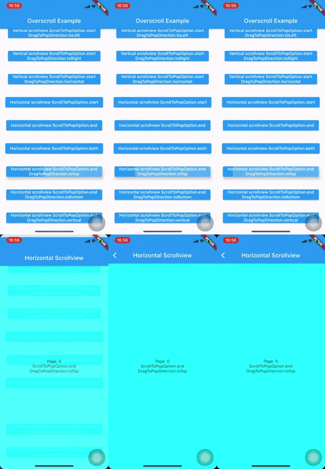
Demo Demo Demo
dependencies:
  	overscroll_pop: <latest version>
Wrap your Scaffold or top widget by OverscrollPop, every ScrollView widget (Listview, GridView, PageView, CustomScrollView, ...) which has scroll physics ClampingScrollPhysics(important) will have overscroll to pop effect.
    MaterialApp(
      home: Scaffold(
        appBar: AppBar(
          title: const Text('Overscroll Example'),
        ),
        body: Builder(
          builder: (c) => Center(
            child: Hero(
              tag: '${ScrollToPopOption.start}${DragToPopDirection.toRight}',
              child: ElevatedButton(
                onPressed: () => pushPage(
                  c,
                  (BuildContext context, _, __) => VerticalScrollview(
                    scrollToPopOption: ScrollToPopOption.start,
                    dragToPopDirection: DragToPopDirection.toRight,
                  ),
                ),
                child: Text('Vertical scrollview ${ScrollToPopOption.start}'),
              ),
            ),
          ),
        ),
      ),
    );

    class VerticalScrollview extends StatelessWidget {
      final ScrollToPopOption scrollToPopOption;
      final DragToPopDirection? dragToPopDirection;

      const VerticalScrollview({
        Key? key,
        this.scrollToPopOption = ScrollToPopOption.start,
        this.dragToPopDirection,
      }) : super(key: key);

      @override
      Widget build(BuildContext context) {
        return OverscrollPop(
          scrollToPopOption: scrollToPopOption,
          dragToPopDirection: dragToPopDirection,
          child: Container(
            clipBehavior: Clip.hardEdge,
            decoration: BoxDecoration(borderRadius: BorderRadius.circular(16.0)),
            child: Scaffold(
              appBar: PreferredSize(
                preferredSize: Size.fromHeight(kToolbarHeight),
                child: Hero(
                  tag: '$scrollToPopOption${dragToPopDirection ?? ''}',
                  child: AppBar(
                    title: Text(
                      'Vertical Scrollview',
                      overflow: TextOverflow.visible,
                    ),
                  ),
                ),
              ),
              body: ListView.builder(
                physics: const ClampingScrollPhysics(),
                itemBuilder: (_, index) => Container(
                  height: 160.0,
                  margin: const EdgeInsets.symmetric(vertical: 8.0),
                  color: index % 2 == 0 ? Colors.cyanAccent : Colors.orangeAccent,
                  alignment: Alignment.center,
                  child: Column(
                    mainAxisAlignment: MainAxisAlignment.center,
                    children: [
                      Text(scrollToPopOption.toString()),
                      if (dragToPopDirection != null)
                        Text(dragToPopDirection.toString()),
                    ],
                  ),
                ),
                itemCount: MediaQuery.of(context).size.height ~/ 160.0 + 2,
              ),
            ),
          ),
        );
      }
    }
If your Scaffold does not contain any ScrollView and want to achieve drag to pop effect, wrap your Scaffold or top widget by DragToPop instead (Example).
Quick push route config helper:
pushOverscrollRoute(
    context: context,
    child: <your scaffold/widget>,
    // scrollToPopOption: <your ScrollToPopOption>,
    // dragToPopDirection: <your DragToPopDirection>,
    // other route configs
)

pushDragToPopRoute(
    context: context,
    child: <your scaffold/widget>,
    // other route configs
)
By default, the effect only apply for overscroll at the start of ScrollView (top edge of vertical scroll, left edge of horizontal scroll)
VStart HStart
To enable the end edge (or both edges) for overscroll to pop, set scrollToPopOption to ScrollToPopOption.end (or ScrollToPopOption.both)
OverscrollPop(
  scrollToPopOption: ScrollToPopOption.end, // or ScrollToPopOption.both
  ...
)
VEnd HEnd
Beside overscroll, you can config the other drag direction to achieve the pop effect by passing dragToPopDirection
OverscrollPop(
  dragToPopDirection: DragToPopDirection.toTop, //  toTop, toBottom, toLeft, toRight, horizontal and vertical
  ...
)
Vertical scroll: drag to left, right or horizontal (both left and right) VStartToLeft VStartToLeft
Horizontal scroll: drag to top, bottom or vertical (both top and bottom) HEndToTop HEndToBottom