
 v0.1.5
simple_grid
一个受 Bootstrap 启发的动态网格,您可以使用它来描述您的网格布局。此包完全使用 MediaQuery,无需担心渲染。
79喜欢 544近 30 天下载160Pub 分数
AndroidiOSWebmacOSWindowsLinux
受 Bootstrap 启发,这是一个动态网格布局,您可以像使用 Bootstrap 网格一样使用它,并且其尺寸遵循 Material UI 的断点。但请放心,您可以自定义自己的断点,如这里所示。该包完全使用 MediaQuery,无需担心渲染问题。

{"sdk":"flutter"}{"sdk":"flutter"}以下为英文项目原文快照,最新内容请访问 GitHub。
Indonesian documentation is here
Inspired by bootstrap , This is dynamic grid layout that you can use Like a bootstrap grid, but the size following material UI break points. You can also customize your break point like here. This package purely using mediaquery, don't worry about the render.
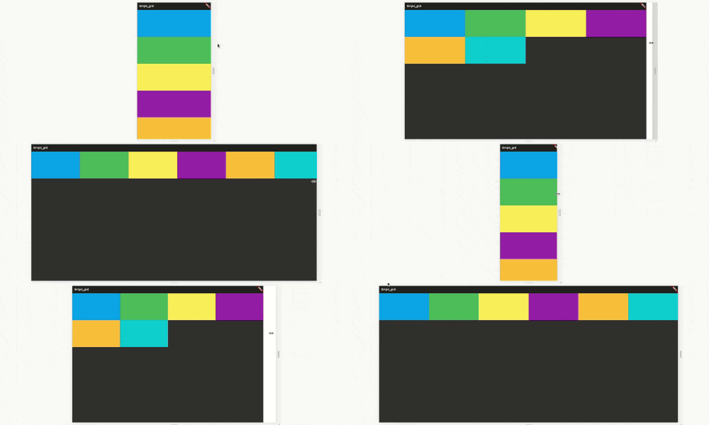
code example here https://raw.githubusercontent.com/nggepe/simple_grid/master/doc/demo-grid.gif
code example here https://raw.githubusercontent.com/nggepe/simple_grid/master/doc/order-example.gif
Bootstrap, material-ui or another web-grid always use 12 size. Here is the image example: https://raw.githubusercontent.com/nggepe/simple_grid/master/doc/grid-example.png
There are 4 classes that you have to now, these are:
SpGrid is the container of grid, more information hereSpGridItem is the children of SpGrid, more information hereSpGridSize is the class that you can declare the maximum of the screen size, more information hereSpOrder, this class is a sort class. when you use 1 of it's value, the value will create an ordering when the screen on the value condition. more information hereSpGrid(width: MediaQuery.of(context).size.width, children: [
SpGridItem(
xs: 12,
sm: 6,
md: 4,
lg: 3,
child: Container(
color: Colors.blue,
height: 200,
),
),
SpGridItem(
xs: 12,
sm: 6,
md: 4,
lg: 3,
child: Container(
color: Colors.green,
height: 200,
),
),
SpGridItem(
xs: 12,
sm: 6,
md: 4,
lg: 3,
child: Container(
color: Colors.yellow,
height: 200,
),
),
SpGridItem(
xs: 12,
sm: 6,
md: 4,
lg: 3,
child: Container(
color: Colors.purple,
height: 200,
),
),
]);
import 'package:flutter/material.dart';
import 'package:simple_grid/simple_grid.dart';

void main() {
  runApp(MyApp());
}

class MyApp extends StatelessWidget {
  @override
  Widget build(BuildContext context) {
    return MaterialApp(
      title: 'Simple_grid',
      theme: ThemeData(
        brightness: Brightness.dark,
      ),
      home: MyHomePage(),
    );
  }
}

class MyHomePage extends StatelessWidget {
  @override
  Widget build(BuildContext context) {
    return Scaffold(
      appBar: AppBar(
        title: Text("SIMPLE GRID EXAMPLE"),
      ),
      body: SpGrid(
        width: MediaQuery.of(context).size.width,
        spacing: 10,
        runSpacing: 10,
        children: [
          SpGridItem(
            xs: 12,
            md: 6,
            order: SpOrder(sm: 1, xs: 1),
            child: Container(
              height: 200,
              child: Column(
                mainAxisAlignment: MainAxisAlignment.center,
                children: [
                  Text(
                    "Hello!",
                    style: TextStyle(fontSize: 40),
                    textAlign: TextAlign.center,
                  ),
                  SizedBox(
                    height: 10,
                  ),
                  Text(
                    "I'm John Doe and I Love Programming",
                    style: TextStyle(fontSize: 25),
                    textAlign: TextAlign.center,
                  ),
                ],
              ),
            ),
          ),
          SpGridItem(
            xs: 12,
            md: 6,
            order: SpOrder(sm: 0, xs: 0),
            child: Container(
              height: 200,
              decoration: BoxDecoration(
                  image: DecorationImage(
                      image: NetworkImage(
                          "https://raw.githubusercontent.com/nggepe/simple_grid/master/doc/john.png"))),
            ),
          ),
        ],
      ),
    );
  }
}
SpGrid(
  width: MediaQuery.of(context).size.width,
  gridSize: SpGridSize(xs: 0, sm: 500, md: 768, lg: 980, xl: 1200),
  children:[],
)