
 v0.0.6
dashed_circular_progress_bar
虚线圆形进度条以圆形显示任务的进度,颜色、样式和形状均可自定义。
117喜欢 5050近 30 天下载160Pub 分数
AndroidiOSWebmacOSWindowsLinux
用于 Flutter 应用的虚线圆形进度条。

{"sdk":"flutter"}{"sdk":"flutter"}^2.0.0以下为英文项目原文快照,最新内容请访问 GitHub。
https://img.shields.io/github/license/radnive/flutter_dashedcircularprogressbar?logo=github https://img.shields.io/badge/version-0.0.6-blueviolet https://img.shields.io/badge/flutter-3.13.5-blue https://img.shields.io/badge/dart-3.1.2-blue
Open source flutter package, Dashed circular progress bar for flutter apps.
Add this line to the pubspec.yaml file below the dependencies:
dependencies:
  dashed_circular_progress_bar: ^0.0.6
Now to use, import this package into the desired file as follows:
import 'package:dashed_circular_progress_bar/dashed_circular_progress_bar.dart';
Here are some simple examples you can use to create this package:
First of all, to access the amount of progress when doing animation, you need to define a ValueNotifier:
final ValueNotifier<double> _valueNotifier = ValueNotifier(0);
Then add it to the widget:
DashedCircularProgressBar.aspectRatio(
  aspectRatio: 1, // width ÷ height
  valueNotifier: _valueNotifier,
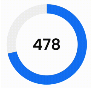
  progress: 478,
  maxProgress: 670,
  corners: StrokeCap.butt,
  foregroundColor: Colors.blue,
  backgroundColor: const Color(0xffeeeeee),
  foregroundStrokeWidth: 36,
  backgroundStrokeWidth: 36,
  animation: true,
  child: Center(
    child: ValueListenableBuilder(
      valueListenable: _valueNotifier,
      builder: (_, double value, __) => Text(
        '${value.toInt()}%',
        style: const TextStyle(
          color: Colors.black,
          fontWeight: FontWeight.w300,
          fontSize: 60
        ),
      ),
    ),
  ),
)
DashedCircularProgressBar.aspectRatio(
  aspectRatio: 2, // width ÷ height
  progress: 34,
  startAngle: 270,
  sweepAngle: 180,
  circleCenterAlignment: Alignment.bottomCenter,
  foregroundColor: Colors.black,
  backgroundColor: const Color(0xffeeeeee),
  foregroundStrokeWidth: 3,
  backgroundStrokeWidth: 2,
  backgroundGapSize: 2,
  backgroundDashSize: 1,
  seekColor: Colors.yellow,
  seekSize: 22,
  animation: true,
)
DashedCircularProgressBar.aspectRatio(
  aspectRatio: 1, // width ÷ height
  valueNotifier: _valueNotifier,
  progress: 37,
  startAngle: 225,
  sweepAngle: 270,
  foregroundColor: Colors.green,
  backgroundColor: const Color(0xffeeeeee),
  foregroundStrokeWidth: 15,
  backgroundStrokeWidth: 15,
  animation: true,
  seekSize: 6,
  seekColor: const Color(0xffeeeeee),
  child: Center(
    child: ValueListenableBuilder(
      valueListenable: _valueNotifier,
      builder: (_, double value, __) => Column(
        mainAxisSize: MainAxisSize.min,
        children: [
          Text(
            '${value.toInt()}%',
            style: const TextStyle(
              color: Colors.black,
              fontWeight: FontWeight.w300,
              fontSize: 60
            ),
          ),
          Text(
            'Accuracy',
            style: const TextStyle(
              color: Color(0xffeeeeee),
              fontWeight: FontWeight.w400,
              fontSize: 16
            ),
          ),
        ],
      )
    ),
  ),
)
You can also use the desired dimensions instead of aspect ratio.
dashed_example_gifDashedCircularProgressBar.square(
dimensions: 350,
progress: 180,
maxProgress: 360,
startAngle: -27.5,
foregroundColor: Colors.redAccent,
backgroundColor: const Color(0xffeeeeee),
foregroundStrokeWidth: 7,
backgroundStrokeWidth: 7,
foregroundGapSize: 5,
foregroundDashSize: 55,
backgroundGapSize: 5,
backgroundDashSize: 55,
animation: true,
child: const Icon(
Icons.favorite,
color: Colors.redAccent,
size: 126
),
)
By changing the center, you can specify the location of the progress bar.
play_with_circle_center_alignment_example.png
For example to make a progress bar in the shape of the first image (first row, first image from the left):
DashedCircularProgressBar.aspectRatio(
  aspectRatio: 1, // width / height
  progress: 60,
  startAngle: 90,
  sweepAngle: 90,
  corners: StrokeCap.butt,
  foregroundStrokeWidth: 7,
  backgroundStrokeWidth: 7,
  circleCenterAlignment: Alignment.topLeft,
  foregroundColor: Colors.white,
  backgroundColor: const Color(0x22000000),
  animation: true
)
| Parameter | Default | Description |
|---|---|---|
| width double |
0 | Progress bar width. |
| height double |
0 | Progress bar height. |
| aspectRatio double |
0 | Progress aspect ratio. |
| progress double |
0 | Current value of progress bar. |
| maxProgress double |
100 | Maximum value of progress. |
| startAngle double |
0 | The starting angle of the arc. |
| sweepAngle double |
360 | The sweep angle of the arc. |
| foregroundStrokeWidth double |
2 | Foreground arc thickness. |
| backgroundStrokeWidth double |
2 | Background arc thickness. |
| foregroundColor Color |
Colors.blue | Foreground arc color. |
| backgroundColor Color |
Colors.white | Background arc color. |
| corners StrokeCap |
StrokeCap.round | Styles to use for arcs endings. |
| foregroundGapSize double |
0 | Foreground arc gap size. |
| foregroundDashSize double |
0 | Foreground arc dash size. |
| backgroundGapSize double |
0 | Background arc gap size. |
| backgroundDashSize double |
0 | Background arc dash size. |
| seekSize double |
0 | Progress bar seek size. |
| seekColor Color |
Colors.blue | Progress bar seek color. |
| circleCenterAlignment Alignment |
Alignment.center | Align center of progress bar. |
| animation bool |
false | Active progress bar animation. |
| animationDuration Duration |
Duration(seconds: 1) | Progress bar animation duration. |
| animationCurve Curve |
Curves.easeOut | Progress bar animation curve. |
| onAnimationEnd void Function()? |
null | This function is called when animation ended. |
| ltr bool |
true | Specifies how to draw arcs from right to left or vice versa. |
| child Widget? |
null | This widget is placed on the progress bar. |
| valueNotifier ValueNotifier? |
null | Animated value notifier. |