
async_button_builder
一个用于在 Flutter 中创建加载按钮的辅助构建器

- 星标
- 31
- 复刻
- 14
- 最近推送(UTC)
- 2023年2月13日
- 项目状态
- 未归档
原始 README
以下为英文项目原文快照,最新内容请访问 GitHub。
async_button_builder
AsyncButtonBuilder offers a simple way to extend any type of button with an asynchronous aspect. It allows adding loading, disabled, errored and completed states (with fluid animation between each) on top of buttons that perform asynchronous tasks.
Getting Started
Include the package:
async_button_builder: <latest_version>
Wrap the builder around a button, passing the onPressed and child element to builder instead of the button directly. These two are the only required fields.
AsyncButtonBuilder(
  child: Text('Click Me'),
  onPressed: () async {
    await Future.delayed(Duration(seconds: 1));
  },
  builder: (context, child, callback, _) {
    return TextButton(
      child: child,
      onPressed: callback,
    );
  },
),
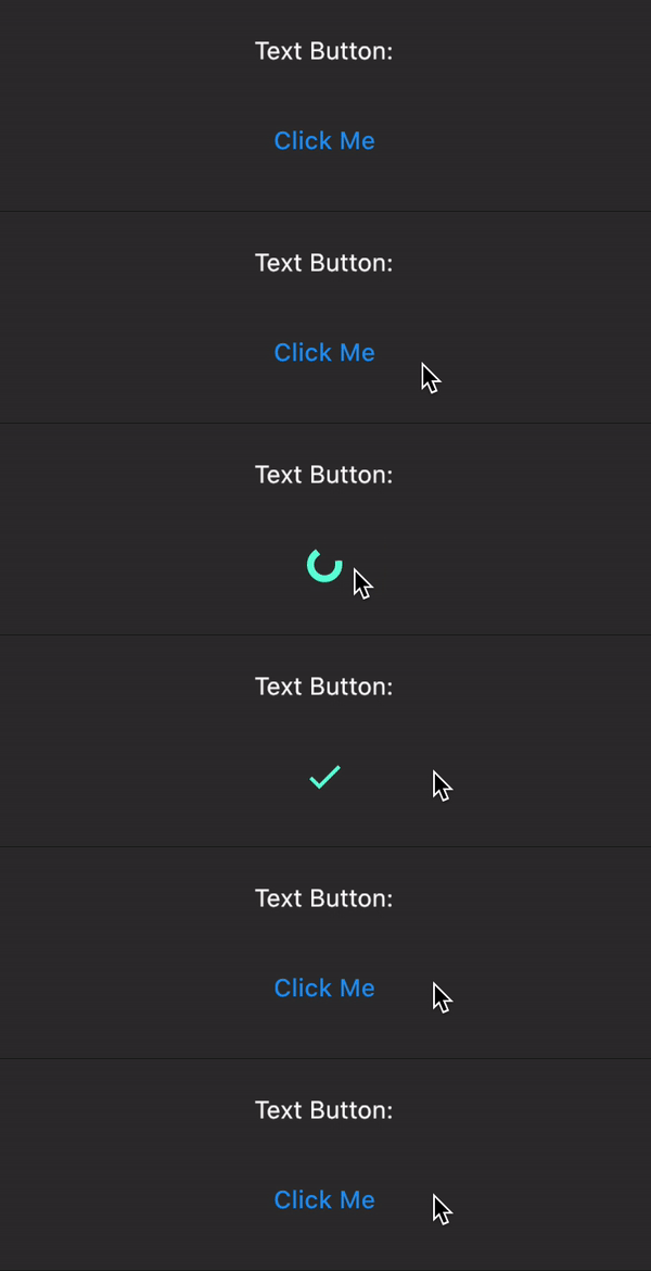
The fourth value in the builder allows you listen to the loading state. This can be used to conditionally style the button. This package depends freezed in order to create a sealed union to better handle the possible states.
NOTE (Breaking change): As of v3.0.0, error now takes the error and stack trace as arguments.
AsyncButtonBuilder(
  child: Text('Click Me'),
  loadingWidget: Text('Loading...'),
  onPressed: () async {
    await Future.delayed(Duration(seconds: 1));

    // See the examples file for a way to handle timeouts
    throw 'yikes';
  },
  builder: (context, child, callback, buttonState) {
    final buttonColor = buttonState.when(
      idle: () => Colors.yellow[200],
      loading: () => Colors.grey,
      success: () => Colors.orangeAccent,
      error: (err, stack) => Colors.orange,
    );

    return OutlinedButton(
      child: child,
      onPressed: callback,
      style: OutlinedButton.styleFrom(
        primary: Colors.black,
        backgroundColor: buttonColor,
      ),
    );
  },
),
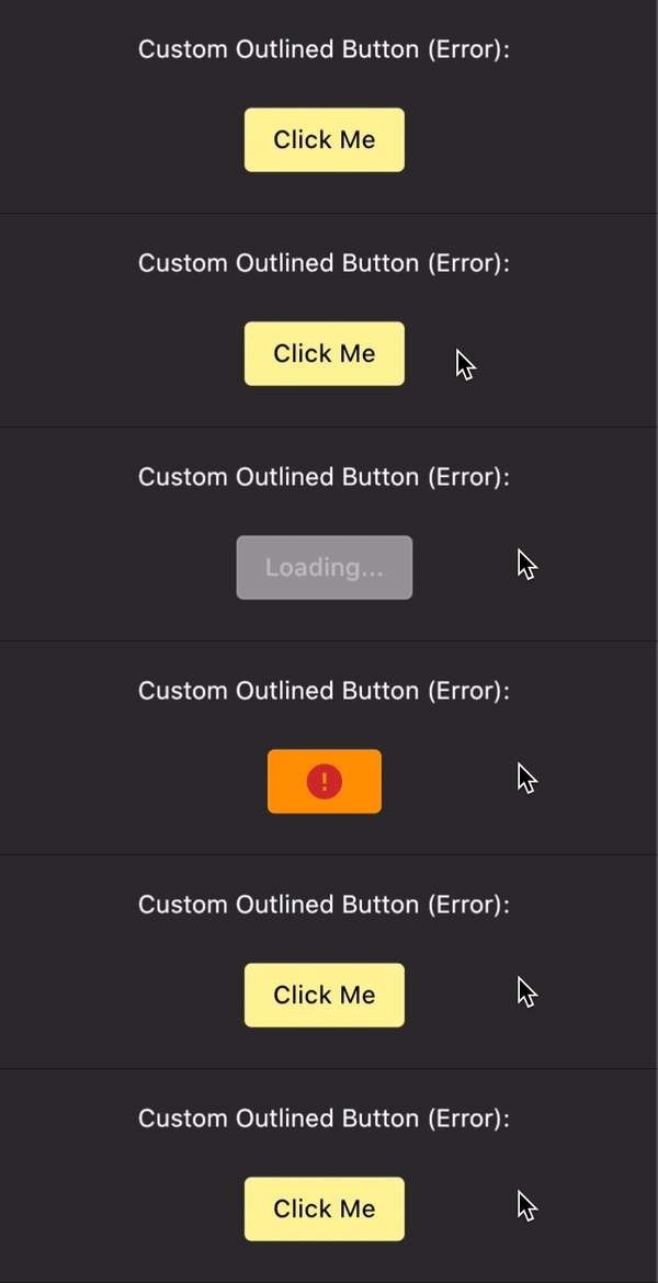
You can also drive the state of the button yourself using the buttonState field:
AsyncButtonBuilder(
  buttonState: ButtonState.completing(),
  // ...
),
Notifications
As of v3.0.0, you can now wrap a higher level parent to handle notifications that come from buttons. Why not use something like runZonedGuarded? Notification bubbling handles not only the error but the state of the button. If you'd like, for example, to trigger a circular spinner in the center of the app notifiying the user that something is happening, you can do so by listening to the AsyncButtonNotification and then using the buttonState to determine what to do.
It might also be a good idea to separate the errors that come from button presses and those that are not. An error wants to see why a button press silently failed but might not need to know why a background fetch failed.
MaterialApp(
  home: NotificationListener<AsyncButtonNotification>(
    onNotification: (notification) {
      notification.buttonState.when(
        idle: () => // nothing -> you could use a maybeWhen as well
        loading: () => // show circular loading widget?
        success: () => // show success snackbar?
        error: (_, __) => // show error snackbar?
      );

      // Tells the notification to stop bubbling
      return true;
    },
    // This async button can be nested arbitrarily deep*
    child: AsyncButtonBuilder(
      duration: duration,
      errorDuration: const Duration(milliseconds: 100),
      errorWidget: const Text('error'),
      onPressed: () async {
        throw ArgumentError();
      },
      builder: (context, child, callback, state) {
        return TextButton(onPressed: callback, child: child);
      },
      child: const Text('click me'),
    ),
  ),
)

// See NotificationListener for more information
To disable the notifications, you can pass false to notifications.
Customization
async_button_builder even works for custom buttons. You can define your own widgets for loading, error, and completion as well as define the transitions between them. This example is a little verbose but shows some of what's possible.
AsyncButtonBuilder(
  child: Padding(
    padding: const EdgeInsets.symmetric(
      horizontal: 16.0,
      vertical: 8.0,
    ),
    child: Text(
      'Click Me',
      style: TextStyle(color: Colors.white),
    ),
  ),
  loadingWidget: Padding(
    padding: const EdgeInsets.all(8.0),
    child: SizedBox(
      height: 16.0,
      width: 16.0,
      child: CircularProgressIndicator(
        valueColor: AlwaysStoppedAnimation<Color>(Colors.white),
      ),
    ),
  ),
  successWidget: Padding(
    padding: const EdgeInsets.all(4.0),
    child: Icon(
      Icons.check,
      color: Colors.purpleAccent,
    ),
  ),
  onPressed: () async {
    await Future.delayed(Duration(seconds: 2));
  },
  loadingSwitchInCurve: Curves.bounceInOut,
  loadingTransitionBuilder: (child, animation) {
    return SlideTransition(
      position: Tween<Offset>(
        begin: Offset(0, 1.0),
        end: Offset(0, 0),
      ).animate(animation),
      child: child,
    );
  },
  builder: (context, child, callback, state) {
    return Material(
      color: state.maybeWhen(
        success: () => Colors.purple[100],
        orElse: () => Colors.blue,
      ),
      // This prevents the loading indicator showing below the
      // button
      clipBehavior: Clip.hardEdge,
      shape: StadiumBorder(),
      child: InkWell(
        child: child,
        onTap: callback,
      ),
    );
  },
),
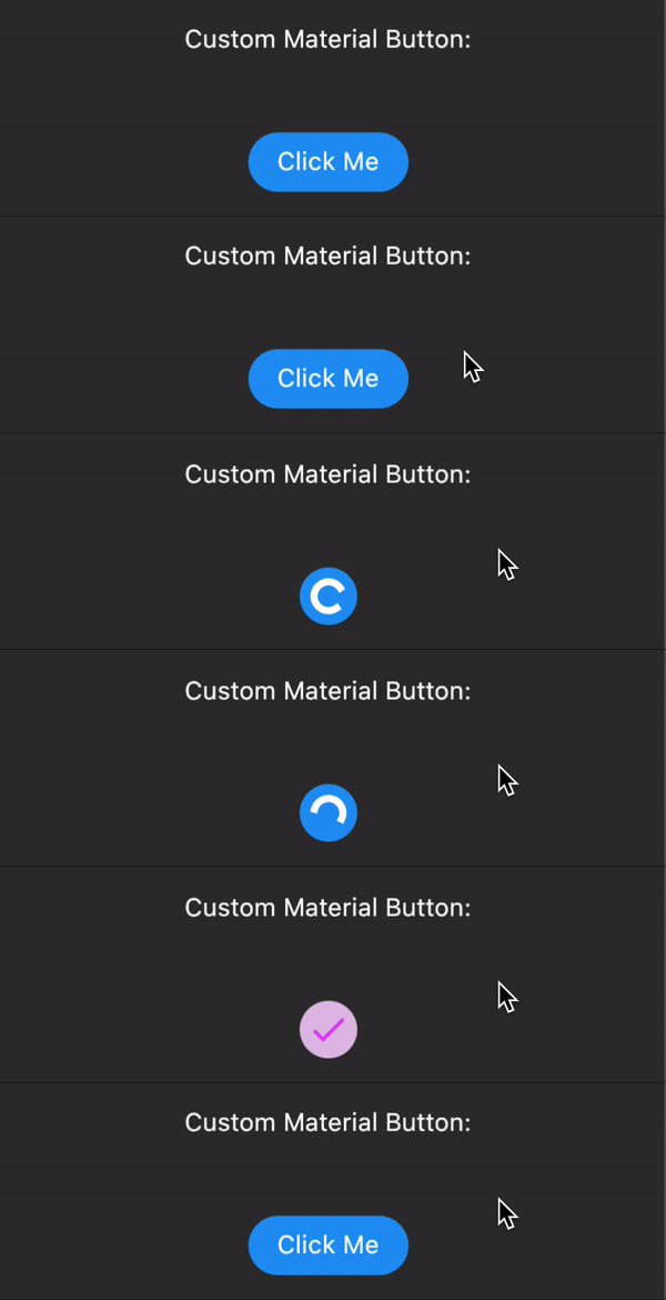
Issues and PR's welcome

Rex ↗
使用的依赖
依赖清单 6 项
- flutter
{"sdk":"flutter"} - freezed_annotation
^2.2.0 - build_runner开发依赖
^2.3.3 - flutter_lints开发依赖
^2.0.1 - flutter_test开发依赖
{"sdk":"flutter"} - freezed开发依赖
^2.3.2
如何选择适合项目的代码仓?
先按使用场景筛选,再比较项目活跃情况,最后到原始仓库核对使用要求。
- 通过仓库名、作者或描述搜索,再按技术分类缩小范围。
- 结合星标、复刻与最近推送比较项目;星标反映社区关注,不代表质量保证。
- 使用前在 GitHub 核对 README、许可证与 Issues。
来源与维护
“A repository is the most basic element of GitHub.”
GitHub Docs — About repositories ↗