
 v1.1.2
light_dark_theme_toggle
一个可动画、可自定义的 Flutter 小部件,用于在亮色模式和暗色模式之间切换,并带有视觉上吸引人的切换按钮。
16喜欢 299近 30 天下载160Pub 分数
AndroidiOSWebmacOSWindowsLinux
LightDarkThemeToggle 小部件是一个可自定义且带有动画效果的 Flutter 应用程序中的亮色/暗色主题切换开关。它为用户在您的应用程序中切换亮色模式和暗色模式提供了一种视觉上吸引人的方法。

{"sdk":"flutter"}{"sdk":"flutter"}^5.0.0以下为英文项目原文快照,最新内容请访问 GitHub。
The LightDarkThemeToggle widget is a customizable and animated light/dark theme toggle switch for
Flutter apps. It provides a visually appealing way for users to switch between light and dark modes
in your app.
CustomPainter for efficient rendering and better performance.LightDarkThemeToggle Demo
pubspec.yaml:dependencies:
light_dark_theme_toggle: ^1.1.2
import 'package:light_dark_theme_toggle/light_dark_theme_toggle.dart';
Here is an example of how to use the LightDarkThemeToggle widget:
import 'package:flutter/material.dart';
import 'package:light_dark_theme_toggle/light_dark_theme_toggle.dart';

void main() => runApp(MyApp());

class MyApp extends StatelessWidget {
  @override
  Widget build(BuildContext context) {
    return MaterialApp(
      theme: ThemeData.light(),
      darkTheme: ThemeData.dark(),
      themeMode: ThemeMode.system,
      home: Scaffold(
        appBar: AppBar(title: Text('Light/Dark Theme Toggle')),
        body: Center(
          child: LightDarkThemeToggle(
            value: false,
            // Initial value (false for dark, true for light)
            onChanged: (bool value) {
              // Handle theme change here.
            },
            size: 48.0,
            themeIconType: ThemeIconType.expand,
            color: Colors.orange,
            tooltip: 'Toggle Theme',
            duration: Duration(milliseconds: 500),
            curve: Curves.easeInOut,
          ),
        ),
      ),
    );
  }
}
| Property | Type | Default | Description |
|---|---|---|---|
value |
bool |
Required | Determines whether the toggle is in light (true) or dark (false) mode. |
onChanged |
ValueChanged<bool> |
Required | Callback when the toggle is pressed. |
themeIconType |
ThemeIconType |
ThemeIconType.expand |
Defines the style of the icon. |
color |
Color? |
ThemeData.colorScheme.onSurface |
Color of the icon. |
hoverColor |
Color? |
ThemeData.hoverColor |
Hover Color of the toggle. |
highlightColor |
Color? |
ThemeData.highlightColor |
Highlight Color of the toggle in pressed down state. |
focusColor |
Color? |
ThemeData.focusColor |
Focus Color of the toggle when it has input focus. |
splashColor |
Color? |
ThemeData.splashColor |
Splash Color of the toggle. |
tooltip |
String? |
null |
Tooltip displayed on long press or hover. |
padding |
EdgeInsetsGeometry? |
null |
Padding around the icon. |
size |
double? |
IconTheme.size ?? 24.0 |
Size of the icon. |
duration |
Duration |
Duration(milliseconds: 500) |
Duration of the animation. |
reverseDuration |
Duration |
Duration(milliseconds: 500) |
Duration of the reverse animation. |
curve |
Curve |
Curves.easeOutBack |
Animation curve for the forward animation. |
reverseCurve |
Curve |
Curves.easeOutBack |
Animation curve for the reverse animation. |
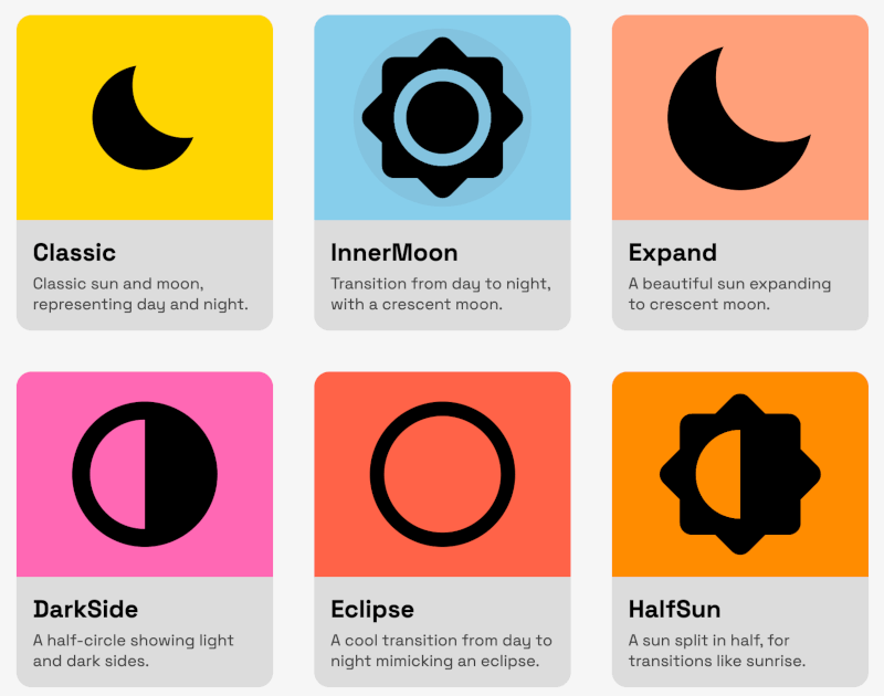
The widget supports the following icon types via the ThemeIconType enum:
To use an icon type, pass it to the themeIconType property. For example:
LightDarkThemeToggle(
  themeIconType:ThemeIconType.eclipse,
  ...
)
You can adjust the animation by changing:
duration: Duration of the forward animation.reverseDuration: Duration of the reverse animation.curve: Curve for forward animation.reverseCurve: Curve for reverse animation.You can customize the icon's:
size: Adjust the size of the toggle.padding: Add padding around the icon.tooltip: Set a tooltip message for accessibility.color: Change the icon's color.hoverColor: Change the toggle's color in hovering state.focusColor: Change the toggle's color when it has the input focus.highlightColor: Change the toggle's color in pressed down state.splashColor: Change the toggle's splash color.This project is licensed under the MIT License.
Contributions, issues, and feature requests are welcome! Feel free to check out the issues page.
This package is inspired by toggles.dev created
by Alfie Jones.
Special thanks for providing inspiration and ideas that helped shape this package.