

 v1.0.0
load
सार्वजनिक लोडिंग विजेट, शुद्ध फ्लटर लाइब्रेरी, मूल निर्माण कोड का उपयोग नहीं। इसका उपयोग OKToast के समान है।
22लाइक 1.9 हज़ार30-दिन डाउनलोड130Pub अंक
AndroidiOSWebmacOSWindowsLinux
CaiJingLong/flutter_load_widget open-source repository details.

यह अंग्रेज़ी मूल स्नैपशॉट है। नवीनतम सामग्री GitHub पर देखें।


Global loading widget, which can be used through simple configuration.
Pure flutter library, not use native code.
It is similar to OKToast in use.
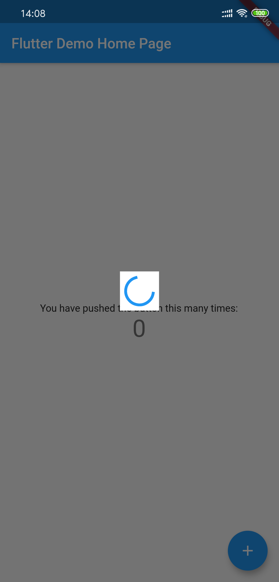
Add to yaml
version is
dependencies:
  load: $latest_version
import 'package:load/load.dart';
void main() {
  runApp(
    LoadingProvider(
      child: MyApp(),
    ),
  );
}

or

LoadingProvider(
  child: MaterialApp(),
);
Debug custom loading widget in Flutter inspector
You can try to use next method to include the widget:
MaterialApp(
  builder: (context, widget) {
    return LoadingProvider(
      child: widget,
    );
  },
);
see example/lib/main.dart
showLoadingDialog();
showCustomLoadingWidget(Container()); // custom dialog
hideLoadingDialog();
Using LoadingThemeData and loadingWidgetBuilder
LoadingProvider(
  themeData: LoadingThemeData(),
  loadingWidgetBuilder: (ctx, data) {
    return Center(
      child: SizedBox(
        width: 30,
        height: 30,
        child: Container(
          child: CupertinoActivityIndicator(),
          color: Colors.blue,
        ),
      ),
    );
  },
  child: MyApp(),
);
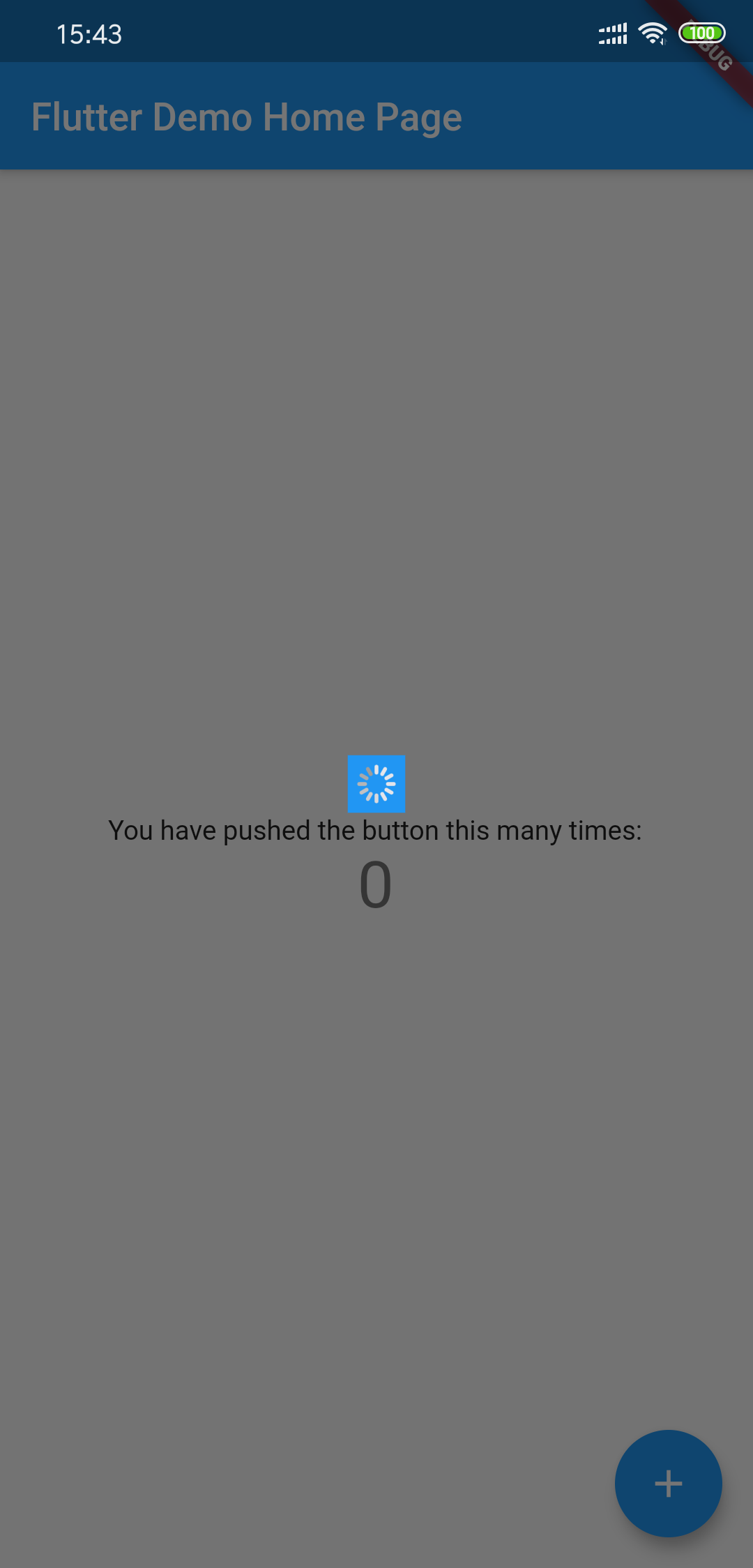
All params is optional
| Params | Type | Default Value | Desc |
|---|---|---|---|
| backgroundColor | Color | Colors.black54 | Background transparent mask |
| tapDismiss | bool | true | Will it close when touching the background? |
| loadingBackgroundColor | Color | Colors.white | Background color for the center Loading Widget |
| loadingPadding | EdgeInsets | EdgeInsets.all(8.0) | Padding for the center Loading Widget |
| loadingSize | Size | Size(55,55) | Size for the center Loading Widget |
| animDuration | Duration | Duration(milliseconds: 300) | Show/Hide Time Duration |
निर्भरता सूची 2 आइटम
{"sdk":"flutter"}{"sdk":"flutter"}उपयोग के अनुसार छाँटें, गतिविधि की तुलना करें और अपनाने से पहले मूल प्रोजेक्ट की आवश्यकताएँ जाँचें।
“A repository is the most basic element of GitHub.”
GitHub Docs — About repositories ↗