📅 Calendar_Day_Slot_Navigator
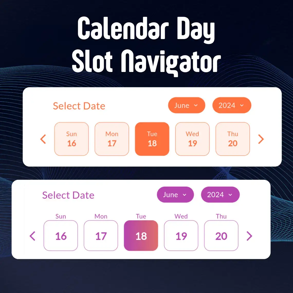
A powerful and highly customizable Flutter calendar widget that makes date selection beautiful and intuitive. Whether you're building a booking app, scheduling system, or any application that needs elegant date picking, CalendarSlot provides the flexibility and features you need.
https://raw.githubusercontent.com/DevCodeSpace/calendar_day_slot_navigator/main/assets/banner1.png
✨ Features
🚀 Getting Started
Installation
Add calendar_day_slot_navigator to your project by including it in your pubspec.yaml:
dependencies:
  calendar_day_slot_navigator: ^0.0.1
Run pub get to install the package:
flutter pub get
Import
Import the package in your Dart file:
import 'package:calendar_day_slot_navigator/calendar_day_slot_navigator.dart';
💻 Usage Examples
Basic Implementation
Here's a simple example to get you started:
CalendarDaySlotNavigator(
  slotLength: 5,
  initialSelectedDate: DateTime.now(),
  dayDisplayMode: DayDisplayMode.outsideDateBox,
  headerText: "Select Date",
  onDateSelect: (selectedDate) {
    print("Selected date: $selectedDate");
  },
)
Custom Styling
Add beautiful gradients and custom styling:
CalendarDaySlotNavigator(
  slotLength: 7,
  dayBoxHeightAspectRatio: 8,
  initialSelectedDate: DateTime.now(),
  dayDisplayMode: DayDisplayMode.insideDateBox,
  isGradientColor: true,
  activeGradientColor: LinearGradient(
    colors: [
      Color(0xffb644ae),
      Color(0xff873999),
    ],
    begin: Alignment.topLeft,
    end: Alignment.bottomRight,
  ),
  monthYearTabBorderRadius: 15,
  dayBoxBorderRadius: 10,
  headerText: "Select Your Preferred Date",
  fontFamilyName: "Roboto",
  isGoogleFont: true,
  dayBorderWidth: 0.5,
  onDateSelect: (selectedDate) {
    print("Selected date: $selectedDate");
  },
)
Date Range Selection
Implement date range selection with specific active dates:
CalendarDaySlotNavigator(
  dateSelectionType: DateSelectionType.activeRangeDates,
  rangeDates: [
    DateTime(2024, 6, 1),
    DateTime(2024, 6, 2),
    DateTime(2024, 6, 3),
    DateTime(2024, 6, 4),
    DateTime(2024, 6, 5),
  ],
  onDateSelect: (selectedDate) {
    print("Selected date within range: $selectedDate");
  },
)
🛠️ Properties Guide
Essential Properties
| Property |
Type |
Default |
Description |
| slotLength |
int? |
7 |
📏 Determines how many days are displayed in each row. Useful for different screen sizes and layouts. |
| dayBoxHeightAspectRatio |
double? |
6.0 |
📐 Controls the height of day boxes relative to their width. Higher values make boxes shorter. |
| dayDisplayMode |
DayDisplayMode |
outsideDateBox |
🎯 Determines where day names appear relative to date boxes. Choose between outsideDateBox or insideDateBox. |
Styling Properties
| Property |
Type |
Default |
Description |
| activeColor |
Color? |
Theme primary |
🎨 Background color for selected dates |
| deActiveColor |
Color? |
White |
⚪️ Background color for unselected dates |
| isGradientColor |
bool? |
false |
🌈 Enable gradient backgrounds for dates |
| activeGradientColor |
LinearGradient? |
null |
🎨 Custom gradient for selected dates |
| deActiveGradientColor |
LinearGradient? |
null |
⚪️ Custom gradient for unselected dates |
| monthYearTabBorderRadius |
double? |
10.0 |
📏 Border radius for month/year selection tabs |
| dayBoxBorderRadius |
double? |
8.0 |
📏 Border radius for individual day boxes |
| dayBorderWidth |
double? |
1.0 |
✏️ Width of borders around day boxes |
Font Properties
| Property |
Type |
Default |
Description |
| fontFamilyName |
String? |
System |
🔤 Name of the font family to use |
| isGoogleFont |
bool? |
false |
📱 Set to true when using Google Fonts |
Selection Properties
| Property |
Type |
Description |
| dateSelectionType |
DateSelectionType |
🎯 Controls which dates can be selected |
| rangeDates |
List<DateTime>? |
📅 List of dates for range-based selection types |
| onDateSelect |
Function(DateTime)? |
🖱️ Callback function when a date is selected |
| initialSelectedDate |
DateTime |
📍 Sets the default selected date when calendar first loads |
Date Selection Types Explained
-
activeAllDates
- All dates in the calendar are selectable
- Useful for unrestricted date picking
-
activePastDates
- Only dates before today are selectable
- Perfect for selecting historical dates
-
activeFutureDates
- Only dates after today are selectable
- Ideal for booking systems and scheduling
-
activeTodayAndPastDates
- Today and all past dates are selectable
- Good for recording past events including today
-
activeTodayAndFutureDates
- Today and all future dates are selectable
- Great for appointment scheduling
-
activeRangeDates
- Only specified dates in
rangeDates are selectable
- Useful for custom date ranges
-
deActiveRangeDates
- Specified dates in
rangeDates are not selectable
- Perfect for blocking out unavailable dates
📱 Display Modes
Outside Date Box Mode
dayDisplayMode: DayDisplayMode.outsideDateBox
- Day names appear above the date boxes
- Provides a clean, separated look
- More space for date numbers
Inside Date Box Mode
dayDisplayMode: DayDisplayMode.insideDateBox
- Day names appear inside the date boxes
- More compact layout
- Ideal for space-conscious designs
🎨 Styling Tips
-
Color Combinations
activeColor: Color(0xffb644ae),    // Purple for selected
deActiveColor: Color(0xffF5F5F5),  // Light grey for unselected
-
Gradient Effects
isGradientColor: true,
activeGradientColor: LinearGradient(
  colors: [Color(0xffb644ae), Color(0xff873999)],
  begin: Alignment.topLeft,
  end: Alignment.bottomRight,
),
-
Border Styling
dayBoxBorderRadius: 12,
dayBorderWidth: 0.5,
💡 Best Practices
-
Responsive Design
- Adjust
slotLength based on screen width
- Use appropriate
dayBoxHeightAspectRatio for different screen sizes
-
Selection Types
- Choose appropriate
dateSelectionType for your use case
- Always handle
onDateSelect callback for user interactions
-
Accessibility
- Use sufficient color contrast
- Provide clear header text
- Consider font size and readability
🤝 Contributing
https://raw.githubusercontent.com/DevCodeSpace/calendar_day_slot_navigator/refs/heads/main/assets/contributors.png
Made with ❤️ by the DevCodeSpace


 v0.0.1