
 v3.2.0
flutter_neumorphic
Flutter के लिए एक पूर्ण, तैयार उपयोग के लिए, Neumorphic UI किट। डार्क थीमिंग सहित और पूरी तरह से कस्टमाइज़ करने योग्य।
1.8 हज़ारलाइक 1.3 हज़ार30-दिन डाउनलोड70Pub अंक
प्लेटफ़ॉर्म डेटा नहीं
Flutter के लिए एक पूर्ण, तैयार उपयोग के लिए, Neumorphic UI किट, 🕶️ डार्क मोड संगत

{"sdk":"flutter"}{"sdk":"flutter"}यह अंग्रेज़ी मूल स्नैपशॉट है। नवीनतम सामग्री GitHub पर देखें।
A complete, ready to use, Neumorphic ui kit for Flutter
Try Flutter-Neumorphic on your browser : 👉 https://flutter-neumorphic.firebaseapp.com/ 🌐
https://pub.dev/packages/flutter_neumorphic
dependencies:
  flutter_neumorphic: ^3.0.3

//requires flutter > 1.13.18
The in your .dart files
import 'package:flutter_neumorphic/flutter_neumorphic.dart';
| Preview | Widget | Description |
|---|---|---|
| https://github.com/Idean/Flutter-Neumorphic/raw/master/medias/widgets/container.gif | Neumorphic | The main Neumorphic Widget, a container which adds white/dark gradient depending on a lightsource and a depth |
| https://github.com/Idean/Flutter-Neumorphic/raw/master/medias/widgets/button.gif | NeumorphicButton | A neumorphic button that plays with the depth to respond to user interraction |
| https://github.com/Idean/Flutter-Neumorphic/raw/master/medias/widgets/radio.gif | NeumorphicRadio | A set of neumorphic button whith only one selected at time, depending on a value and groupValue |
| https://github.com/Idean/Flutter-Neumorphic/raw/master/medias/widgets/checkbox.gif | NeumorphicCheckbox | A button associated with a value, can be checked/unckecked, if checked, takes the accent color |
| https://github.com/Idean/Flutter-Neumorphic/raw/master/medias/widgets/text.png | NeumorphicText | A Neumorphic text (only work with positive depth) |
| https://github.com/Idean/Flutter-Neumorphic/raw/master/medias/widgets/icon.png | NeumorphicIcon | A Neumorphic icon (only work with positive depth) |
| https://github.com/Idean/Flutter-Neumorphic/raw/master/medias/widgets/textfield.png | material.TextField | For TextFields, just surround your existing material textfield widget with a Neumorphic (container) |
| https://github.com/Idean/Flutter-Neumorphic/raw/master/medias/widgets/switch.gif | NeumorphicSwitch | An On/Off toggle, associated with a value, if toggled, takes the accent color |
| https://github.com/Idean/Flutter-Neumorphic/raw/master/medias/widgets/toggle.gif | NeumorphicToggle | An mutiple value toggle, associated with a selecteedIndex |
| https://github.com/Idean/Flutter-Neumorphic/raw/master/medias/widgets/slider.gif | NeumorphicSlider | A Neumorphic seekbar (range slider), the user can select a value in a range |
| https://github.com/Idean/Flutter-Neumorphic/raw/master/medias/widgets/progress.gif | NeumorphicProgress | A determinate progress, takes the displayed percentage |
| https://github.com/Idean/Flutter-Neumorphic/raw/master/medias/widgets/indeterminate.gif | NeumorphicProgressIndeterminate | An inderminate progress-bar |
| https://github.com/Idean/Flutter-Neumorphic/raw/master/medias/widgets/background.png | NeumorphicBackground | Take the background color of the theme, can clip the screen with a borderRadius |
| https://github.com/Idean/Flutter-Neumorphic/raw/master/medias/widgets/background.png | NeumorphicApp | An application that uses Neumorphic design. Handle theme, navigation, localisation, and much more |
| https://github.com/Idean/Flutter-Neumorphic/raw/master/medias/widgets/app_bar.png | NeumorphicAppBar | A Neumorphhic design app bar. Can be used inside Scaffold |
Neumorphic(
  style: NeumorphicStyle(
    shape: NeumorphicShape.concave,
    boxShape: NeumorphicBoxShape.roundRect(BorderRadius.circular(12)),
    depth: 8,
    lightSource: LightSource.topLeft,
    color: Colors.grey
  ),
  child: ...
)
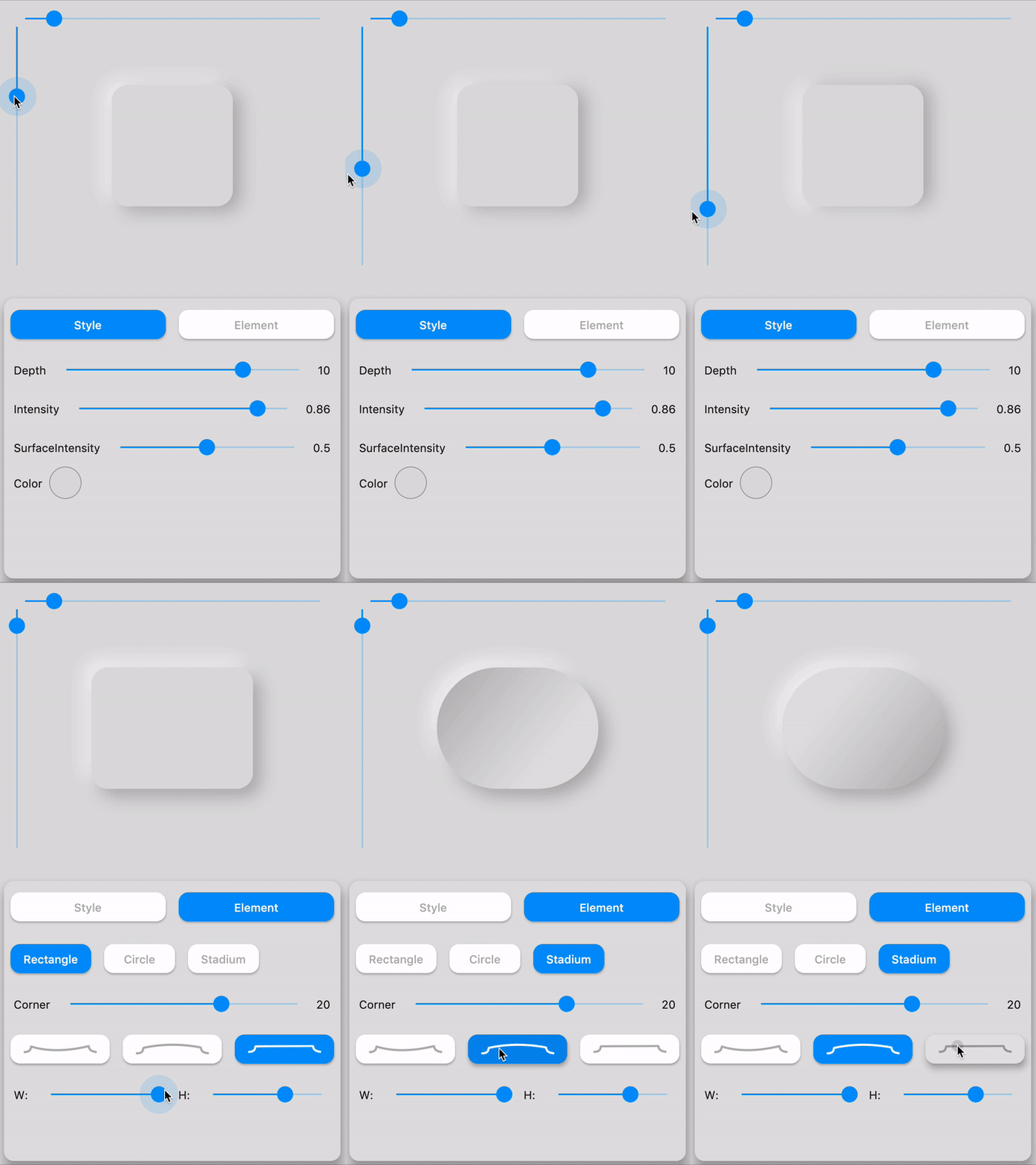
☝️ Playing with LightSource & Depth
| Attributes | Values | Description |
|---|---|---|
| LightSource | TopLeft, BottomRight, etc. / (dx, dy) | The source of light specifit to the theme or the widget, used to project white/dark shadows on neumorphic elements |
| Shape | Concave / Convex / Flat | The shape of the curve used in the neumorphic container |
| Depth | -20 <= double <= 20 | The distance of the widget to his parent. Can be negative => emboss. It influences on the shadow's color and its size/blur |
| Intensity | 0 <= double <= 1 | The intensity of the Light, it influences on the shadow's color |
| SurfaceIntensity | 0 <= double <= 1 | The intensity of the Surface, it influences on the concave/convex darkness |
| Color | any Color | The default color of Neumorphic elements |
| Accent | any Color | The default accent color of the Neumorphic element when activated (eg: checkbox) |
| Variant | any Color | The default secondary color of the Neumorphic element (eg: used as second color on the progress gradient) |
| BoxShape | Circle, RoundRect(radius), Stadium, Path | The box shape of a Neumorphic element. Stadium : roundrect with cirlces on each side |
| Border | NeumorphicBorder | A border (color/width) to enhance contrast with background and others elements |
Neumorphic Neumorphic Neumorphic Neumorphic
| Shape | Widget | Image | Condition |
|---|---|---|---|
| Flat | https://github.com/Idean/Flutter-Neumorphic/raw/master/medias/shapes/widget_flat.png | https://github.com/Idean/Flutter-Neumorphic/raw/master/medias/shapes/flat.png | depth >= 0 && shape == Flat |
| Convex | https://github.com/Idean/Flutter-Neumorphic/raw/master/medias/shapes/widget_convex.png | https://github.com/Idean/Flutter-Neumorphic/raw/master/medias/shapes/convex.png | depth >= 0 && shape == Convex |
| Concave | https://github.com/Idean/Flutter-Neumorphic/raw/master/medias/shapes/widget_concave.png | https://github.com/Idean/Flutter-Neumorphic/raw/master/medias/shapes/concave.png | depth >= 0 && shape == Concave |
| Emboss | https://github.com/Idean/Flutter-Neumorphic/raw/master/medias/shapes/widget_emboss.png | https://github.com/Idean/Flutter-Neumorphic/raw/master/medias/shapes/emboss.png | depth < 0 |
Text only handle positive depth
child: NeumorphicText(
        "I love flutter",
        style: NeumorphicStyle(
          depth: 4,  //customize depth here
          color: Colors.white, //customize color here
        ),
        textStyle: NeumorphicTextStyle(
          fontSize: 18, //customize size here
          // AND others usual text style properties (fontFamily, fontWeight, ...)
        ),
    ),
child: NeumorphicIcon(
        Icons.add_circle,
        size: 80,
    ),
How to display SVG icons ?
Simply use https://fluttericon.com/ to export your svg as .ttf & use NeumorphicIcon(YOUR_ICON)
Flutter Neumorphic supports custom shapes, just provide a path to
class MyShapePathProvider extends NeumorphicPathProvider {
  @override
  bool shouldReclip(NeumorphicPathProvider oldClipper) {
    return true;
  }

  @override
  Path getPath(Size size) {
    return Path()
      ..moveTo(0, 0)
      ..lineTo(size.width/2, 0)
      ..lineTo(size.width, size.height/2)
      ..lineTo(size.width/2, size.height/2)
      ..lineTo(size.width, size.height)
      ..lineTo(0, size.height)
      ..close();
  }
}
And use NeumorphicBoxShape.path
Neumorphic(
  style: NeumorphicStyle(
     boxShape: NeumorphicBoxShape.path(MyShapePathProvider()),
  ),
  ...
),
You can import the Flutter logo as a custom shape using
Neumorphic(
  style: NeumorphicStyle(
    shape: NeumorphicBoxShape.path(NeumorphicFlutterLogoPathProvider()),
  ),
  ...
),
For design purposes, or simply to enhance accessibility, you can add a border on Neumorphic widgets
Neumorphic(
      style: NeumorphicStyle(
        border: NeumorphicBorder(
          color: Color(0x33000000),
          width: 0.8,
        )
      ),
      ...
)
You can enable/disable it (eg: listening an Accessibility Provider) with isEnabled
border: NeumorphicBorder(
    isEnabled: true,
    color: Color(0x33000000),
    width: 0.8,
)
Note that borderColor and borderWidth default values has been added to NeumorphicThemeData
neumorphic_theme neumorphic_theme
NeumorphicTheme(
    themeMode: ThemeMode.light, //or dark / system
    darkTheme: NeumorphicThemeData(
        baseColor: Color(0xff333333),
        accentColor: Colors.green,
        lightSource: LightSource.topLeft,
        depth: 4,
        intensity: 0.3,
    ),
    theme: NeumorphicThemeData(
        baseColor: Color(0xffDDDDDD),
        accentColor: Colors.cyan,
        lightSource: LightSource.topLeft,
        depth: 6,
        intensity: 0.5,
    ),
    child: ...
)
To retrieve the current used theme :
final theme = NeumorphicTheme.currentTheme(context);
final baseColor = theme.baseColor;
final accentColor = theme.accentColor;
...
Toggle from light to dark
NeumorphicTheme.of(context).themeMode = ThemeMode.dark;
Know if using dark
if(NeumorphicTheme.of(context).isUsingDark){

}
You can use direcly in your project a NeumorphicApp, surrounding your code
It handle directly NeumorphicTheme & Navigation (and all possibilities of MaterialApp )
void main() => runApp(MyApp());

class MyApp extends StatelessWidget {
  // This widget is the root of your application.
  @override
  Widget build(BuildContext context) {
    return NeumorphicApp(
      debugShowCheckedModeBanner: false,
      title: 'Neumorphic App',
      themeMode: ThemeMode.light,
      theme: NeumorphicThemeData(
        baseColor: Color(0xFFFFFFFF),
        lightSource: LightSource.topLeft,
        depth: 10,
      ),
      darkTheme: NeumorphicThemeData(
        baseColor: Color(0xFF3E3E3E),
        lightSource: LightSource.topLeft,
        depth: 6,
      ),
      home: MyHomePage(),
    );
  }
}
A Modern / Material (upgraded) card usually is a surface floating on top of our perceived background and casting a shadow onto it. The shadow both gives it depth and also in many cases defines the shape itself — as it’s quite often borderless.
Neumorphic card however pretends to extrude from the background. It’s a raised shape made from the exact same material as the background. When we look at it from the side we see that it doesn’t “float”.
Here's a Nereumorphic Button tap (slowed x2) from the sample app, you can see how the element seems to change its depth to its surface.
| Contributors | |
|---|---|
| florent | Florent Champigny |
| olivier | Olivier Bonvila |
| gyl | Gyl Jean Lambert |
| jaumard | Jimmy Aumard |
| Overman775 | Overman775 |
| schopy | schopy |
Flutter-Neumorphic is released under the Apache2 license. See LICENSE for details.
If you use the open-source library in your project, please make sure to credit and backlink to www.idean.com