
 v1.1.4
flutter_slidable_panel
एक उच्च प्रदर्शन वाला स्लाइडेबल पैनल जो अलग-अलग स्थितियों में कार्रवाई दिखा सकता है, और साथ ही पैनल खुलते समय कार्रवाई आइटम को फैला सकता है
12लाइक 13830-दिन डाउनलोड140Pub अंक
AndroidiOSWebmacOSWindowsLinux
Flutter के लिए उच्च प्रदर्शन वाला स्लाइडिंग पैनल।

{"sdk":"flutter"}{"sdk":"flutter"}^2.0.0यह अंग्रेज़ी मूल स्नैपशॉट है। नवीनतम सामग्री GitHub पर देखें।
A high-performant slidable Panel that can show actions in different positions, and also can expand the action item when the panel is opening
this package uses some syntax sugar of Dart 3.0, please create issues if you want to use this package in Dart 2.x, I will remove those syntax sugars and migrate it to Dart 2.x
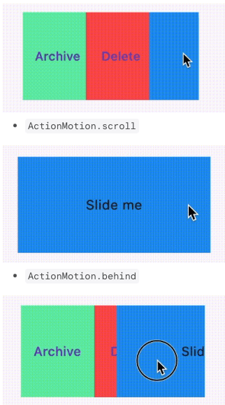
SlidablePanelSlidablePanel and actions programmatically using SlideController, not limited to gestures.SlidablePanel is opening.ActionMotion.drawerActionMotion.scrollActionMotion.behindBy setting gestureDisabled: true, you could avoid gesture sliding and continue sliding via SlideController programmatically
SlidablePanel(
  ...
  gestureDisabled: true,
  ...
)
By specifying the initOpenedPosition of SlideController, you could open actions at the initOpenedPosition without using WidgetsBinding.instance.addPostFrameCallback.
you should ensure there are actions at the specified
initOpenedPosition
  final SlideController _slideController = SlideController(
    usePreActionController: true,
    usePostActionController: true,
    initOpenedPosition: ActionPosition.pre,
  );
import 'package:flutter/material.dart';
import 'package:flutter_slidable_panel/flutter_slidable_panel.dart';

class SizedSlidableExample extends StatefulWidget {
  const SizedSlidableExample({super.key});

  @override
  State<SizedSlidableExample> createState() => _SizedSlidableExampleState();
}

class _SizedSlidableExampleState extends State<SizedSlidableExample> {
  final SlideController _slideController = SlideController(
    usePreActionController: true,
    usePostActionController: true,
  );

  @override
  void dispose() {
    _slideController.dispose();
    super.dispose();
  }

  @override
  Widget build(BuildContext context) {
    return Scaffold(
      appBar: AppBar(
        title: const Text('Sized Slidable Example'),
      ),
      body: Center(
        child: SlidablePanel(
          controller: _slideController,
          maxSlideThreshold: 0.8,
          axis: Axis.horizontal,
          preActions: [
            TextButton(
              onPressed: () {
                _slideController.toggleAction(0);
              },
              style: TextButton.styleFrom(
                backgroundColor: Colors.greenAccent,
                shape: const RoundedRectangleBorder(),
              ),
              child: const Text("PreAction"),
            ),
            TextButton(
              onPressed: () {
                _slideController.toggleAction(1);
              },
              style: TextButton.styleFrom(
                backgroundColor: Colors.redAccent,
                shape: const RoundedRectangleBorder(),
              ),
              child: const Text("PreAction"),
            ),
          ],
          postActions: [
            TextButton(
              onPressed: () {
                _slideController.toggleAction(0);
              },
              style: TextButton.styleFrom(
                backgroundColor: Colors.greenAccent,
                shape: const RoundedRectangleBorder(),
              ),
              child: const Text("PostAction"),
            ),
            TextButton(
              onPressed: () {
                _slideController.toggleAction(1);
              },
              style: TextButton.styleFrom(
                backgroundColor: Colors.redAccent,
                shape: const RoundedRectangleBorder(),
              ),
              child: const Text("PostAction"),
            ),
          ],
          child: GestureDetector(
            onTap: () {
              _slideController.dismiss();
            },
            child: const DecoratedBox(
              decoration: BoxDecoration(color: Colors.blue),
              child: SizedBox(
                width: 250,
                height: 100,
                child: Center(
                  child: Text(
                    'Slide me',
                  ),
                ),
              ),
            ),
          ),
        ),
      ),
    );
  }
}
SlideControllerusePreActionController indicates if you want to enable expanding/collapsing the pre actionsusePostActionController indicates if you want to enable expanding/collapsing the post actions.if [usePreActionController] or [usePostActionController] is set to true, the corresponding [ActionController] would be created and bound to [RenderSlideAction] automatically
  final SlideController _slideController = SlideController(
    usePreActionController: true,
    usePostActionController: true,
  );
SlidablePanel.preActionLayout and SlidablePanel.postActionLayout accept ActionLayout as parameters.
You could determine how to layout the actions at the different positions by specifying:
when using
ActionAlignment.flex, you could give an action a specific flex value usingActionItem. Other actions not wrapped inActionItemwould have a default flex value of 1.
ActionAlignment.spaceEvenlywould ignoreActionItem
ActionLayout(
  alignment: ActionAlignment.spaceEvenly || ActionAlignment.flex,
)
ActionLayout(
  motion: ActionMotion.behind || ActionMotion.drawer || ActionMotion.scroll
)
You could set onSlideStart to do some work when starting sliding,
e.g., you want to dismiss all other SlidablePanel when starting sliding.
SlidablePanel(
  /// other code
  onSlideStart: <your function>,
  /// other code
)
SlideController programmaticallySlideController.open({
ActionPosition position = ActionPosition.pre,
Curve curve = Curves.easeInOut,
Duration duration = const Duration(milliseconds: 300),
VoidCallback? onOpened,
});
SlideController.dismiss({
    Curve curve = Curves.easeInOut,
    Duration duration = const Duration(milliseconds: 300),
    VoidCallback? onDismissed,
  })
SlideController.openedPosition
ActionPosition.pre for horizontal and verticalActionPosition.post for horizontal and verticalindex action at the opened positionindex is the index in SlidablePanel.preActions or SlidablePanel.postActions
it will try to expand the
indexaction at the current opened position if this panel is opened;
if this panel is closed/dismissed, it has no effects
if the current opened position has no associated
ActionController, it also has no effects
you could associate
ActionControllerto a specific position by settingusePreActionControllerorusePostActionControllerastrue.
SlideController.expand(
    int index, {
    Curve curve = Curves.easeInOut,
    Duration duration = const Duration(milliseconds: 150),
  })
index action at the opened positionSlideController.collapse(
int index, {
required ActionPosition position,
Curve curve = Curves.easeInOut,
Duration duration = const Duration(milliseconds: 150),
})
index action at the opened positionSlideController.toggleAction(
int index, {
Curve curve = Curves.easeInOut,
Duration duration = const Duration(milliseconds: 150),
})
index action is expandedbool SlideController.hasExpandedAt(int index)