
 v4.1.1
flutter_flow_chart
विभिन्न प्रकार के कस्टमाइज़ेबल तत्वों के साथ एक फ्लोचार्ट डायग्राम बनाएं। डैशबोर्ड को बाद में उपयोग के लिए सहेजा जा सकता है।
197लाइक 1.4 हज़ार30-दिन डाउनलोड160Pub अंक
AndroidiOSWebmacOSWindowsLinux
एक #Flutter पैकेज जो आपको विभिन्न प्रकार के कस्टमाइज़ करने योग्य तत्वों के साथ एक प्रवाह चार्ट डायग्राम बनाने की अनुमति देता है

{"sdk":"flutter"}^4.4.0{"sdk":"flutter"}^5.1.0यह अंग्रेज़ी मूल स्नैपशॉट है। नवीनतम सामग्री GitHub पर देखें।
A package that let you draw a flow chart diagram with different kinds of customizable elements. Dashboards can be saved for later use.
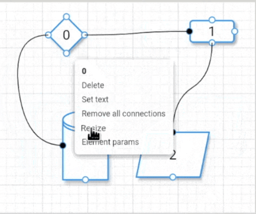
Image
See the online example here
First create a Dashboard:
Dashboard dashboard = Dashboard(
    blockDefaultZoomGestures: false,    // optional
    handlerFeedbackOffset: Offset.zero, // optional
    minimumZoomFactor: 1.25,            // optional
    defaultArrowStyle: ArrowStyle.curve,       // optional
);
then crete the [FlowChart] widget where you can react to the user interactions:
FlowChart(
    dashboard: dashboard,
    onDashboardTapped: ((context, position) {}),
    onDashboardLongtTapped: ((context, position) {}),
    onElementLongPressed: (context, element) {},
    onElementPressed: (context, element) {},
    onHandlerPressed: (context, position, handler, element) {},
    onHandlerLongPressed: (context, position, handler, element) {},
    onScaleUpdate: (newScale) {},
)
then use the _dashboard_ variable to add, remove, resize, etc. elements or load/save the dashboard.

In the [example](https://github.com/alnitak/flutter_flow_chart/blob/master/example/lib/main.dart), the [StarMenu](https://pub.dev/packages/star_menu) package is used to easily interact with user inputs.
The **Dashboard** object contains all the methods described below used to interact with the flow chart.

| **relevant methods**       | **description**                                                                                                          |
| -------------------------- | ------------------------------------------------------------------------------------------------------------------------ |
| _setGridBackgroundParams_  | set grid background parameters                                                                                           |
| _setHandlerFeedbackOffset_ | set the feedback offset to help on mobile device to see the end of arrow and not hiding behind the finger when moving it |
| _setElementResizable_      | set the element as resizable. A handle will be displayed on the bottom right and will disappear when finish resizing     |
| _addElement_               | add a _FlowElement_ to the dashboard                                                                                     |
| _removeAllElements_        | remove all elements                                                                                                      |
| _removeElementConnection_  | remove the given handler connection of the given element                                                                 |
| _removeElementConnections_ | remove all the connections from the given element                                                                        |
| _removeElementById_        | remove all the elements with the given id from the dashboard                                                             |
| _removeElement_            | remove the given element                                                                                                 |
| _addNextById_              | make a connection from the given sourceElement to the elements with the given id                                         |
| _recenter_                 | Recenter the dashboard relative to the first element in the element array                                                |
| _saveDashboard_            | save the dashboard into the given file path                                                                              |
| _loadDashboard_            | clear the dashboard and load the new one                                                                                 |
| _setZoomFactor_            | Zoom the entire dashboard and content by the given factor corresponding to the given epicenter                           |
| _dissectElementConnection_ | Dissect the connection into two segments from the given point. Only available on ArrowStyle.segmented                    |
| _dissectElementConnection_ | Remove dissection by the given pivot                                                                                     |
| _setArrowStyle_            | Update arrow style for single connection using the source and destination elements                                       |
The _FlowElement_ defines the element kind with its position, size, colors and so on.

| **properties**    | **type**               | **description**                                                              |
| ----------------- | ---------------------- | ---------------------------------------------------------------------------- |
| _position_        | Offset                 | The position of the _FlowElement_                                            |
| _size_            | Size                   | The size of the _FlowElement_                                                |
| _text_            | String                 | Element text                                                                 |
| _textColor_       | Color                  | Text color                                                                   |
| _fontFamily_      | String                 | Text font family                                                             |
| _textSize_        | double                 | Text size                                                                    |
| _textIsBold_      | bool                   | Makes text bold if true                                                      |
| _kind_            | ElementKind            | Element shape: enum {rectangle, diamond, storage, oval, parallelogram}       |
| _handlers_        | List<Handler>          | Connection handlers: enum {topCenter, bottomCenter, rightCenter, leftCenter} |
| _handlerSize_     | Size                   | The size of element handlers                                                 |
| _backgroundColor_ | Size                   | Background color of the element                                              |
| _borderColor_     | Size                   | Border color of the element                                                  |
| _borderThickness_ | Size                   | Border thickness of the element                                              |
| _elevation_       | Size                   | Shadow elevation                                                             |
| _next_            | List<ConnectionParams> | Shadow elevation                                                             |

| **relevant methods** | **description**                                                                                                                      |
| -------------------- | ------------------------------------------------------------------------------------------------------------------------------------ |
| _setIsResizing_      | When setting to true, a handler will disply at the element bottom right to let the user to resize it. When finish it will disappear. |
| _setText_            | Set element text                                                                                                                     |
| _setTextColor_       | Set text color                                                                                                                       |
| _setTextSize_        | Set text size                                                                                                                        |
| _setTextIsBold_      | Set text bold                                                                                                                        |
| _setBackgroundColor_ | Set background color                                                                                                                 |
| _setBorderColor_     | Set border color                                                                                                                     |
| _setBorderThickness_ | Set border thickness                                                                                                                 |
| _setElevation_       | Set elevation                                                                                                                        |
| _changePosition_     | Change element position in the dashboard                                                                                             |
| _changeSize_         | Change element size                                                                                                                  |
Dashboard dashboard = Dashboard();

///////////////////////////////////
/// Define 2 elements
FlowElement element1 = FlowElement(
/// position in the local dashboard coordinates
position: const Offset(100, 100),
/// element size
size: const Size(100, 100),
/// text to show
text: 'diamond',
/// rectangle, diamond, storage, oval or parallelogram element kind
kind: ElementKind.diamond,
/// which handler to make active
handlers: [
    Handler.bottomCenter,
    Handler.topCenter,
    Handler.leftCenter,
    Handler.rightCenter,
]);
FlowElement element2 = FlowElement(
    position: const Offset(300, 100),
    size: const Size(100, 150),
    text: 'rect',
    kind: ElementKind.rectangle,
    handlers: [
    Handler.bottomCenter,
    Handler.topCenter,
    Handler.leftCenter,
    Handler.rightCenter,
]);
///////////////////////////////////
/// Add the element to Dashboard
dashboard.addElement(element);

///////////////////////////////////
/// Connect right handler of element1
/// to the left handler of element2
dashboard.addNextById(
    element1,
    element2.id,
    ArrowParams(
        thickness: 1.5,
        color: Colors.Black,
        startArrowPosition: Alignment.centerRight,
        endArrowPosition: Alignment.centerLeft,
    ),
);

///////////////////////////////////
/// Save/load dashboard
Directory appDocDir = await path.getApplicationDocumentsDirectory();

dashboard.saveDashboard('${appDocDir.path}/FLOWCHART.json');

dashboard.loadDashboard('${appDocDir.path}/FLOWCHART.json');
The library supports attaching arbitrary data to each element via the generic elementData field. To preserve this data across JSON save/load you must provide a serializer when creating the Dashboard. The serializer implements the DataSerializer<T, JSON> mixin and converts between your data type and a JSON-compatible representation (typically Map<String, dynamic>).
Notes
Dashboard, FlowChart and FlowElement must use the same generic type T.elementData will be treated as JSON serializable as it is, but will cause an error when the data is not serializable.// Serializer that converts ExampleData <-> Map<String, dynamic>
class ExampleDataSerializer with DataSerializer<ExampleData, Map<String, dynamic>> {
@override
ExampleData? fromJson(Map<String, dynamic>? source) {
if (source == null) return null;
return ExampleData(
name: source['name'] as String,
value: source['value'] as int,
);
}
@override
Map<String, dynamic>? toJson(ExampleData? data) {
if (data == null) return null;
return <String, dynamic>{
'name': data.name,
'value': data.value,
};
}
}
class ExampleData {
ExampleData({ required this.name, required this.value });
final String name;
final int value;
}
// Create a dashboard that knows how to (de)serialize ExampleData
final Dashboard<ExampleData> dashboard = Dashboard<ExampleData>(
dataSerializer: ExampleDataSerializer(),
);
// Use the same generic type for the FlowChart
FlowChart<ExampleData>(
dashboard: dashboard,
onDashboardTapped: ((context, position) {}),
onDashboardLongtTapped: ((context, position) {}),
onElementLongPressed: (context, element) {},
onElementPressed: (context, element) {},
onHandlerPressed: (context, position, handler, element) {},
onHandlerLongPressed: (context, position, handler, element) {},
onScaleUpdate: (newScale) {},
);
// Create an element with custom data
final FlowElement<ExampleData> element = FlowElement<ExampleData>(
position: const Offset(300, 100),
size: const Size(100, 150),
text: 'rect',
kind: ElementKind.rectangle,
handlers: [
Handler.bottomCenter,
Handler.topCenter,
Handler.leftCenter,
Handler.rightCenter,
],
elementData: ExampleData(value: 42, name: 'Example Data'),
);
// Save/load will preserve `elementData` thanks to the provided serializer
await dashboard.saveDashboard('${appDocDir.path}/FLOWCHART.json');
await dashboard.loadDashboard('${appDocDir.path}/FLOWCHART.json');
This preserves your custom data across persistence and ensures type-safety when interacting with elements in the UI.
The library supports custom elements via ElementKind.custom.
ElementKind.custom, provide a customElementBuilder to the FlowChart constructor. The builder is called for each element with kind == ElementKind.custom and must return a Widget.// flow chart construction
FlowChart(
dashboard: dashboard,
// ...callbacks...
// custom element builder: receives (BuildContext, FlowElement<T>)
customElementBuilder: (context, element) =>
SomeCustomWidget(text: element.text),
);
// new element (same as any other element)
dashboard.addElement(
FlowElement(
position: position,
size: const Size(100, 150),
text: '${dashboard.elements.length}',
handlerSize: 25,
handlers: [
Handler.bottomCenter,
Handler.leftCenter,
Handler.rightCenter,
],
elementData: ExampleData(name: 'Example', value: 42),
kind: ElementKind.custom,
),
);
elementData as a discriminator: store a type/id in your custom data and inspect it inside customElementBuilder to render different widgets.// element with discriminator
dashboard.addElement(
FlowElement(
position: position,
size: const Size(100, 150),
text: '1',
handlers: [Handler.bottomCenter],
elementData: ExampleData(name: 'Example', value: 42, type: 'STAR'),
kind: ElementKind.custom,
),
);
// builder inspects element.elementData
FlowChart(
dashboard: dashboard,
customElementBuilder: (context, element) {
final data = element.elementData as ExampleData?;
if (data?.type == 'STAR') return StarWidget(data: data);
if (data?.type == 'CIRCLE') return CircleWidget(data: data);
return DefaultCustomWidget(text: element.text);
},
);
This keeps the API simple while letting you implement any number of custom element views.