

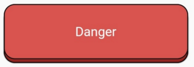
 v2.0.0+3
button_animations
एक पैकेज जो आपको अत्यधिक कस्टमाइज़ेबल एनीमेटेड 3डी बटन बनाने में मदद करता है।
39लाइक 630-दिन डाउनलोड140Pub अंक
AndroidiOSWebmacOSWindowsLinux
3D एनीमेशन के साथ बहुत अनुकूलित फ्लटर विजेट्स बनाने के लिए एक सरल फ्लटर पैकेज।

यह अंग्रेज़ी मूल स्नैपशॉट है। नवीनतम सामग्री GitHub पर देखें।


The button_animations is a package to make highly customizable Flutter widgets with 3d animations.
To use this plugin, add the latest version of button_animations as a dependency in your pubspec.yaml file.
| Android | iOS | Web | MacOS | Linux | Windows |
|---|---|---|---|---|---|
| ✅ | ✅ | ✅ | ✅ | ✅ | ✅ |
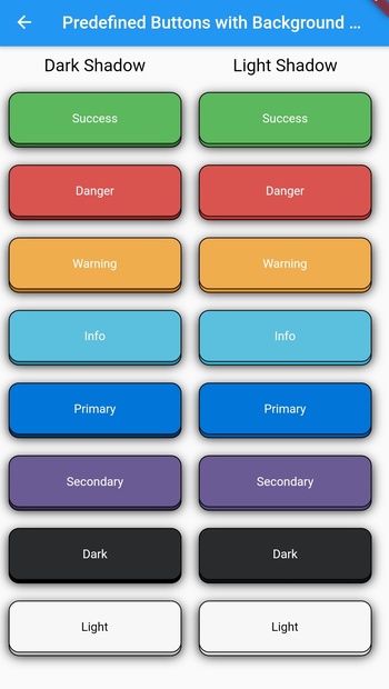
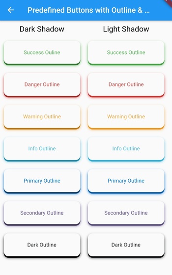
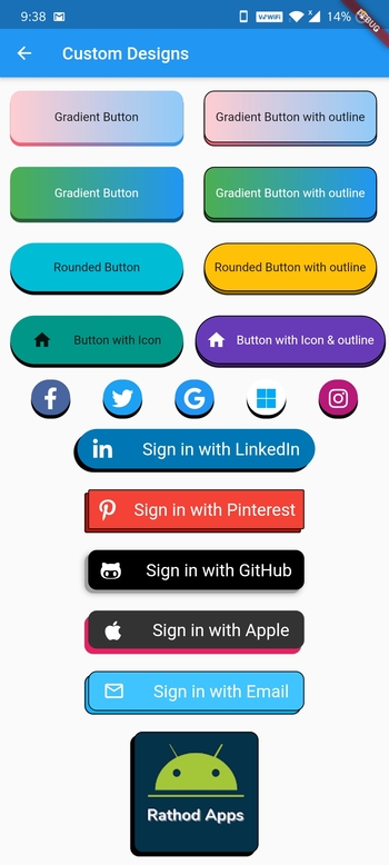
| Datatype | Parameter | Description | Default Value | Required |
|---|---|---|---|---|
function |
onTap | The function that is called whenever the widget is tapped | -- | Yes |
widget |
child | The child widget | -- | Yes |
PredefinedThemes |
type | There are 16 predefined themes that you can choose from if you dont want to customize the widget yourself | PredefinedThemes.primary | No |
Curve |
animationCurve | The curve that the animation will follow | Curves.easeIn | No |
bool |
enabled | To check whether the button is enabled or not | true | No |
bool |
isMultiColor | To check whether the button has multiple color gradient or not | false | No |
bool |
isOutline | To check whether the button has an outline or not | false | No |
bool |
darkshadow | To check whether the button has dark or light shadow | true | No |
int |
duration | The time that the animation takes in milliseconds | 70 | No |
double |
height | The height of the widget | 64 | No |
double |
width | The width of the widget | 200 | No |
double |
blurRadius | The radius of the blur effect of the widget | 0 | No |
double |
borderRadius | The radius of the borders of the widget | 12 | No |
double |
shadowHeightBottom | The height of the shadow and the animation of the widget from the bottom of the child widget | 4 | No |
double |
shadowHeightLeft | The height of the shadow and the animation of the widget from the left of the child widget | 0 | No |
double |
borderWidth | The width of the border of the widget | 1 | No |
Color |
borderColor | The color of the border of the widget (if type is not null, this will not work & isOutline should be true for this to work) | Colors.black | No |
Color |
blurColor | The color of the blur of the widget(if type is not null, this will not work) | Colors.black | No |
Color |
color | The color of the widget(if type is not null, this will not work) | Colors.blue | No |
Color |
shadowColor | The color of the shadow of the widget(if type is not null, this will not work) | Colors.black | No |
List<Color> |
colors | The list of colors for the gradient for the background of the widget(isMulticolor should be true for this to work) | [] | No |
| Theme Name | Example |
|---|---|
| success |  |
| successOutline |  |
| danger |  |
| dangerOutline |  |
| warning |  |
| warningOutline |  |
| info |  |
| infoOutline |  |
| primary |  |
| primaryOutline |  |
| secondary |  |
| secondaryOutline |  |
| dark |  |
| darkOutline |  |
| light |  |
AnimatedButton(
  child: Text(
    'Danger', // add your text here
    style: TextStyle(
      color: Colors.white,
    ),
  ),
  type: PredefinedTheme.danger,
  isOutline: true,
  borderWidth: 1,
  onTap: () {},
),
AnimatedButton(
  child: Text(
    'Danger', // add your text here
    style: TextStyle(
      color: Colors.white,
    ),
  ),
  type: PredefinedTheme.danger,
  darkshadow: false,
  isOutline: true,
  borderWidth: 1,

  onTap: () {},
),
AnimatedButton(
  child: Text(
    'Dark', // add your text here
    style: TextStyle(
      color: Colors.white,
    ),
  ),
  type: PredefinedTheme.dark,
  blurRadius: 10,
  onTap: () {},
),
AnimatedButton(
  child: Text(
    'Danger', // add your text here
    style: TextStyle(
      color: Colors.white,
    ),
  ),
  type: PredefinedTheme.danger,
  darkshadow: false,
  blurRadius: 10,
  onTap: () {},
),
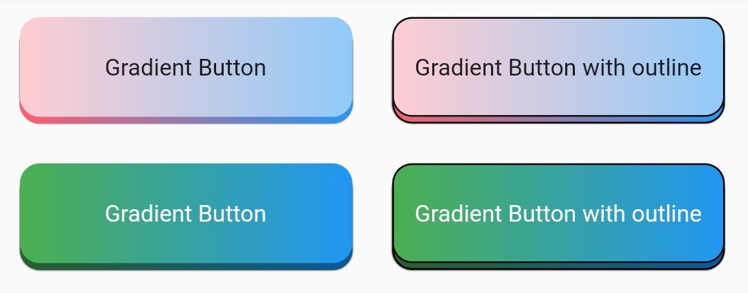
Row(
  children: [
    Padding(
      padding: const EdgeInsets.all(12.0),
      child: AnimatedButton(
        child: Text("Gradient Button"),
        onTap: () {},
        isMultiColor: true,
        colors: [
          Colors.red[100],
          Colors.blue[200],
        ],
      ),
    ),
    Padding(
      padding: const EdgeInsets.all(12.0),
      child: AnimatedButton(
        child: Text("Gradient Button with outline"),
        onTap: () {},
        isMultiColor: true,
        isOutline: true,
        colors: [
          Colors.red[100],
          Colors.blue[200],
        ],
      ),
    ),
  ],
),
Row(
  children: [
    Padding(
      padding: const EdgeInsets.all(12.0),
      child: AnimatedButton(
        child: Text(
          "Gradient Button",
          style: TextStyle(
            color: Colors.white,
          ),
        ),
        onTap: () {},
        isMultiColor: true,
        colors: [
          Colors.green,
          Colors.blue,
        ],
      ),
    ),
    Padding(
      padding: const EdgeInsets.all(12.0),
      child: AnimatedButton(
        child: Text(
          "Gradient Button with outline",
          style: TextStyle(
            color: Colors.white,
          ),
        ),
        onTap: () {},
        isMultiColor: true,
        isOutline: true,
        colors: [
          Colors.green,
          Colors.blue,
        ],
      ),
    ),
  ],
),

Row(
  children: [
    Padding(
      padding: const EdgeInsets.all(12.0),
      child: AnimatedButton(
        child: Text("Rounded Button"),
        onTap: () {},
        height: 60,
        type: null,
        borderRadius: 30,
        color: Colors.cyan,
      ),
    ),
    Padding(
      padding: const EdgeInsets.all(12.0),
      child: AnimatedButton(
        child: Text("Rounded Button with outline"),
        onTap: () {},
        height: 60,
        type: null,
        borderRadius: 30,
        isOutline: true,
        color: Colors.amber,
      ),
    ),
  ],
),

Row(
  children: [
    Padding(
      padding: const EdgeInsets.all(12.0),
      child: AnimatedButton(
        child: Row(
          mainAxisAlignment: MainAxisAlignment.spaceEvenly,
          children: [
            Icon(Icons.home),
            Text("Button with Icon"),
          ],
        ),
        onTap: () {},
        type: null,
        height: 60,
        borderRadius: 30,
        color: Colors.teal,
      ),
    ),
    Padding(
      padding: const EdgeInsets.all(2.0),
      child: AnimatedButton(
        child: Row(
          mainAxisAlignment: MainAxisAlignment.spaceEvenly,
          children: [
            Icon(Icons.home, color: Colors.white),
            Text("Button with Icon & outline",
                style: TextStyle(color: Colors.white)),
          ],
        ),
        onTap: () {},
        type: null,
        height: 60,
        width: 220,
        borderRadius: 30,
        isOutline: true,
        color: Colors.deepPurple,
      ),
    ),
  ],
),

Row(
  mainAxisAlignment: MainAxisAlignment.spaceEvenly,
  children: [
    Padding(
      padding: const EdgeInsets.all(2),
      child: AnimatedButton(
        child: Icon(
          FontAwesomeIcons.facebookF,
          color: Colors.white,
          size: 25,
        ),
        onTap: () {},
        type: null,
        height: 45,
        width: 45,
        borderRadius: 22.5,
        color: Color(0xFF49659F),
      ),
    ),
    Padding(
      padding: const EdgeInsets.all(2),
      child: AnimatedButton(
        child: Icon(
          FontAwesomeIcons.twitter,
          color: Colors.white,
          size: 25,
        ),
        onTap: () {},
        type: null,
        height: 45,
        width: 45,
        borderRadius: 22.5,
        color: Color(0xFF1DA1F2),
      ),
    ),
    Padding(
      padding: const EdgeInsets.all(2),
      child: AnimatedButton(
        child: Icon(
          FontAwesomeIcons.google,
          color: Colors.white,
          size: 25,
        ),
        onTap: () {},
        type: null,
        height: 45,
        width: 45,
        borderRadius: 22.5,
        color: Colors.blue,
      ),
    ),
    Padding(
      padding: const EdgeInsets.all(2),
      child: AnimatedButton(
        child: Icon(
          FontAwesomeIcons.microsoft,
          color: Colors.lightBlue,
          size: 25,
        ),
        onTap: () {},
        type: null,
        height: 45,
        width: 45,
        borderRadius: 22.5,
        color: Colors.white,
      ),
    ),
    Padding(
      padding: const EdgeInsets.all(2),
      child: AnimatedButton(
        child: Icon(
          FontAwesomeIcons.instagram,
          color: Colors.white,
          size: 25,
        ),
        onTap: () {},
        type: null,
        height: 45,
        width: 45,
        borderRadius: 22.5,
        color: Color(0xFFB81877),
      ),
    ),
  ],
),
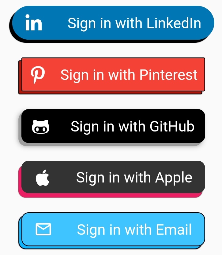
Padding(
  padding: const EdgeInsets.all(10),
  child: AnimatedButton(
    child: Row(
      mainAxisAlignment: MainAxisAlignment.spaceAround,
      children: [
        Icon(
          FontAwesomeIcons.linkedinIn,
          color: Colors.white,
          size: 25,
        ),
        Text(
          "Sign in with LinkedIn",
          style: TextStyle(
            color: Colors.white,
            fontSize: 20.0,
          ),
        )
      ],
    ),
    onTap: () {},
    type: null,
    height: 50,
    shadowHeightBottom: 4,
    shadowHeightLeft: 4,
    width: 275,
    borderRadius: 25,
    color: Color(0xFF0077B5),
  ),
),
Padding(
  padding: const EdgeInsets.all(10),
  child: AnimatedButton(
    child: Row(
      mainAxisAlignment: MainAxisAlignment.spaceAround,
      children: [
        Icon(
          FontAwesomeIcons.pinterestP,
          color: Colors.white,
          size: 25,
        ),
        Text(
          "Sign in with Pinterest",
          style: TextStyle(
            color: Colors.white,
            fontSize: 20.0,
          ),
        )
      ],
    ),
    onTap: () {},
    type: null,
    height: 50,
    isOutline: true,
    shadowHeightBottom: 4,
    shadowHeightLeft: 4,
    width: 250,
    borderRadius: 2,
    color: Colors.red,
  ),
),
Padding(
  padding: const EdgeInsets.all(10),
  child: AnimatedButton(
    child: Row(
      mainAxisAlignment: MainAxisAlignment.spaceAround,
      children: [
        Icon(
          FontAwesomeIcons.githubAlt,
          color: Colors.white,
          size: 25,
        ),
        Text(
          "Sign in with GitHub",
          style: TextStyle(
            color: Colors.white,
            fontSize: 20.0,
          ),
        )
      ],
    ),
    onTap: () {},
    type: null,
    height: 50,
    shadowHeightBottom: 4,
    shadowHeightLeft: 4,
    width: 250,
    shadowColor: Colors.grey,
    blurColor: Colors.grey,
    blurRadius: 5,
    borderRadius: 10,
    color: Colors.black,
  ),
),
Padding(
  padding: const EdgeInsets.all(10),
  child: AnimatedButton(
    child: Row(
      mainAxisAlignment: MainAxisAlignment.spaceAround,
      children: [
        Icon(
          FontAwesomeIcons.apple,
          color: Colors.white,
          size: 25,
        ),
        Text(
          "Sign in with Apple",
          style: TextStyle(
            color: Colors.white,
            fontSize: 20.0,
          ),
        )
      ],
    ),
    onTap: () {},
    type: null,
    shadowColor: Colors.pink,
    height: 50,
    width: 250,
    shadowHeightBottom: 6,
    shadowHeightLeft: 4,
    borderRadius: 10,
    color: Color(0xFF333333),
  ),
),
Padding(
  padding: const EdgeInsets.all(10),
  child: AnimatedButton(
    child: Row(
      mainAxisAlignment: MainAxisAlignment.spaceAround,
      children: [
        Icon(
          Icons.mail_outline,
          color: Colors.white,
          size: 25,
        ),
        Text(
          "Sign in with Email",
          style: TextStyle(
            color: Colors.white,
            fontSize: 20.0,
          ),
        )
      ],
    ),
    onTap: () {},
    type: null,
    height: 50,
    width: 250,
    isOutline: true,
    darkShadow: false,
    shadowHeightBottom: 4,
    shadowHeightLeft: 4,
    borderRadius: 10,
    color: Colors.lightBlueAccent,
  ),
),

Padding(
  padding: const EdgeInsets.all(10),
  child: AnimatedButton(
    child: ClipRRect(
      borderRadius: BorderRadius.circular(10.0),
      child: Image.network(
        "my_logo_image_url",
        fit: BoxFit.fill,
      ),
    ),
    onTap: () {},
    type: null,
    height: 144,
    width: 144,
    isOutline: true,
    shadowHeightBottom: 4,
    shadowHeightLeft: 4,
    borderRadius: 10,
    color: Color(0xFF033249),
  ),
),
निर्भरता सूची 3 आइटम
{"sdk":"flutter"}{"sdk":"flutter"}—उपयोग के अनुसार छाँटें, गतिविधि की तुलना करें और अपनाने से पहले मूल प्रोजेक्ट की आवश्यकताएँ जाँचें।
“A repository is the most basic element of GitHub.”
GitHub Docs — About repositories ↗