
 v3.0.0
motion_tab_bar_v2
फ्लटर ऐप्स के लिए एनीमेटेड बॉटम नेविगेशन बार, आइकन स्थान पर एनीमेट होता है, रंग कस्टमाइज़ किए जा सकते हैं।
95लाइक 44830-दिन डाउनलोड160Pub अंक
AndroidiOSWebmacOSWindowsLinux
एक सुंदर एनिमेटेड फ्लटर विजेट पैकेज लाइब्रेरी। टैब बार आपके वर्तमान थीम का उपयोग करने की कोशिश करेगा, हालांकि आप इसे थीम करना चाह सकते हैं।

{"sdk":"flutter"}{"sdk":"flutter"}^6.0.0यह अंग्रेज़ी मूल स्नैपशॉट है। नवीनतम सामग्री GitHub पर देखें।
pub package likes popularity pub points
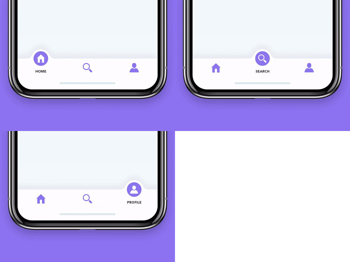
A highly customizable, animated bottom navigation bar for Flutter apps. The active tab icon animates into place with a smooth motion effect, and colors, sizes, icons, labels and badges are fully customizable.
Built with Flutter 3 and null-safety support.
IconData or custom widgets (iconWidgets)MotionBadgeWidget or any custom widget)MotionTabBarControllerlabelAlwaysVisible)0.3.x screenshot, example with programmatically change tabs
0.2.x screenshot
MotionTabBar Gif
Add the package to your pubspec.yaml:
dependencies:
  motion_tab_bar_v2: ^3.0.0
import 'package:motion_tab_bar_v2/motion-tab-bar.dart';

// optional, only if using the provided badge style
import 'package:motion_tab_bar_v2/motion-badge.widget.dart';

// optional, only if using "MotionTabBarController" to programmatically change the tab
import 'package:motion_tab_bar_v2/motion-tab-controller.dart';
Use a MotionTabBarController (instead of a plain TabController) if you need to change the selected tab programmatically:
class _MyHomePageState extends State<MyHomePage> with TickerProviderStateMixin {
  MotionTabBarController? _motionTabBarController;

  @override
  void initState() {
    super.initState();

    //// Use normal tab controller
    // _tabController = TabController(
    //   initialIndex: 1,
    //   length: 4,
    //   vsync: this,
    // );

    //// use "MotionTabBarController" to replace with "TabController", if you need to programmatically change the tab
    _motionTabBarController = MotionTabBarController(
      initialIndex: 1,
      length: 4,
      vsync: this,
    );
  }

  @override
  void dispose() {
    super.dispose();

    // _tabController.dispose();
    _motionTabBarController!.dispose();
  }
}
bottomNavigationBar: MotionTabBar(
  controller: _motionTabBarController, // ADD THIS if you need to change your tab programmatically
  initialSelectedTab: "Home",
  useSafeArea: true, // default: true, apply safe area wrapper
  labelAlwaysVisible: true, // default: false, set to "true" if you need to always show labels
  labels: const ["Dashboard", "Home", "Profile", "Settings"],

  //// use default icon (with IconData)
  // icons: const [
  //   Icons.dashboard,
  //   Icons.home,
  //   Icons.people_alt,
  //   Icons.settings,
  // ],

  // use custom widget as display Icon
  iconWidgets: [
    _generateCustomIcon('<svgString>'),
    _generateCustomIcon('<svgString>'),
    _generateCustomIcon('<svgString>'),
    _generateCustomIcon('<svgString>'),
  ],

  // optional badges, length must be same with labels
  badges: [
    // Default Motion Badge Widget
    const MotionBadgeWidget(
      text: '99+',
      textColor: Colors.white, // optional, default to Colors.white
      color: Colors.blue, // optional, default to Colors.red
      size: 18, // optional, default to 18
    ),

    // custom badge Widget
    Container(
      color: Colors.black,
      padding: const EdgeInsets.all(2),
      child: const Text(
        '48',
        style: TextStyle(
          fontSize: 14,
          color: Colors.white,
        ),
      ),
    ),

    // allow null
    null,

    // Default Motion Badge Widget with indicator only
    const MotionBadgeWidget(
      isIndicator: true,
      color: Colors.blue, // optional, default to Colors.red
      size: 5, // optional, default to 5,
      show: true, // true / false
    ),
  ],
  tabSize: 50,
  tabBarHeight: 55,
  textStyle: const TextStyle(
    fontSize: 12,
    color: Colors.black,
    fontWeight: FontWeight.w500,
  ),
  // tabIconColor: Colors.blue[600],
  tabIconSize: 28.0,
  tabIconSelectedSize: 32.0,
  tabSelectedColor: Colors.white,
  tabIconSelectedColor: Colors.black,
  tabBarColor: Colors.orange,
  onTabItemSelected: (int value) {
    setState(() {
      _motionTabBarController!.index = value;
    });
  },
),
body: TabBarView(
  physics: const NeverScrollableScrollPhysics(), // swipe navigation handling is not supported
  // controller: _tabController,
  controller: _motionTabBarController,
  children: <Widget>[
    const Center(
      child: Text("Dashboard"),
    ),
    const Center(
      child: Text("Home"),
    ),
    const Center(
      child: Text("Profile"),
    ),
    const Center(
      child: Text("Settings"),
    ),
  ],
),
ElevatedButton(
  // set MotionTabBarController index to new tab index
  onPressed: () => _motionTabBarController.index = 0,
  child: const Text('Dashboard Page'),
),
ElevatedButton(
  // set MotionTabBarController index to new tab index
  onPressed: () => _motionTabBarController.index = 1,
  child: const Text('Home Page'),
),
| Parameter | Type | Default | Description |
|---|---|---|---|
initialSelectedTab |
String |
— (required) | Label of the tab selected when the widget is first built. Must be one of labels. |
labels |
List<String?> |
— (required) | Labels of the tabs. Length must match icons / iconWidgets. |
icons |
List<IconData>? |
null |
Icons for each tab. Mutually exclusive with iconWidgets; either one must be provided. |
iconWidgets |
List<Widget>? |
null |
Custom widgets used as tab icons. Mutually exclusive with icons; either one must be provided. |
badges |
List<Widget?>? |
null |
Badges shown on each tab. Length must match labels; entries may be null to hide a badge. |
controller |
MotionTabBarController? |
null |
Controller used to change the selected tab programmatically. |
onTabItemSelected |
Function? |
null |
Callback invoked when a tab is selected, receiving the index of the selected tab. |
tabIconColor |
Color? |
Colors.black |
Color of the unselected tab icons. |
tabIconSelectedColor |
Color? |
Colors.white |
Color of the selected tab icon (inside the floating indicator). |
tabIconSize |
double? |
24 |
Size of the unselected tab icons. |
tabIconSelectedSize |
double? |
24 |
Size of the selected tab icon. |
tabSelectedColor |
Color? |
Colors.black |
Background color of the floating indicator circle. |
tabBarColor |
Color? |
Colors.white |
Background color of the tab bar. |
tabBarHeight |
double? |
65 |
Height of the tab bar. |
tabSize |
double? |
60 |
Size of the floating indicator circle. |
textStyle |
TextStyle? |
TextStyle(color: Colors.black) |
Text style applied to the tab labels. |
useSafeArea |
bool |
true |
Whether to wrap the tab bar in a SafeArea. |
labelAlwaysVisible |
bool |
false |
Whether tab labels are always visible. When false, only the selected tab's label is shown. |
| Parameter | Type | Default | Description |
|---|---|---|---|
text |
String? |
null |
Badge text (at most 3 characters). |
isIndicator |
bool? |
false |
When true, renders a plain indicator dot instead of a text badge. |
color |
Color? |
Colors.red |
Background color of the badge. |
textColor |
Color? |
Colors.white |
Color of the badge text. |
size |
double? |
18 (or 5 for indicator) |
Size of the badge. |
disabled |
bool? |
false |
When true, renders the badge in a dimmed style. |
show |
bool? |
true |
When false, hides the badge. |
MotionTabBarController extends Flutter's TabController and adds a callback so the MotionTabBar animates to the new tab when its index is changed programmatically.
| Member | Type | Description |
|---|---|---|
index (setter) |
int |
Sets the current tab index and notifies the MotionTabBar to animate to the new tab. |
onTabChange (setter) |
Function(int)? |
Callback invoked when the tab index changes. Used internally by MotionTabBar. |
A complete, runnable example app is available in the example/ folder (and a full multi-platform app in example_app/). It demonstrates:
iconWidgets (SVG icons)MotionBadgeWidget and custom widgetsMotionTabBarControllerRun it with:
cd example
flutter run
Contributions are welcome! If you find a bug or have a feature request, please open an issue or submit a pull request.