
 v1.1.0
flutter_responsive
Flutter के लिए प्रतिक्रियाशील लेआउट विजेट। इस प्लगइन को बूटस्ट्रैप वेब प्रोजेक्ट पर प्रेरित किया गया था।
30लाइक 11330-दिन डाउनलोड140Pub अंक
AndroidiOSWebmacOSWindowsLinux
Flutter के लिए प्रतिक्रियाशील लेआउट और पाठ

{"sdk":"flutter"}{"sdk":"flutter"}यह अंग्रेज़ी मूल स्नैपशॉट है। नवीनतम सामग्री GitHub पर देखें।
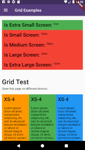
flutter_responsive pluginexample_6 example_7
This plugin provides a easy and productive way to work with responsive layouts for Flutter Applications in mobile, desktop and web, allowing your layout to adapt and wrap widgets ( Container, Rows, Columns and RichText ) referent to the size of his parent element.
Made by Rafael Setragni to all Flutter's Community.
This project follows the GNU General Public License V3, wich means you can change the entire project the way as you want to, but you need to share your improvements back to the community.
To share your improvements, please first do a Fork of this project, change what you need to and finally do a pull request. And don´t let to share your ideas and needs on "Issues" page, even before to start your changes.
div Html element.Add the dependency bellow into your pubspec.yaml file.
dependencies:
  flutter_responsive: ^0.0.6 #Please, ensure to use the most updated version
Add the reference into your .dart files
import 'package:flutter_responsive/flutter_responsive.dart';
Use the Widgets ResponsiveContainer, ResponsiveRow, ResponsiveCol and JSX as the way you want to.
This plugin was based on Bootstrap web project and split the screen in 12 columns, considering 7 screen sizes:
example_1 example_2 example_3 example_4
All the limits could be personalized as you need, changing the limit Hashmap into ResponsiveScreen class.
/* Map<String, double> */
ResponsiveScreen.limits = {
    ScreenSize.us: 0.00,
    // Smart watches
    ScreenSize.xs: 310.00,
    // Small phones (5c)
    ScreenSize.sm: 576.00,
    // Medium phones
    ScreenSize.md: 768.00,
    // Large phones (iPhone X)
    ScreenSize.lg: 992.00,
    // Tablets
    ScreenSize.xl: 1200.00,
    // Laptops
    ScreenSize.ul: 2000.00,
    // Desktops and TVs 4K
  };
This plugin have 3 major grid elements:
ResponsiveContainer(

  // Determines the container's limit size
  widthLimit: ResponsiveScreen.limits[ScreenSize.lg],
  margin: EdgeInsets.symmetric(horizontal: 10),

  children: <Widget>[

    ResponsiveRow(),
    ResponsiveRow(),
    ResponsiveRow(),

  ]
)
ResponsiveRow(

  margin: EdgeInsets.only(top: 20, bottom: 5),

  children: <Widget>[

    ResponsiveCol(),
    ResponsiveCol(),
    ResponsiveCol(),

    Text('It´s fine to use another widget directly inside a ResponsiveRow')
  ]
),
ResponsiveCol(
  margin: EdgeInsets.all(10),
  padding: EdgeInsets.all(10),
  backgroundColor: Colors.blue,
  gridSizes: {
      ScreenSize.xs : 4,
      ScreenSize.sm : 3,
      ScreenSize.lg : 2,
      ScreenSize.xl : 1,
  },
  children: [
      Text('Lorem ipsum dolor sit amet, consectetur adipiscing elit')
  ]
)
import 'package:flutter/material.dart';
import 'package:flutter_responsive/flutter_responsive.dart';

class HomePage extends StatefulWidget {
  @override
  _HomePage createState() => _HomePage();
}

class _HomePage extends State<HomePage> {

  @override
  void initState() {
    super.initState();
  }

  @override
  Widget build(BuildContext context) {

    /*create 12 columns*/
    List<Widget> responsiveGridExample =

      /*repeat 12 times*/
      List<int>.generate(12, (index) => index).map((colIndex) =>
          ResponsiveCol(
              padding: EdgeInsets.all(10),
              backgroundColor: Colors.blue,
              gridSizes: {
                ScreenSize.xs : 4,
                ScreenSize.sm : 3,
                ScreenSize.lg : 2,
                ScreenSize.xl : 1,
              },
              children: [
                Text('Lorem ipsum dolor sit amet, consectetur adipiscing elit')
              ]
          )
      ).toList();

    MediaQueryData mediaQuery = MediaQuery.of(context);

    return Scaffold(
        appBar: AppBar(
          title: const Text('Home', overflow: TextOverflow.ellipsis),
        ),
        body: Container(
          color: Color(0xFFCCCCCC),
          child: ListView(
            children: <Widget>[
              ResponsiveContainer(
                margin: EdgeInsets.symmetric(vertical: 10),
                padding: EdgeInsets.symmetric(horizontal: 10),
                backgroundColor: Colors.white,
                widthLimit: mediaQuery.size.width * 0.95,
                children: <Widget>[
                  ResponsiveRow(
                    margin: EdgeInsets.symmetric(vertical: 10),
                    children: <Widget>[

                      ResponsiveCol(
                          padding: EdgeInsets.all(10),
                          margin: EdgeInsets.only(bottom: 20),
                          backgroundColor: Colors.blueGrey,
                          children: [
                            Text('Flutter Responsive Layout', style: JSXTypography.h4.merge(TextStyle(color: Colors.white)))
                          ]
                      ),
                    ]
                  ),
                  ResponsiveRow(
                    margin: EdgeInsets.symmetric(vertical: 10),
                    children: <Widget>[

                      // By default, the column occupies the entire row, always
                      ResponsiveCol(
                        children: [
                          JSX(
                            shrinkToFit: true,
                            padding: EdgeInsets.only(bottom: 20),
                            stylesheet: {
                              'h3': JSXStylesheet(
                                  textStyle: TextStyle(color: Theme.of(context).primaryColor),
                                  displayLine: DisplayLine.block
                              ),
                              'h6': JSXStylesheet(
                                  textStyle: TextStyle(color: Theme.of(context).primaryColor),
                                  displayLine: DisplayLine.block
                              )
                            },
                            margin: EdgeInsets.symmetric(horizontal: 10, vertical: 20),
                            text:
                            '<div>'
                                '<h3>Responsive Layouts</h3><h6>for <i>Flutter</i></h6>'
                                '<br><br>'
                                '<p>This <b>RichText</b> was easily produced and personalized using pure HTML</p>'
                                '<p>Bellow there is an example of 12 columns, wich changes the amount of each line depending of his father´s widget size.</p>'
                            '</div>',
                          )
                        ]
                      )

                    ]..addAll(
                        responsiveGridExample
                    )
                  )
                ],
              )
            ],
          ),
        )
    );
  }
}
example_9
This project is a starting point for a Flutter plug-in package, a specialized package that includes platform-specific implementation code for Android and/or iOS.
For help getting started with Flutter, view our online documentation, which offers tutorials, samples, guidance on mobile development, and a full API reference.
To run the full example App, wich contains performance and case tests, do the steps bellow:
flutter pub get to update all the dependenciesexample/lib/main.dart or any of the unity case tests located on test folder on emulator or real device.flutter run --release